
Interviews
UnCovered: *repeat repeat’s Kristyn Corder Psyches Us Up on the ‘Floral Canyon’ Cover Art
Nashville, Tennessee’s *repeat repeat released their Floral Canyon album on September 15th and today we dive into its psychedelic cover artwork!
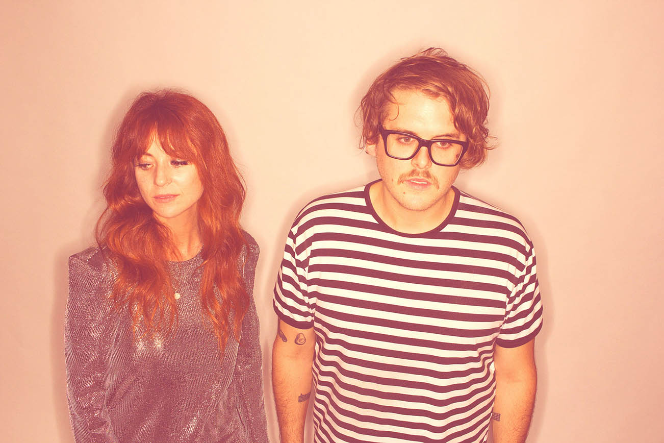
Released on September 15th, we were instantly drawn to the psychedelic cover artwork of the latest twelve-track offering, Floral Canyon, via Nashville, Tennessee’s *repeat repeat. We’ve been jamming the album for a few months now and are stoked to get more detailed info about how the artwork came to be. Here’s what singer and keyboardist Kristyn Corder had to say about its creation and concept.
Your new album cover is crazy-cool. Tell us about the artist and how you found him/her?
Kristyn Corder: Thank you! We instantly fell in love with it ourselves. The artist’s name is Rachel Briggs. We’d been a fan of her work for a long time before we asked her to do the Floral Canyon artwork. We have several mutual friends and she’s created a long list of really cool artwork for musicians. She spends much of her time in Nashville, so we were used to recognizing her work around the community. We never envisioned anyone other than Rachel to set the visual scene for this album.
What were the partnership’s dynamics like? For example, was a specific look given, or did the artist have full free range?
Corder: The same time we started working on the music, we began a mood board of imagery and color palette inspirations. We shared that with Rachel initially, along with a list of things we consider ourselves to be inspired by. We didn’t have a concept for her – we wanted that to be all her. We did have a list of things we love and some visual references for the vibe we were going for. I’ve included a few screenshots from those early emails to give you a peek into what our vision was and how we communicated that to Rachel.

Did the artist who did the cover art hear the album before hand? Or, what kind of input did you give him/her?
Corder: From the onset of this album, we always knew we wanted to ask her to listen to the record and subsequently create whatever she felt to be representative of what she was hearing.
Have you ever purchased an album solely because of its album artwork? If yes, did the music live up to the artwork?
Corder: I think maybe everyone has picked up the Herb Alpert vinyl with the whipped cream girl at some point simply because it looks so groovy. It seems like everyone’s got that one. I don’t know that I’d say the music lived up to the imagery’s level of awesome, but I will say I wasn’t surprised by its sound. Also, love those greens. (Whipped Cream & Other Delights is a 1965 album by Herb Alpert & the Tijuana Brass.)
With the increasing popularity of digital music, most fans view artwork as just pixels on a screen. Why did you feel the artwork was important?
Corder: The album was always intended to be on vinyl, there was never any doubt about it. We have a lot of vinyl ourselves and a huge old record console that our living room is anchored by. We wanted our own album to look fun and inviting on the shelf, and feel like a modern take on the pivotal psychedelic artwork from back in the day that was incredibly colorful and a touch trippy.
When people look at the album cover artwork, what do you want them to see/think?
Corder: Fun, retro colors, beachy feels, love, hope. We kept saying that it would look like if that same psychedelic style had continued through the eras.
What are your thoughts and/or the pros and cons about digital art versus non-digital?
Corder: Sometimes when artwork is created for digital-only, it can come off a little like corners were cut or the album concept wasn’t able to be fully explored because you’re not thinking of it as a tangible thing that has to look good in someone’s hands, or stand out on a shelf full of other music.
Was the album art influenced by any of the themes explored on the band’s album?
Corder: I think the artwork is literal in that it was designed based around the album title (as opposed to themes explored in the songs). And I also think that the art evokes a fitting sense of what you can expect to hear.
How do you think the album art will affect the listener’s perception of your album?
Corder: We hope it sets a visual tone for what we feel is a somewhat whimsical album.
Is the art for this album related to any of your previous album cover artwork?
Corder: Yes! She also designed the single artwork for “Plugged In” in 2016 that preceded the album.
Stream the full Floral Canyon album here, and never look back!


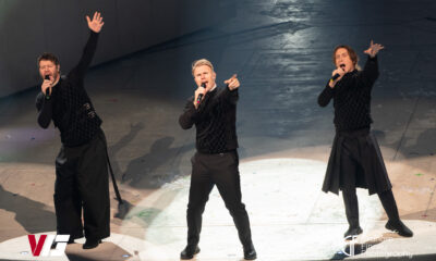
Take That (w/ Olly Murs) Kick Off Four-Night Leeds Stint with Hit-Laden Spectacular [Photos]

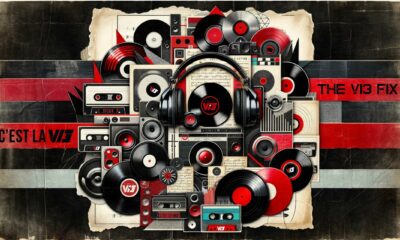
The V13 Fix #010 w/ High on Fire, NOFX, My Dying Bride and more

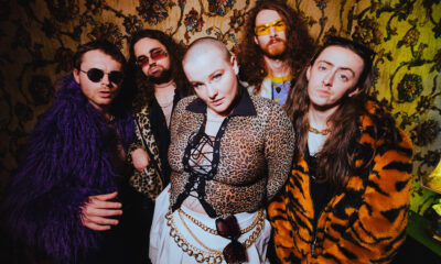
A Rejuvenated Dream State are ‘Still Dreaming’ as They Bounce Into Manchester YES [Photos]


-
 Music5 days ago
Take That (w/ Olly Murs) Kick Off Four-Night Leeds Stint with Hit-Laden Spectacular [Photos]
-
 Alternative/Rock6 days ago
The V13 Fix #010 w/ High on Fire, NOFX, My Dying Bride and more
-
 Alternative/Rock2 weeks ago
A Rejuvenated Dream State are ‘Still Dreaming’ as They Bounce Into Manchester YES [Photos]
-
 Features5 days ago
Tour Diary: Gen & The Degenerates Party Their Way Across America
-

 Culture1 week ago
Dan Carter & George Miller Chat Foodinati Live, Heavy Metal Charities and Pre-Gig Meals
-
 Music1 week ago
Reclusive Producer Stumbleine Premieres Beat-Driven New Single “Cinderhaze”
-
 Alternative/Rock1 week ago
Three Lefts and a Right Premiere Their Guitar-Driven Single “Lovulator”
-
 Alternative/Rock1 week ago
Death Wishlist Are Fiery and Fierce with Their “I Get Bored” Video Premiere