
(dis)Cover Artwork
(dis)Cover Artwork – Vol 3: BenBen, Dog of Man, Kids Return, The Standstills, Trutopia & Greta Levska, Vails
In volume 3 of our series (dis)CoverArtwork, we dive into incredible cover art for releases from BenBen, Dog of Man, Kids Return, The Standstills, Trutopia & Greta Levska, and Vails.
Ever see a totally rad cover artwork on an album, EP or single and wonder how it got to be so fetching? You’re not alone; we have as well. In fact, this crosses our minds daily, thanks to the deluge of new music bombarding our inboxes. Enter (dis)Cover Artwork, a simple series focused on diving a little deeper into some of the most eye-catching imagery to grace musical output.
We regularly break down six different covers from a multitude of artists across all genres that we found to be particularly un-look-away-able. We touch on the new music and the story behind each cover and artwork. Moreover, we also get some input from the bands and artists themselves to gain a little more insight into what these rad covers are all about.
After checking this out, we’re sure you’ll look at all the artwork in your album collection a little more curiously!
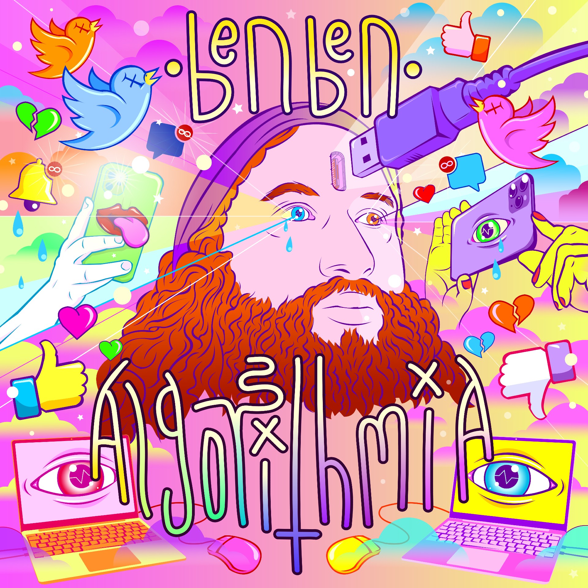
Artwork for the album ‘Algorithmia’ by BenBen
1. BenBen – Algorithmia
release: November 18, 2022
label: GiftShop Records
genre: alt-rock
November 18th saw the release of Algorithmia via GiftShop Records, the debut solo EP by Brooklyn-based animator, producer, and self-described “gnome rocker” BenBen (aka Ben Wigler). The album’s seven tracks are loaded with experimental and riff-heavy art-rock that’s all accompanied by some damn snazzy visuals, including the creative, colourful cover art.
The music on Algorithmia, per info about the album, is “an exploration of our digital dystopia, our addiction to our electronic devices, and our constant need for external validation in the form of likes and follows.” From artificial intelligence (AI) to ever-connectedness, it’s easy to see how the cover ties into the lyrical topics at hand.
Eloquently elaborating on his art, Ben shares:
“Algorithmia is an album about the spiritual void ripped open by 21st-century digital overload and the sort of neuro-slavery caused by algorithm-driven content delivery platforms that literally hijack our brain chemicals. The album artwork, illustrated by my close musical and visual collaborator Dima Drjuchin (who has done artwork for Father John Misty, Flaming Lips, and Tool, among many others), was created in Adobe Illustrator to look as digital as possible.
“I did several first passes of the design before turning it over to Dima. When Dima picked it up, we agreed to eliminate any subtlety whatsoever and just make a train wreck of maximalist digital iconography. There’s a quasi-religious or sacred art feel that’s been turned into this nightmare of being overwhelmed by content. Instead of a third eye, I’ve got a USB port (well, it’s actually an HDMI port, because that’s more graphic). There’s this look in my eyes that is meant to convey how serenity is being replaced with dumb sterility. Around my disembodied head in this gradient, Heaven-scape are dead Twitter birds and endless cellphones made to look like Jokerish nightmare creatures. Literally an infinity of unread messages and emails. I had a really cool design for a sort of inverted-cross version of the Spotify logo that didn’t make it to the final artwork, but I think the feeling is there.
“Algorithmia is an album about the spiritual void ripped open by 21st-century digital overload and the sort of neuro-slavery caused by algorithm-driven content delivery platforms that literally hijack our brain chemicals.”
“The handwriting is mine – handwriting is a really important part of my process. I have ADHD and other neurological challenges, which made learning to write in school very difficult. For most of my life, I really hated my handwriting, but over the last few years, I’ve developed it into a sort of Tolkien-sequence style that is really fun to write and instantly identifiable as mine. It was a big part of learning to be OK with myself. I usually write by hand on a special kind of paper, but all my own digital artwork and animation are done by index finger on a trackpad. Dima thinks I’m a psycho for not using a tablet, and I have to admit that one of the reasons I do it this way is to freak him out.
“Algorithmia is an odd choice to launch my solo musician pathway. Everything else I’ve got ready to go in 2023 is deeply organic, mostly analog and handmade, but even the digital stuff is super subtle and imbued with magic. That feeling extends to the music in a big way. Algorithmia, musically and especially visually, is like my way of flipping two digital tokens to the Ferryman to help me navigate the streams of the River of Styx. But I’m not planning on going to the digital afterlife…I’m gonna hi-jack the boat.“
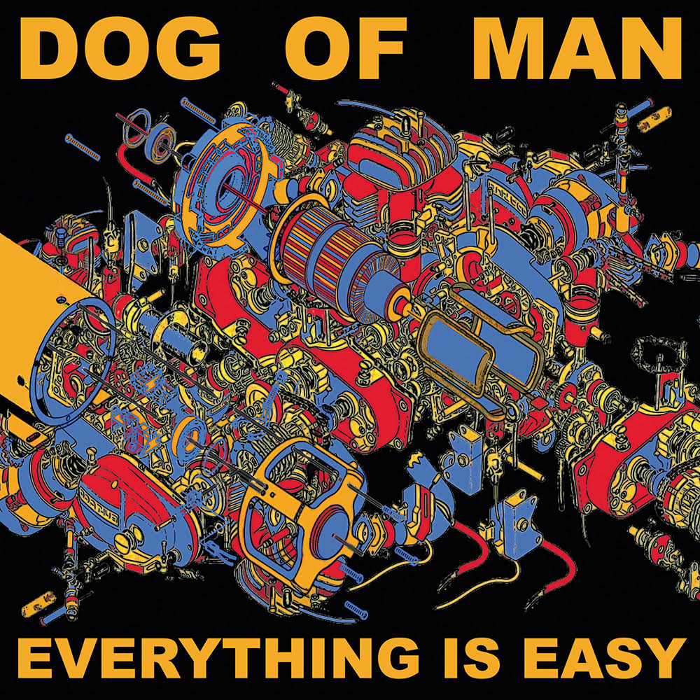
Artwork for the album ‘Everything is Easy’ by Dog of Man
2. Dog of Man – Everything is Easy
release: October 14, 2022
label: Sentient Rash Records / Fail Better Records
genre: psych-punk, heavy psych-pop
According to the Brighton, Egland-based psych-punk band Dog of Man, their new album Everything is Easy dives into themes of neuroses, madness and breakdown—and gazing upon their album cover, it’s easy also to see these topics being tackled visually.
Serving up a heavy psych-pop mixture fueled by weird indie, thrashy punk, breakcore and Balkan folk, the band’s musical chops are as sharp as their humour is wry. Per a press release, “What started as a cathartic noise jam morphed into the weirdest rock music you’ll ever dance to. This is the sound of distorted accordion, erratic guitar licks, melodic bass and frenetic drumming. It’s noisy, it’s fun, inventive and immediate.”
Delving further into the Everything is Easy cover, lead vocalist and electric accordion aficionado Mike Milner states:
“Everything is Easy displays an isometric view of what appears to be an unnecessarily complicated engine, which I call the anxiety engine. It’s made up of lots of other engines, working parts and illustrations of mechanical components, spliced and combined together into a palimpsest of parts. I was inspired by the An Albatross cover for Return of the Lazer Viking; for the colour palette, all primary colours (easy) segregating the multitude of contrapuntal doohickeys and thingamajigs into a nauseating mess.
“Everything is Easy displays an isometric view of what appears to be an unnecessarily complicated engine, which I call the anxiety engine.”
“My intention was to intentionally lead the viewer into looking for a discernible pattern, something salient or meaningful within the anxiety engine which could reveal some insight as to its function. It may look complex, but the answer is, in fact, quite easy. Everything is ;). Cheers, all.”
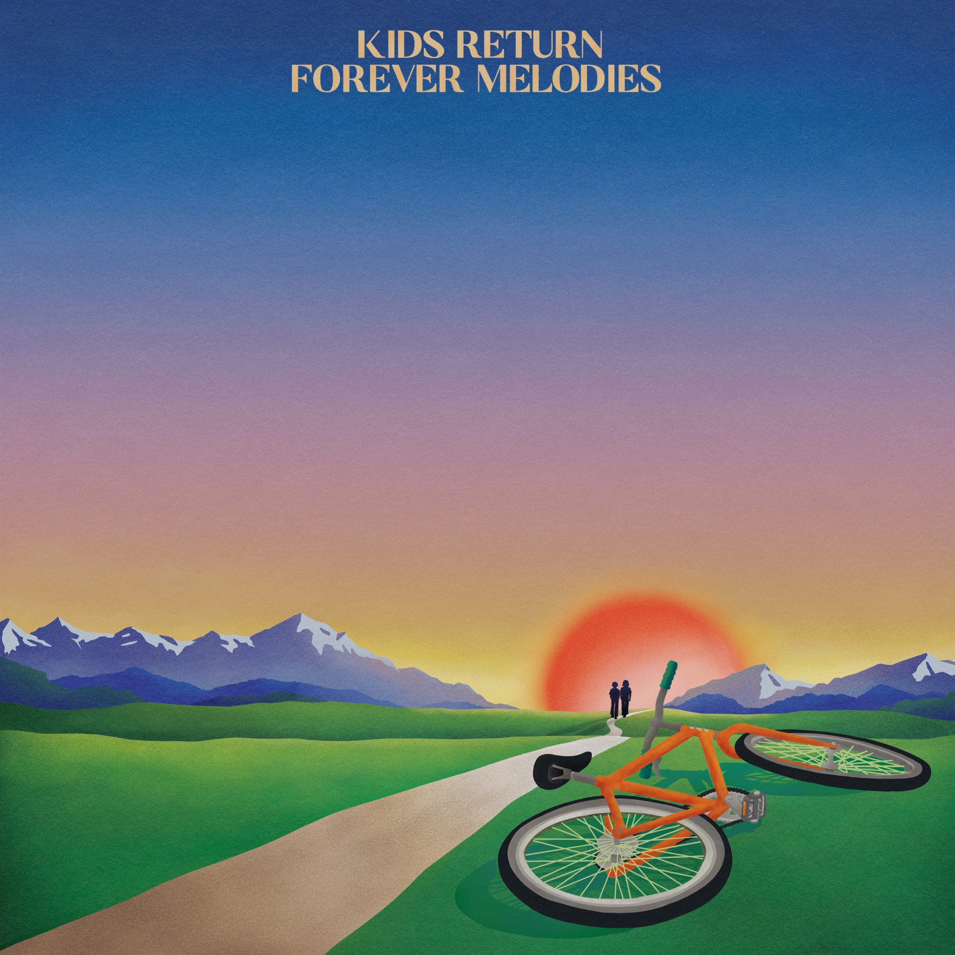
Artwork for the album ‘Forever Melodies’ by Kids Return, created by Apollo Thomas
3. Kids Return – Forever Melodies
release: October 7, 2022
label: Ekleroshock / Hamburger Records
genre: indie-pop
On October 7th, Kids Return dropped their debut album Forever Melodies via Ekleroshock/Hamburger Records, a terrific mixture of sounds ultimately delivering impressive indie-pop. Their band moniker taken from the Takeshi Kitano film of the same name, the French duo—childhood friends Adrien Rozé and Clément Savoye—crafted the album after being quarantined together in Paris in April 2020.
The end result is a musical package rife with nostalgia, sincerity, and the musicians’ love for arranging melodies with lyrics running the gamut from breakups and friendship to physical anguish and growing up. Inspired by the movie, as well as the soundtrack by Joe Hisaishi, the twosome comment, “The movie was our emotional milestone: sensitivity, naivety, melancholy.”
Elaborating on the intriguing cover art that, as above-stated, seems to give off feelings of happiness and sadness simultaneously, the guys share:
“The cover of the album speaks about the transition from childhood to adulthood. It synthesizes in a drawing the topic of the record. We asked our friend Apollo Thomas to draw two young people walking towards the unknown and leaving behind their bike, a great symbol of childhood.
“The cover of the album speaks about the transition from childhood to adulthood.”
“We wanted to represent a light tone of nostalgia through the colors while putting hope in it. The album was written and produced with a small team; everything is played on real instruments, we needed the cover to have that organic and handmade feel. We tried several ideas, and seeing this sketch was like a revelation. The march towards the future in a world full of poetry.”
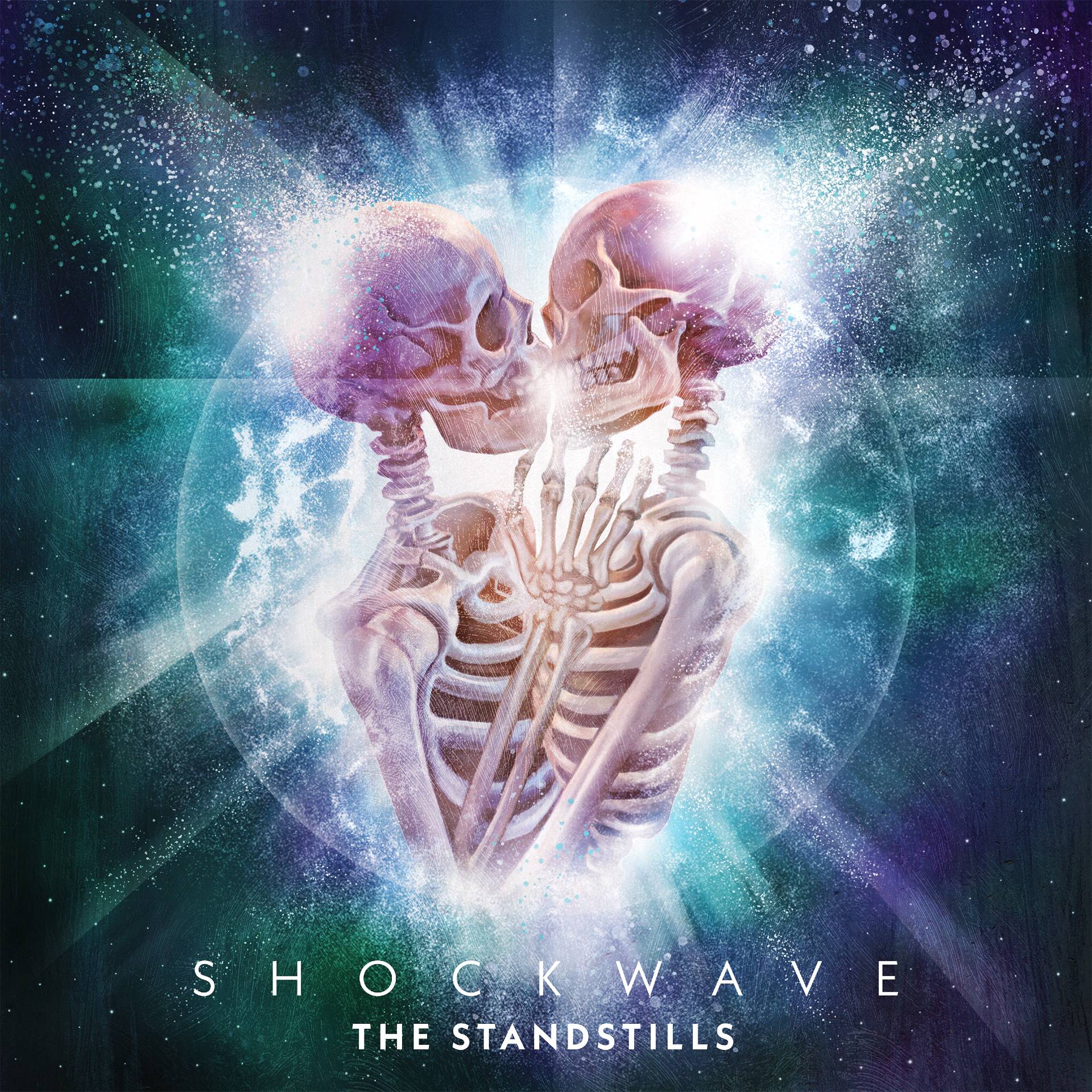
Artwork for the album ‘Shockwave’ by The Standstills
4. The Standstills – Shockwave
release: November 4, 2022
label: MNRK Music Group
genre: rock, hard rock, alternative metal, alternative rock
The Standstills is a hard-rocking husband-and-wife duo consisting of musicians Jonny Fox and Renée Couture. With their new album, Shockwave, out as of November 4th via MNRK, it’s been hard to ignore the hook-filled, rock-heavy singles being showcased from this thirteen-track set, which even includes a re-worked version of their desert rock single “Motherlode,” featuring Jesse Hughes of Eagles of Death Metal fame.
The twosome calls the Lake Ontario shoreline city of Oshawa home and, for this release, worked with producer Neil Sanderson from Three Days Grace. Mixing was handled by none other than two-time GRAMMY Award winner Howard Benson (My Chemical Romance, Santana, Daughtry), resulting in a gritty-yet-polished offering that would be equally at home in dingy clubs and big stadiums.
Discussing in more detail the “love is eternal-eqsue” cover art, artist Matthew Therrien shares:
“At its core, I believe that the album art for Shockwave is about love, and just how extraordinarily powerful it can be. There are, I think, two ways you can look at the image. In the first way, you see two human beings united in an embrace so powerful and profound that the act of coming together has literally created a burst of energy, turning their bones to dust and scattering them through the cosmos. But the other way is: even in the midst of something apocalyptic – a cataclysmic, life-ending explosion – there is still a bond between two lovers that is strong enough to endure even the complete annihilation of existence.
“At its core, I believe that the album art for Shockwave is about love, and just how extraordinarily powerful it can be.”
“But no matter how you look at it or choose to interpret it, the image is still a testament to the power of two people, literally stripped down to their bare bones, sharing an embrace and authentic connection with each other.
“The artwork was digitally painted after a number of pencil sketches and layouts were created. We discussed the concept (myself and The Standstills ) and had a good idea of what we wanted to be represented visually. A single, iconic and striking image that depicted a powerful moment; and while two skeletal figures could easily be seen as horrific, it was treated in a way to emphasize the beauty of it through colour and lighting. A moment of destruction and creation, simultaneously. A shockwave so strong, it would echo through the universe.”
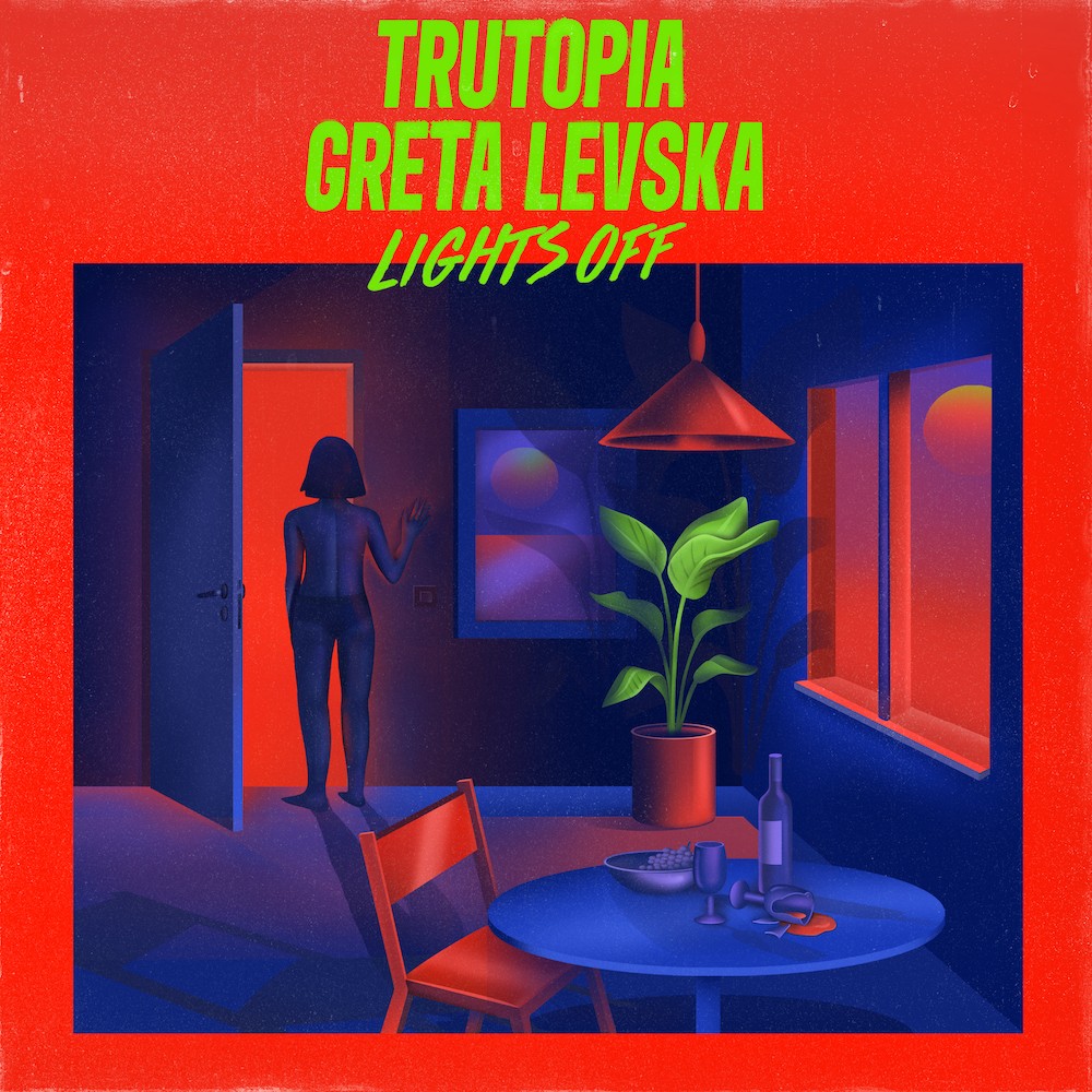
Artwork for the single “Lights Off” by Trutopia & Greta Levska
5. Trutopia & Greta Levska – “Lights Off”
release: November 11, 2022
label: Get Physical Music
genre: electronica, house
This song immediately drew us in, both with its bassy beats and vibrant cover. The “Lights Off” single, which sees the duo Trutopia partnering with Lithuanian-born, London-raised Ibiza resident Greta Levska, is dreamy, atmospheric, and totally club-ready. The brotherly Trutopia twosome is already well-known in London and Ibiza for their concoction of classic, deep electro house, and this song will only further said acclaim.
With high praise from the likes of Mixmag and Pete Tong and Jaguar on BBC Radio 1 and hot drops on labels the likes of Strictly Rhythm, Nervous Records, and Stress Records, Trutopia can seemingly do no wrong. Meanwhile, Greta is slated to follow up on this debut outing on Get Physical with more new music in 2023.
We were lucky enough to get in touch with the single cover’s designer, Mirjam Schmid, who gave us some insight into her wicked work.
“Creating strong contrasts was what I had in mind when I made this cover. First of all, contrast between light and shadow, to capture the idea of the track and to create a certain mood: That something special may be over, but something new unknown may be waiting for you.
“Creating strong contrasts was what I had in mind when I made this cover.”
“Then I also wanted to work with only two bold contrast colors to underline this idea even more. The lights and shadows in the picture are able to expand the color palette and show their actual diversity. The picture is a digital painting. Painted inside Photoshop, using a large drawing tablet. To paint, I used mainly a digital pen and also the mouse to create an airbrush effect.
“Trutopia & Greta Levska gave me a lot of trust to come up with my own idea for their cover, which was very nice and made me work intuitively and freely. Often then the best results appear.”
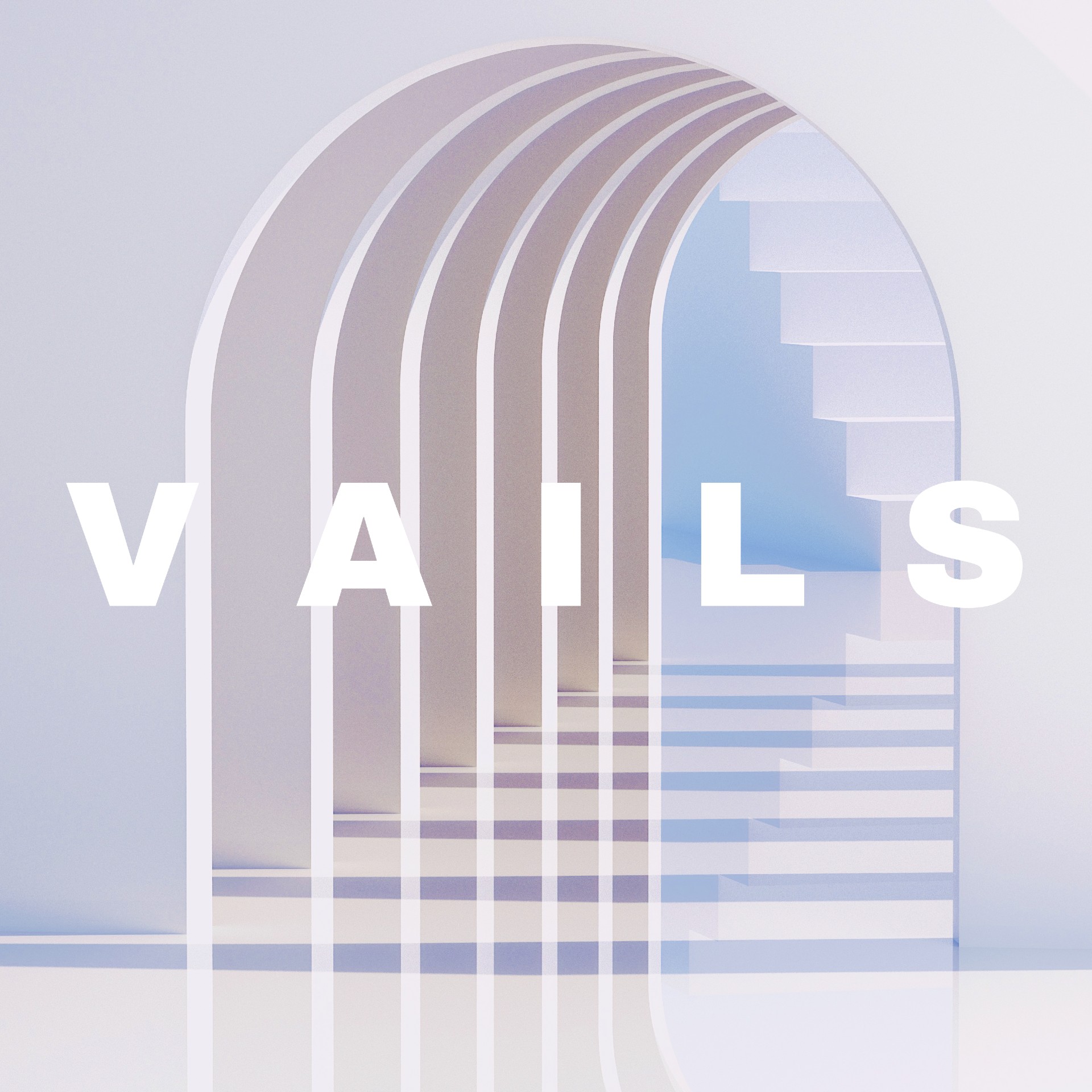
Artwork for the album ‘Elysian Fields’ by Vails
6. Vails – Elysian Fields
release: November 25, 2022
label: Subtle Energy
genre: electronica, dark house, synthwave
It was tough to turn away from the terrific tones being touted by LA-based, UK-native Vails when we were pitched to premiere his single “Zephyr.” Well, we were also taken by the clean, minimal-yet-detailed cover art for this dark house/synthwave EP, Elysian Fields, due via Subtle Energy.
The artist’s first broke out in 2013 with his analog techno number, “Beaster,” released via A-Traks influential label Fools Gold. Now, in 2022, he’s back to his beat-making antics and has fired up the project with Elysian Fields, his same beloved music, but also with new cinematic and atmospheric influences. The EP was recorded over three months at Los Angeles’ Principle Pleasure Studios with influences such as John Carpenter, The Art of Noise, and Decius.
Commenting on the album’s artwork, Vails states:
“I wanted something that would reflect the relative obscurity of my profile in the project, but also give an insight into the esoteric nature of the genres and styles on the EP. Think of it as an entry portal to an unknown destination, or a vaguely familiar destination whose path has not been charted yet.
The label says of the art:
“We commissioned Italian artist Marica Martella (Meeduse) to fulfil Vails’ brief, as we love her 3D artwork, which mixes symbolism and mythology with club culture elements.”
“I wanted to create a non-place, a space of transience where humans remain anonymous. A space between the real and the ethereal, between the digital and the tangible.”
And, finally, Marica offered her thoughts as well:
“What is this place? Where do those stairs lead? What’s the view as soon as you turn the corner? (After Aneta [works at the label] gave me the references) for Vails’ cover, I wanted to create a non-place, a space of transience where humans remain anonymous. A space between the real and the ethereal, between the digital and the tangible.
“The minimal architecture makes it easy for the eye to perceive a space of peace and tranquillity, with the uncertainty of the stairs in the background with sharp and defined angles. I used the minimal architecture, gentle shapes and soft but decisive light to my advantage to create a place that is surreal and magical.
“In one of the original drafts, there was a single cloud floating in the corridor of arches, which was later removed so as not to give the impression that the place created was some kind of paradise, but rather a place that raises questions, a place to explore despite its simplicity.”


-
 Music7 days ago
Take That (w/ Olly Murs) Kick Off Four-Night Leeds Stint with Hit-Laden Spectacular [Photos]
-
 Alternative/Rock1 day ago
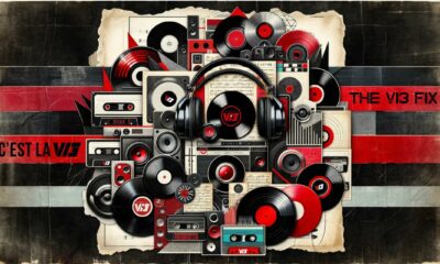
The V13 Fix #011 w/ Microwave, Full Of Hell, Cold Years and more
-
Alternative/Rock1 week ago
The V13 Fix #010 w/ High on Fire, NOFX, My Dying Bride and more
-
 Features7 days ago
Tour Diary: Gen & The Degenerates Party Their Way Across America
-
 Culture1 week ago
Dan Carter & George Miller Chat Foodinati Live, Heavy Metal Charities and Pre-Gig Meals
-
 Music1 week ago
Reclusive Producer Stumbleine Premieres Beat-Driven New Single “Cinderhaze”
-

 Indie1 day ago
Deadset Premiere Music Video for Addiction-Inspired “Heavy Eyes” Single
-

 Alternative/Rock2 weeks ago
Three Lefts and a Right Premiere Their Guitar-Driven Single “Lovulator”