
Interviews
UnCovered: SEA IN THE SKY Discuss Their Cosmic ‘Everything All At Once’ Album Cover Artwork
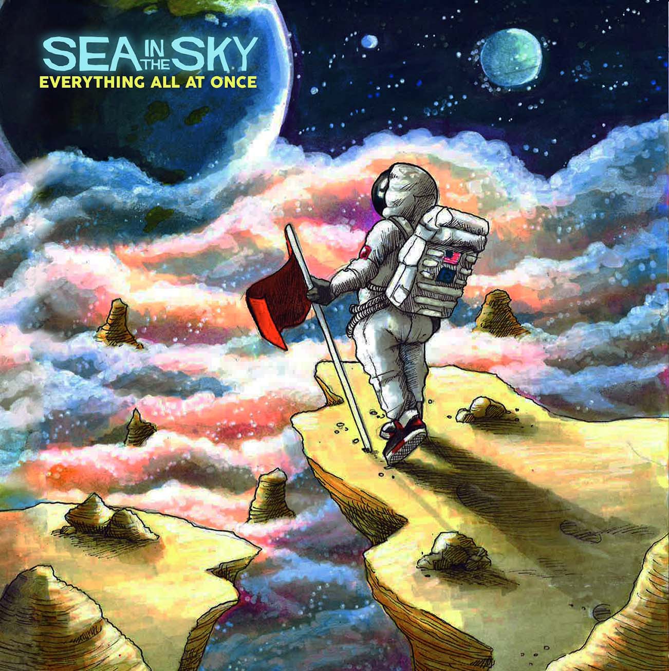
Unsigned Redwood City, CA-based progressive rock quintet, Sea In The Sky, travel to new heights with their Everything All at Once full-length and it’s cosmic album art!
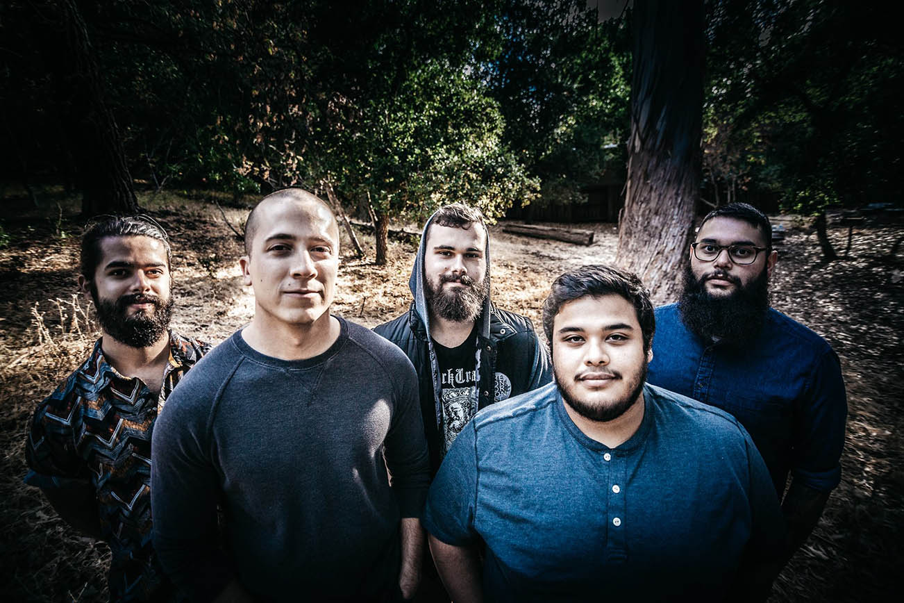
The unsigned Redwood City, CA-based progressive rock quintet, Sea In The Sky, issued their ten-track Everything All at Once full-length on September 29th, and, killer music aside, we wanted to learn more about the album’s spacey cover artwork. Thankfully, we scored some time with guitarist Jakob Bray who was happy to indulge our And Justice For Art-based curiosity.
What was the inspiration for the album’s cover artwork?
Jakob Bray: The album artwork for Everything All At Once was inspired by a loose concept that is present throughout some of the songs on the album. These songs can be interpreted however you feel they make the most sense, but the idea was based on being in space and looking down upon Earth. From that vantage point, one would realize that our world is only a small, vulnerable fragment (“Pale Blue Dot”) of what is present in the universe. When experiencing this (“Overview Effect”), one would be gazing upon all that ever has and will exist in our planet’s history, leaving one overcome by emotion and awe (“Everything All At Once”).
Your new album cover is crazy-cool. Tell us about the artist and how you found him/her?
Bray: Thank you! We’re extremely happy with how it turned out. Yvette Young, of the band Covet, is the artist who illustrated the album artwork. Yvette designs album artwork, tattoos, and custom guitar finishes just to list a few of her other artistic mediums. She’s an amazing artist in every sense of the word and she also happens to be a good friend of the band. She also illustrated the album artwork for our Visions EP, making her an obvious choice when it came time to complete the album artwork.
With the increasing popularity of digital music, most fans view artwork as just pixels on a screen. Why did you feel the artwork was important?
Bray: We believe that an album’s artwork should represent something relevant to the overall theme of an album. It’s essentially the first impression anyone may have when they come across our music if they aren’t already listening to it. The phrase “don’t judge a book by its cover” doesn’t always convince people to actually give new things a chance, but we want to make our albums as attractive as possible in hopes that more people will give it a listen and enjoy it.
What are your thoughts and/or the pros and cons about digital art versus non-digital?
Bray: Digital art is suitable in certain situations and we admire plenty of album covers that were digitally designed, but physically illustrated artwork is just more alluring to us. We really admire how Circa Survive has used physically illustrated artwork for all of their releases. They even hired the same artist (Esao Andrews) for every one of their album covers, which is really cool that they’ve maintained a steady relationship with an artist for so long. When an artist creates something truly impressive with their hands, it’s bound to be more stimulating and inspiring to anyone who comes across it.
What do you think are some of the cover artworks that have translated best/worst onto t-shirts and other merch?
Bray: Monuments has released two albums called Gnosis and The Amanuensis. Both of those have stunning intricacies in their artwork. Gnosis features a person with colorful flames trailing from its eyes, leading into a cloud of what seems to be a galaxy within a brainstorm. The Amanuensis is a concept album that features a Samsara Cycle as its artwork. Each song represents a uniquely illustrated chapter along the wheel. The band sold both of those as t-shirt designs that turned out incredible.
Have any favourite music-related visual artists?
Bray: Andy Chen, of Locust Garden, is a filmmaker who we really admire. He’s a good friend of the band and we recently had the pleasure of working with him on a music video. He’s directed and produced plenty music videos and films that caught our eye. His portfolio is pretty impressive. His cinematography skills are impeccable. The way he can transform the reality captured on camera into something captivating and truly out of this world is stunning.
Seat In The Sky like it “Not Too Tall, Not Too Cool” in new music video.


Take That (w/ Olly Murs) Kick Off Four-Night Leeds Stint with Hit-Laden Spectacular [Photos]

The V13 Fix #010 w/ High on Fire, NOFX, My Dying Bride and more

A Rejuvenated Dream State are ‘Still Dreaming’ as They Bounce Into Manchester YES [Photos]


-
 Music6 days ago
Take That (w/ Olly Murs) Kick Off Four-Night Leeds Stint with Hit-Laden Spectacular [Photos]
-
 Alternative/Rock7 days ago
The V13 Fix #010 w/ High on Fire, NOFX, My Dying Bride and more
-
 Alternative/Rock2 weeks ago
A Rejuvenated Dream State are ‘Still Dreaming’ as They Bounce Into Manchester YES [Photos]
-

 Features6 days ago
Tour Diary: Gen & The Degenerates Party Their Way Across America
-

 Culture1 week ago
Dan Carter & George Miller Chat Foodinati Live, Heavy Metal Charities and Pre-Gig Meals
-
 Music1 week ago
Reclusive Producer Stumbleine Premieres Beat-Driven New Single “Cinderhaze”
-

 Alternative/Rock1 week ago
Three Lefts and a Right Premiere Their Guitar-Driven Single “Lovulator”
-

 Alternative/Rock2 weeks ago
Death Wishlist Are Fiery and Fierce with Their “I Get Bored” Video Premiere