
Interviews
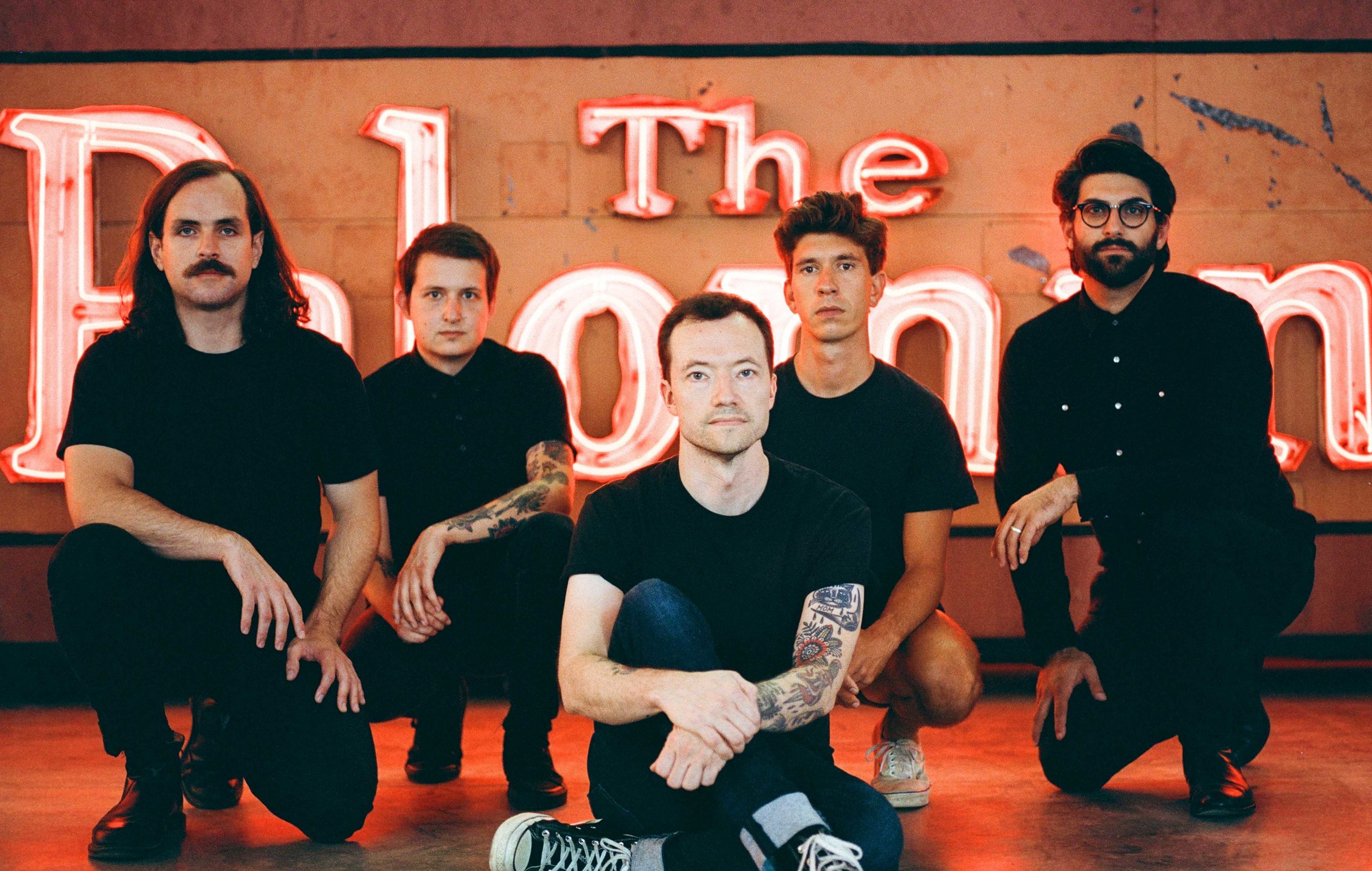
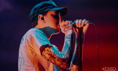
UnCovered: Touché Amoré Guitarist Nick Steinhardt on How He Designed the Artwork for ‘Lament’
If you’re a fan of Touché Amoré then you know that it’s a monumental time for the band with the release of their latest studio album, Lament, back in early October. Produced by super producer Ross Robinson, the group’s fifth studio album offers a look at what life has been like for these musicians since the release of their 2016 record, Stage Four.
Fragility, empathy, love, and our current political realities are all prominent themes throughout the record, but, rather than add to the already rampant cynicism that is ever so rampant these days, Lament maintains a sense of hope and confidence. It’s been a spiritual and emotional evolution for lead singer Jeremy Bolm since the passing of his mother which was a prominent theme on Stage Four. That album received widespread praise for its sound and its ingenuity, landing on many top albums of the year lists.
Not only is he one of Touché Amoré’s two guitar players, but Nick Steinhardt is also a trained graphic designer who designs and creates all of the group’s artwork. His talents have become widely regarded throughout the music industry as he has created artwork for hugely popular singers and bands such as Katy Perry, Jimmy Eat World, The Dixie Chicks, Selena Gomez, and Niall Horan. We recently spoke with Steinhardt for our latest UnCovered interview where he discusses the creative process behind designing the artwork for Lament, how the artwork crosses over with the music, and how he has come to work with so many talented musicians in the industry.
I really like the artwork you’ve created for Lament. It has a certain classic look to it but is also highly original. What made you decide that this particular artwork was the right choice for this album?
Nick Steinhardt: “I think it felt like the right choice partially because was inspired by the creative process of the album itself: the idea of confusion, dichotomy, being split in two. In short, pessimism vs. optimism. Depending on which way you look at it, the lettering is either rising or sinking. The shadows create sharp angles that connote conflict or tension.
The artwork was in some form of progress long before the music took full shape. We had initially toyed with the record being self-titled so I went on an exploratory mission of identity. What do we do best? What IS Touché Amoré visually, and how do we be aware of that, comment on it, and expand on it at the same time? Since that’s ostensibly what we’d be doing musically as well even if unconsciously. Taking the best bits of our previous body of work and moving on with our best foot forward.
While my strength and specialty is in typography, we’ve always avoided typography on our album covers. So I think the original self-titled experimentation sort of cemented that in my brain, informed the approach, and combined with the word lament itself, just felt right.”
How many different ideas or designs did you go through before you landed on this concept for the cover art? Were there a lot of different designs that you ended up considering?
“I went through hundreds of designs over a few months before landing on this concept. That’s not to say that all the options were ‘cover worthy’ or even involved the word lament. Some of my favourites felt a little bit too dark to represent what I think is one of more varied and eclectic bodies of work. I’d say there were three final pieces I felt were in the running, and the rest that told the story well ended up in our deluxe book (physical package) or visual album (online).”
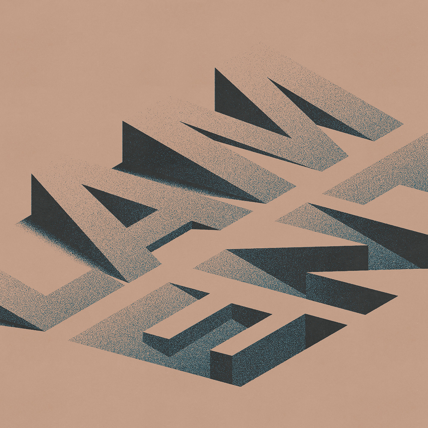
Artwork for ‘Lament’ by Touché Amoré
If you could, explain to us what mediums you used to create the Lament artwork. How was it specifically created?
“The cover was originally created as vector art in Adobe Illustrator and then treated in Photoshop to have a little more texture or vibe. Which later kind of bit me in the ass when I wanted to tease the album cover as a static shot with light moving overhead, casting long ominous shadows against the harsh angles. I had to retrace my steps and actually render the concept in 3D.”
As an artist, how challenging would you say it was creating this artwork for Lament? Was it a pretty involved and time-consuming process?
“The hours I spent working on this album, in general, are un-quantifiable. The shading on the lettering itself was tricky, but dialing in subtle details like the grain and colour and tone were extremely time-consuming.”
Was there a specific inspiration that you went off of to create the artwork? In other words, did another drawing, painting, or piece of art motivate the idea for the finished product?
“I wouldn’t say I was inspired directly by one piece of art or artist for this one, but what I’ll call a few ‘giants of typography’ to me, Ed Ruscha, Wim Crouwel and Vaughan Oliver are usually somewhere in my mind.”
Being a graphic designer and overseeing all of the band’s artwork, I’d imagine you’re very hands-on throughout the whole process, but did you work with anyone at any stage in developing the Lament cover art?
“There were multiple points where I reached out to trusted colleagues or ‘creative confidantes’ to try and suss out a concept, or how to execute something that was in my mind or in a medium I’m unfamiliar with doing myself, like time-lapse photography. Sometimes it’s also nice to just run an idea by someone you trust and get their gut reaction. I’m also not strongly tied to needing to do everything myself, and I enjoy collaboration and hiring people for what they do best. I think more interesting work can arise from this.
One of my closest collaborators (George Clarke, of Deafheaven) had taken up photography quite seriously in the past few years and I wanted an excuse to reverse the roles a little bit, give him some conceptual direction and see what he would come back with. In addition to having a great eye, he also understands the band on a deeper level than most and I love any excuse to champion someone’s creativity that I truly believe in.”
How, if at all, did any of the songs or ideas on the album inspire the creation of the artwork? Would you say it’s linked to any themes explored on the record?
“Part of my creative process is annotating the lyrics and weaving threads between to find the strongest individual and overlapping concepts. To me, the cover needs to represent the body of work as a whole, or its strongest themes at least in mood. The standard album package is one version of the story, or the beginning rather, since there are a few more surfaces to explore. The full vision is there in the form of a 72-page book (our deluxe package which has recently sold out) or in the form of our visual album (on YouTube) which was a way we figured we could represent these themes in an increasingly digital world. They were all deeply and directly inspired by the lyrics for each song.”
Check out exclusive samples of some of the images included in the deluxe version of Lament.
Album artwork is a bit of a tricky game now that the record industry is almost entirely digital. What motivates you to put such a high degree of effort into the artwork even though fans aren’t typically buying physical copies?
“I definitely came up in a digital age of music consumption, but also one that focuses more intently on special packaging to try and entice people to buy physical products. I think that a cover is just one part of the story, one that can unfold across multiple surfaces and now through extensive roll-outs and digital campaign as well, which in my eyes should be cohesive but have an ‘evolution’ or arc if that makes sense.”
Being a graphic designer, so much of your life is consumed by creating and designing art. As an artist, what do you love most about the process?
“I love every chance to create something great, not just for my own body of work, but to truly represent the artists I work for. I also love the aspect of connecting with so many other creative types and musicians on a deeper level than just being a fan.”
You’re able to balance both your music and design careers, but was there a time you were ever intent on only being a graphic designer and putting music aside?
“I don’t think either side will ever truly leave my life. Considering music a career is completely surreal but it does not sustain me the way the art side does. I have been ready to give up ‘client work’ at one or two points in the last ten years but I am on a bit of a creative high the past two years. Eventually, I’d love to do something off the screen like landscaping.”
You’ve created art for so many huge artists like Katy Perry, Jimmy Eat World, Selena Gomez, and The Dixie Chicks. How do you typically get involved in working with these artists? Are you approached by them?
“I’m mostly approached by managers as opposed to artists directly or their labels. Though I’ve made a lot of meaningful connections with artists through touring.”
Of all the art you’ve created for other artists, would you say you have a favourite piece?
“Tom Petty, Hypnotic Eye, Deafheaven, Sunbather, Jimmy Eat World, Surviving are high up there for one reason or another.”
With not being able to tour right now, are you spending a lot of time on your art? Has it become your priority at the moment or are you still also writing songs?
“Yes, art is full-on at the moment in addition to promoting our new record. One downside of a band being your ‘job’ is that it can feel like one at times. I don’t tend to write songs on my own outside of when we are gearing up for an album. I wish I had more time to focus on that but with two more-than-full-time jobs it’s tough to find the time. When I am playing music at home it’s practicing on the pedal steel guitar which I’ve recently incorporated into the band.”


-

 Music1 week ago
Take That (w/ Olly Murs) Kick Off Four-Night Leeds Stint with Hit-Laden Spectacular [Photos]
-
 Alternative/Rock4 days ago
The V13 Fix #011 w/ Microwave, Full Of Hell, Cold Years and more
-
Alternative/Rock2 weeks ago
The V13 Fix #010 w/ High on Fire, NOFX, My Dying Bride and more
-

 Features1 week ago
Tour Diary: Gen & The Degenerates Party Their Way Across America
-
 Culture2 weeks ago
Dan Carter & George Miller Chat Foodinati Live, Heavy Metal Charities and Pre-Gig Meals
-

 Indie4 days ago
Deadset Premiere Music Video for Addiction-Inspired “Heavy Eyes” Single
-
 Music2 weeks ago
Reclusive Producer Stumbleine Premieres Beat-Driven New Single “Cinderhaze”
-

 Folk5 days ago
Katherine Perkins Strikes the Right Tone with Her “Hold On” Music Video Premiere