
Interviews
UnCovered: THE BURDEN Discuss Their ‘The Presence of Past Tense’ EP’s Captivating Cover Art
Canadian post-hardcore quartet The Burden recently issued their five-track EP The Presence of Past Tense and we spoke with the band and artistic director Ross Vanosch about the album’s simple yet captivating cover artwork.
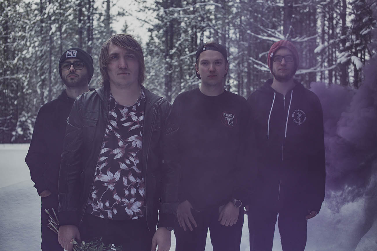
Hailing from Prince George, British Columbia, the Canadian post-hardcore quartet The Burden are quickly racking up followers thanks to their solid sonic prowess as can be found on their recent release, The Presence of Past Tense. The five-track EP dropped on February 28th (purchase a copy via Bandcamp here) and was both produced and mixed at Kelowna, BC’s Hidden Home Studios by Jordan Chase. Boasting some simple yet captivating cover artwork, we spoke with the band and artistic director Ross Vanosch of Eyeheart Creative about the album’s imagery.
What was the inspiration for the album’s cover artwork?
The Burden: The intention of the cover for the Presence of Past Tense EP was to tell a story that connects to our music on a couple different levels. The main intention was to create a visual link between the imagery and the themes the EP touches on regarding relationships, mental health, and the destructive behaviours that can influence these things. We also wanted to symbolically show that we are moving forward and growing since our debut album Modern Disease, so we wanted the imagery to connect in certain ways to the artwork for that release as well.
The idea for everything came from the concept of using something that is traditionally viewed as a symbol of affection and twisting it to become something darker and more selfish. Because the art direction on Modern Disease had been focused on the use of a flower for the cover, we continued that theme with the EP cover, but used the overall concept behind the visuals to really expand on the story the artwork told on the album before and use the EP to create a sort of conclusion to it. It symbolizes both acknowledging where you’ve been in the past, and accepts the need to move forward and grow beyond what you once were.
Your new album cover is crazy-cool. Tell us about the artist and how you found him/her?
The Burden: The artist for our album artwork is actually also our bass player. Ross Vanosch is a graphic designer who works under the name Eyeheart Creative, so we have the advantage as a band of keeping most of the visual direction for the band “in-house”. That’s one of the reasons he actually ended up in the band. When we were preparing for the release of our debut album, we had reached out to Ross as an artist to do the artwork, and found out he was a bass player (and we happened to be needing a new one at the time). So, in addition to taking on the task of the artwork for our first record, he also ended up joining the band. He’s had his hand in most of the visual direction of what we do for the last couple of years.
Ross Vanosch: Additionally, for the artwork for our The Presence of Past Tense EP, we also hired a photographer who is a good friend of ours, Brett Cullen. He has been shooting both our band promotional photos and much of our live show photography for the last several years, and I needed his skill set to help create the artwork for the EP.

Please elaborate on the medium(s) used when creating the art. We’d love to know how the artwork was created.
Vanosch: The initial concept for the EP cover was a composited image created in Photoshop using a variety of stock imagery to build the final concept. One of the advantages of being both the artist and being in the band is that I get the opportunity to begin flushing out concepts for our artwork very early on (sometimes even before songs are done being written). Because of this, we have a lot of time to really critique our direction for artwork as a band. As we drew closer to the EP being finished, we decided that the artwork needed a much more organic feeling to it. So we decided that we would re-create the Photoshop concept with real photography. We hired our good friend, and incredibly talented photographer, Brett Cullen to shoot the scene.
My wife was gracious enough to be the arm model for the cover, holding the bouquet of flowers. Everything was 100% real in the composition of the final shot. I bought a bouquet of flowers and let it wither, dry out and die. Then we bought a bunch of different coloured smoke bombs, and shoved them down into the middle of the bouquet and set them off with my wife holding it up in front of a white backdrop. She was such a trooper, we had to shoot outside because of how much smoke we were making, and the wind wasn’t cooperating so she would end up with a face full of smoke half the time. We actually had one of the smoke bombs explode accidentally as well, and she got hit in the arm by it. It was definitely not a comfortable day for her, but we are all thankful because we ended up getting some absolutely awesome shots that translated amazingly for the EP artwork after Brett and I brought them into Adobe Lightroom and Photoshop for post-processing.
What were the partnership’s dynamics like? For example, was a specific look given, or did the artist have full free range?
The Burden: Because Ross is both our visual artist and a band member, the whole dynamic of band/artist relationship is very integrated. The end result of everything we develop visually comes from a place of all having the same end goal in mind. With the EP, Ross was the one who came up with the initial concept of continuing with the visual theme of using flowers to tie the EP back to the previous album, and from there we all worked together to develop a final image that we all felt was right for the EP.
Have you ever purchased an album solely because of its album artwork? If yes, did the music live up to the artwork?
Vanosch: I’m not afraid to admit that I do sometimes “judge a book by its cover” and buy music based on the artwork. Especially if it’s a very well done piece of art. Back when I first was getting into heavier music, I saw Norma Jean’s Redeemer album on the shelf at a music store and bought it because I loved how it looked. I had absolutely no idea who the band was, or what they sounded like. But the music definitely lived up to the quality and style of the artwork. They’re still one of my favourite bands ever, and Redeemer is probably my personal favourite release of theirs.
With the increasing popularity of digital music, most fans view artwork as just pixels on a screen. Why did you feel the artwork was important?
Vanosch: I’ve always connected to the visual aspect of records. That’s one of the reasons I became a designer. The connecting of the two different artistic mediums of the sound and visual is important. I think the art helps tell the extended story of a record and creates an additional dimension to the emotional connection a listener makes to the music. I felt that it was important to make sure that the artwork for this EP accomplished that. It’s one thing to have a “cool looking” cover, but we really want to extend the reach of our artistic vision as a band beyond just the sound of our music. And I think creating artwork that tells the story of the songs on this EP can help connect the listener in a deep way.
When people look at the album cover artwork, what do you want them to see/think?
The Burden: We want the listener to see the themes and mood of the EP reflected in the visual aspect of the record. We want them to make the connection between the relational act of giving someone a gift like a bouquet of flowers (and the intention to display affection that is associated with it), and the hidden emotional motivations that can be behind how we treat the people in our lives and the relationships we have with them. The message can be both internal and external, as the lyrical themes on the EP deal with both. It can refer to both how we treat the people around us, and also how we treat our own selves.
Have any favourite music-related visual artists?
Vanosch: One of my biggest inspirations and influences for my work, and why I became a designer, is a firm out of Seattle called Invisible Creature. The work they do with the music industry is simply stunning. I’m also good friends with a designer based in Vancouver, Kevin Moore of Soft Surrogate. His work is incredibly thoughtful and unique. He’s also an incredible human being, he has both inspired and pushed me to work harder and think outside the box.
You can stream The Burden’s single “Moving Pictures” just below.


-
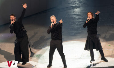
 Music6 days ago
Take That (w/ Olly Murs) Kick Off Four-Night Leeds Stint with Hit-Laden Spectacular [Photos]
-
 Alternative/Rock3 hours ago
The V13 Fix #011 w/ Microwave, Full Of Hell, Cold Years and more
-
Alternative/Rock1 week ago
The V13 Fix #010 w/ High on Fire, NOFX, My Dying Bride and more
-
 Alternative/Rock2 weeks ago
A Rejuvenated Dream State are ‘Still Dreaming’ as They Bounce Into Manchester YES [Photos]
-
 Features6 days ago
Tour Diary: Gen & The Degenerates Party Their Way Across America
-
 Culture1 week ago
Dan Carter & George Miller Chat Foodinati Live, Heavy Metal Charities and Pre-Gig Meals
-
 Music1 week ago
Reclusive Producer Stumbleine Premieres Beat-Driven New Single “Cinderhaze”
-
 Indie3 hours ago
Deadset Premiere Music Video for Addiction-Inspired “Heavy Eyes” Single