
Features
…And Justice For Art: A Guide to (some of) the Best Metal Album Covers of 2012 (Part II)
This is the second part to our “A Guide to (some of) the Best Metal Album Covers of 2012” posting last week. As we know, cover artwork was a big thing for Metal music in 2012. Many of them were epic, cryptic, nightmarish and more importantly, artfully executed. They helped to both enrich many listeners’ imaginations and to enhance the music itself; and this is why we’re covering them! In the second part to our guide, we keep exploring the stories behind some of these magnificent visual pieces. We’ve interviewed some of the designers and musicians involved with said art and they in turn opened for us new worlds of imagination an awe. Check it out!
This is the second part to our “A Guide to (some of) the Best Metal Album Covers of 2012” posting last week. As we know, cover artwork was a big thing for Metal music in 2012. Many of them were epic, cryptic, nightmarish and more importantly, artfully executed. They helped to both enrich many listeners’ imaginations and to enhance the music itself; and this is why we’re covering them! In the second part to our guide, we keep exploring the stories behind some of these magnificent visual pieces. We’ve interviewed some of the designers and musicians involved with said art and they in turn opened for us new worlds of imagination. Check it out!
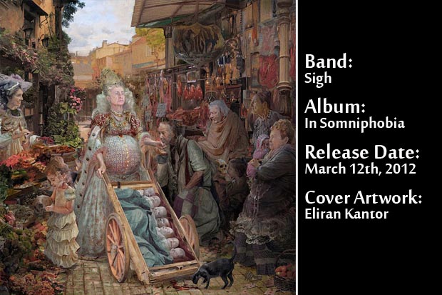
01. Sigh – In Somniphobia:
“It’s a sunny town’s market piece, filled with smiles and fruits but, considering Sigh’s music, I was actually shooting less for neo-classical and more for just plain unsettling,” remembers Berlin-based artist Eliran Kantor about the themes he explored on the cover of Sigh’s In Somniphobia. He was commissioned by the band to create this artwork after the success of their previous collaboration on the album Scenes From Hell. Kantor, who spent two months completing the period-oriented image, prefers not to reveal much about his painting techniques, but affirms that technically, “I just came up with whatever I needed in order to get that certain atmosphere I was looking for.”
This resulted in one of the most intriguing artworks created last year. “I’ve read some great theories online about the cover, weaving various political conspiracies and secret meanings. These things will be in the back of their minds when listening to the record, which is fantastic. All I’m willing to give out is a small silly trivia detail, not really related to the concept – in a classic King Diamond-like manner, the queen is based on my grandma.”
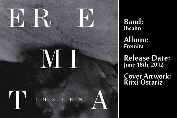
02. Ihsahn – Eremita:
Eremita, the fourth solo album of Norwegian Metal legend Ihsahn, only confirms his desire to keep contributing to the advance of extreme music. This is not a formulaic or “by the book” Metal album but a highly successful avant-garde venture.
To create the album cover, which showcases an upside down photo of German philosopher Friedrich Nietzsche, Ihsahn and his wife Heidi, collaborated once again with Spanish equally avant-garde graphic designer Ritxi Ostariz. “He had a clear idea of what he wanted for this release,” comments the designer. “He decided to go back to the past, to a darker visual style, rawer if that makes sense. It was perfect because it was also my idea for it. Something very dark, inspired by old Magic books, but still with a modern influence.”
In fact, they began working on the album booklet’s design and left the cover for last. “We had in mind going for a composition of black and white photography and typographic work,” Rtixi remembers. “Vegard (Ihsahn’s real name) and Heidi sent me some pictures from their personal collection, including that Nietzsche amazing photography. I decided to go for it, but turning it upside down; that way you get a more eye-catching cover. I think it is one of the covers I liked the most from all my works. It is provocative, but still elegant. I am sure he was extremely happy with the result, the same I was. I think it reflects very well my style, my likes and dislikes and the sort of things I want to do.”
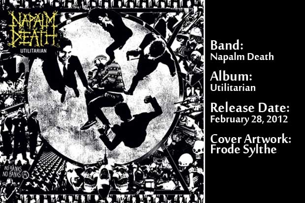
03. Napalm Death – Utilitarian:
Utilitarian, the newest album from British sonic extremists Napalm Death, came to confirm that this band refuses to rest under the shadow of its past achievements. They still have new things to say, musically speaking. If there’s a connection with the past, that’s emphatically present on the album’s artwork, which depicts a man on the floor being kicked by white collar men while surrounded by some of the world’s most alarming issues. It certainly retains the socio-political references and raw aesthetics of their earliest covers.
“The album cover itself took a kind of different kind of life,” says longtime Napalm Death vocalist Barney Greenway. “The result of 99% of people in the world having no power, no voice and one percent having all the power and all the voice. Well, that’s kind of what this cover is about. You know, you got a guy being kicked around on the floor, and then you just got various authority images around it.”
About the black and white, high contrast look of the artwork, Barney comments: “We wanted something simple and stark. For Napalm and the sort of stuff we’re singing about, the starkness is always a good thing. It comes mainly from punk bands. But a lot of bands do that style, this black and white, its effective.”
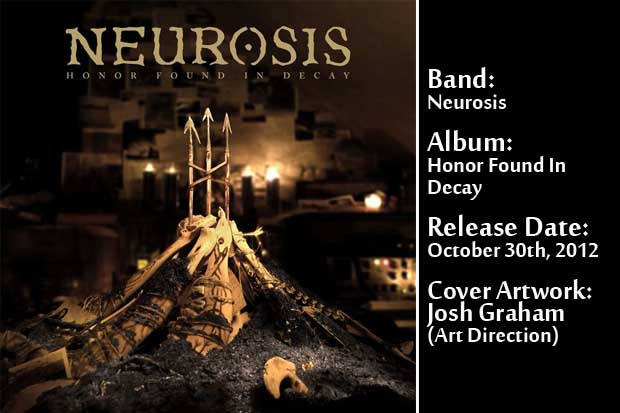
04. Neurosis – Honor Found In Decay:
The American, true bringers of doom, Neurosis, dominated the post-Metal landscape thanks to their magnificent brand new recording Honor Found In Decay. They also produced one of the most elaborate pieces present on an album cover this year, which came to life thanks to the collaborations of four different individuals, including their own former visual artist Josh Graham, who recently part ways with the band.
Longtime singer and guitarist Steve Von Till remembers that, “we’re sitting brainstorming in the studio all together and I remembered that a friend of ours, who was also an archaeologist, had given Scott Kelly a gift of three arrows and given me a gift of an arrow that are actually ancient arrows from the tribes that lived in Slovakia thousands years ago. I said, ‘We can build the symbol and make it a physical object and take a picture of it.””
From there the band started brainstorming about the meaning and the concept surrounding the image. The final image contains not only the aforementioned symbols, but also photographs, and book pages with the songs lyrics and a plethora of different objects. “The symbol was part of a totem in somebody’s space,” states Von Till. “It could be somebody isolated because they chose to be or it could be a post apocalyptic isolation or spiritual or political isolation. You’re not sure.”
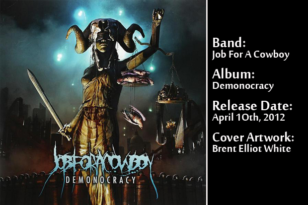
05. Job For A Cowboy – Demonocracy:
Three years after the release of their last full-length, Ruination, Arizona’s Job For A Cowboy returned to the world’s Death Metal arena with Demonocracy. Once again the politically charged cover sleeve was the result of the band’s collaboration with artist Brent Elliot White. “On this one, (singer) Jonny Davy came to me with a couple of ideas early on. He had some themes for the tracks and the overall idea for the album,” remembers the designer. “Jonny had two visual ideas he definitely wanted in there. One was some kind of lady Justice and the other was the American flag. We discussed continuing the strong iconic centerpiece composition and allegorical themes that worked well in (previous album) Ruination.”
In reference to the artwork’s meaning and socio-political overtones, Elliot comments: “I think of it as the dirty truth behind our ‘democracy’. It’s about what perverts and corrupts our leaders that make the laws, enforce the laws and then judge us based on them. The concepts I was going off of were very non-partisan. In that sense, this wasn’t intended to be political, but rather more of an overall critique of the system.”
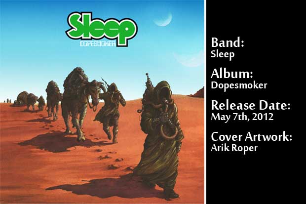
0.6 Sleep – Dopesmoker:
After years of being unsatisfied with the many releases of their landmark recording Dopesmoker, California’s stoner rockers Sleep, finally had the opportunity of releasing the definitive edition of this album, also known in Metal circles as “Jerusalem”. Celebrated artist Arik Roper, had worked on the album’s previous cover artwork versions and ended being summoned by singer/bassist Al Cisneros to create the ultimate sleeve for such an important recording. “Al called and told me it was happening. He said he wanted to finally make it the way he envisioned it,’ Arik remembers. “So we brainstormed and came up with a new vision.”
The new cover showcases a caravan of smoking, nomad-like characters crossing a deserted land in what in seems to be another world. It contains all of trademarks of Ropers’ style: a mix of watercolor and guache and traits of comic and fantasy aesthetics. In the end, the resulting image fulfilled the expectations of both the band and the designer. “It was a great thing to accomplish. Considering my history as an artist with the album, this was the perfect realization of what the band and I wanted it to be.”
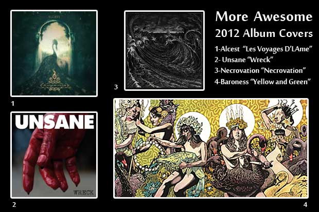
So there you have it, our mini, two-part list of some of the best Metal album cover artwork of 2012. We know, there are more, but this is our list. So deal with it! We will leave you with this one last image, sort of a compilation of honourable mentions… some of the year’s other great album covers.
Next Time on AJFA: Van Halen’s “1984”: A Little Angel and a Hard Rock Milestone
Previously on AJFA: A Guide to (some of) the Best Metal Album Covers of 2012 (Part I)


-

 Music6 days ago
Take That (w/ Olly Murs) Kick Off Four-Night Leeds Stint with Hit-Laden Spectacular [Photos]
-

 Alternative/Rock17 hours ago
The V13 Fix #011 w/ Microwave, Full Of Hell, Cold Years and more
-
Alternative/Rock1 week ago
The V13 Fix #010 w/ High on Fire, NOFX, My Dying Bride and more
-

 Features6 days ago
Tour Diary: Gen & The Degenerates Party Their Way Across America
-
 Culture1 week ago
Dan Carter & George Miller Chat Foodinati Live, Heavy Metal Charities and Pre-Gig Meals
-

 Music1 week ago
Reclusive Producer Stumbleine Premieres Beat-Driven New Single “Cinderhaze”
-

 Indie17 hours ago
Deadset Premiere Music Video for Addiction-Inspired “Heavy Eyes” Single
-

 Alternative/Rock1 week ago
Three Lefts and a Right Premiere Their Guitar-Driven Single “Lovulator”