
Interviews
UnCovered: Oscar Jerome Forks Over Details on ‘The Spoon’ Album Artwork
For our latest Un Covered interview, Oscar Jerome discusses the very effective Malcolm Yaeng-created cover artwork for his album ‘The Spoon.’
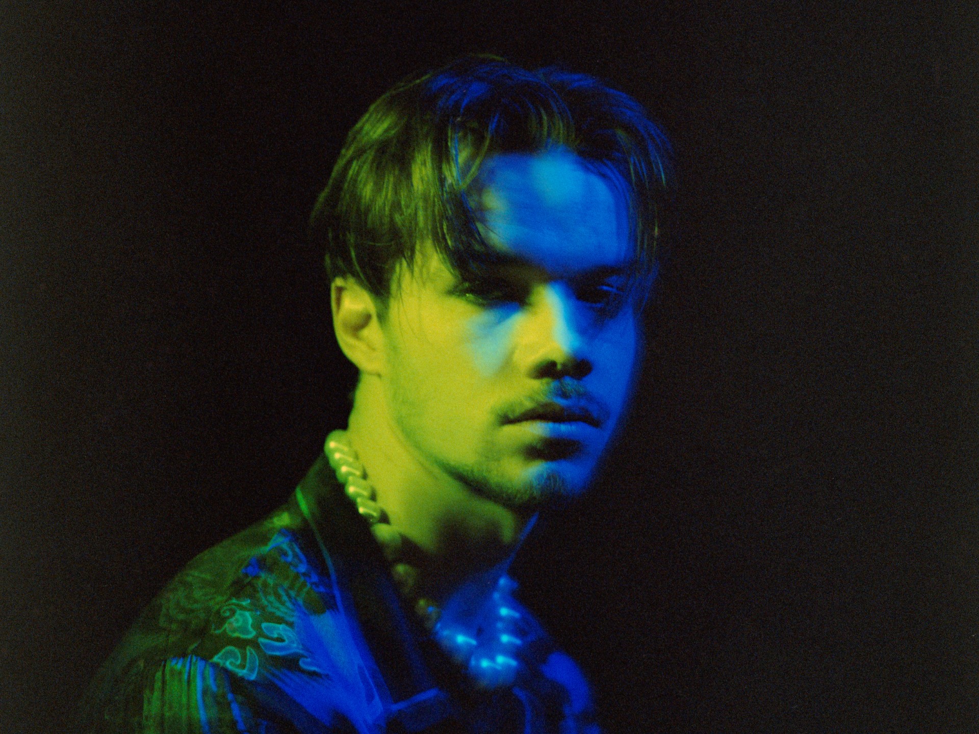
With inhibitions pushed firmly to the side and a certain fearlessness when it comes to his goals and creativity, Oscar Jerome has really found his stride with the release of his new album, The Spoon. His sophomore record, the singer and songwriter released the twelve-track full-length in December. Like many artists over the last few years, Jerome found himself isolated and secluded in Berlin during the pandemic-related lockdowns, unsure of how to forge ahead. Fortunately, this confinement bred creativity, with a lot of the songs on The Spoon written during this timespan, which certainly explains the melancholic sound and feel to these tracks. He seamlessly moves from a whisper to a scream, moving between discussing his negative thoughts to fuming about the injustices he observes in his home country of England.
Jerome took an interesting approach to expressing himself on this album, inhabiting different personas throughout the songs. For instance, you will encounter Ice Guycicle, a figure who represents the sphere of creative melancholy, and Jerry, a parody of a big city banker, too selfish to care about anything except money and his professional life. You actually get to meet Jerry in the music video for the single “Sweet Isolation,” as Jerry arrogantly goes about his business, unconcerned with anything but himself.
For our latest UnCovered interview, we are joined by Jerome to discuss the very effective cover artwork for Spoon, working with artist Malcolm Yaeng to create it, and some of his favourite album cover art of all time.
Please help us understand what you are trying to convey with the cover’s imagery. Give us details on the concept.
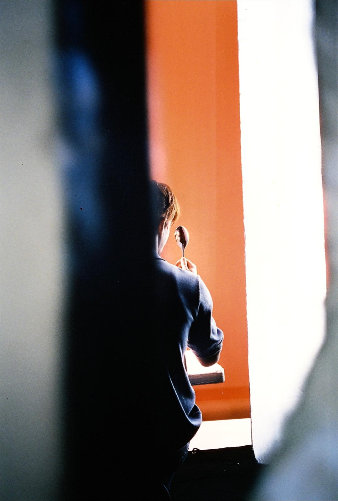
Oscar Jerome: “‘The spoon’ is a metaphor for how we are constantly being presented with a warped reflection of ourselves. Whether that is through the eyes and insecurities of other people or the greedy lens of capitalism. It is important to develop your own sense of self, not an image through ‘the spoon.’”
When it came time to come up with artwork, did you give the artist Malcolm Yaeng guidance, or was this more from your interpretation?
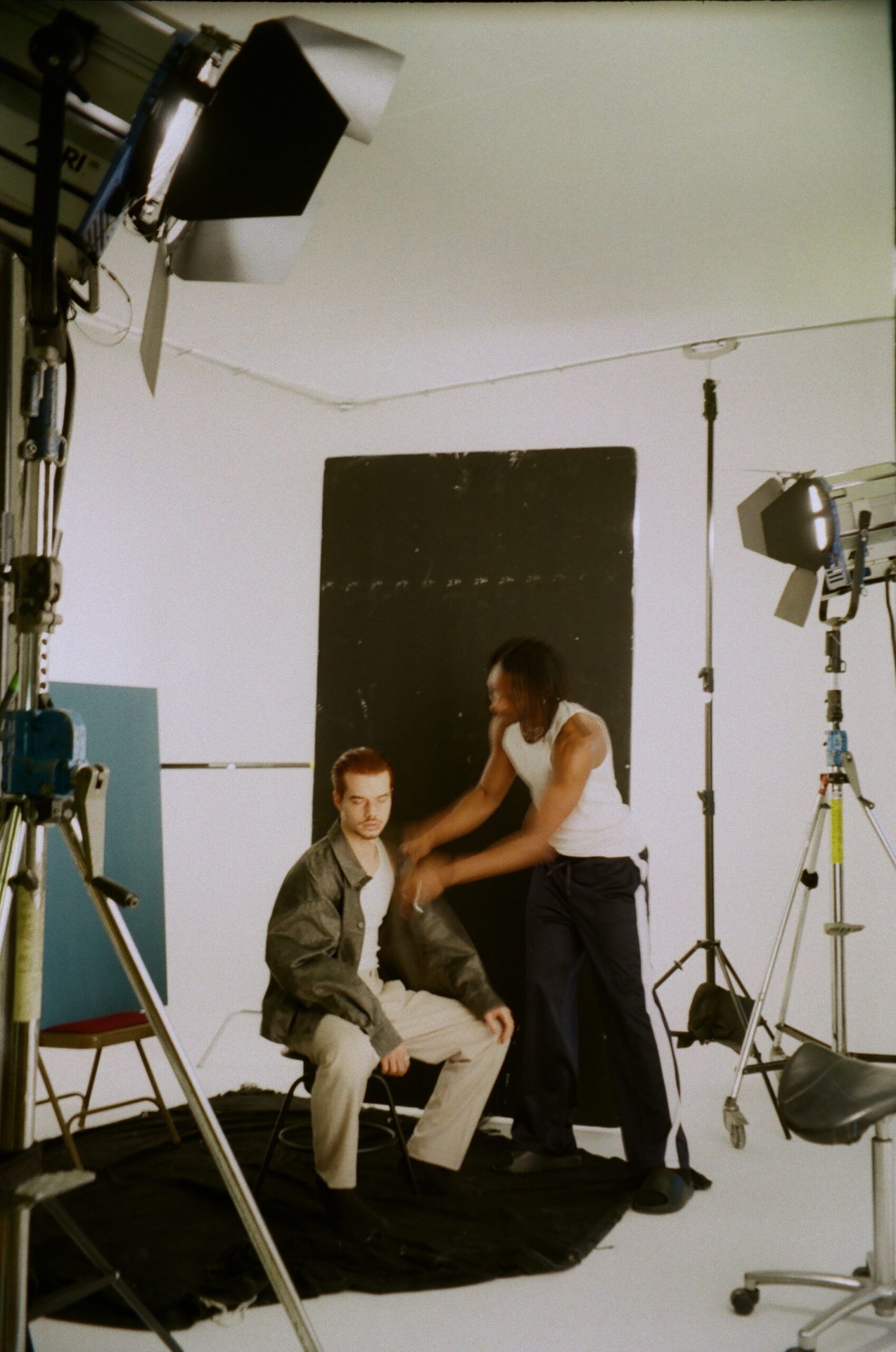
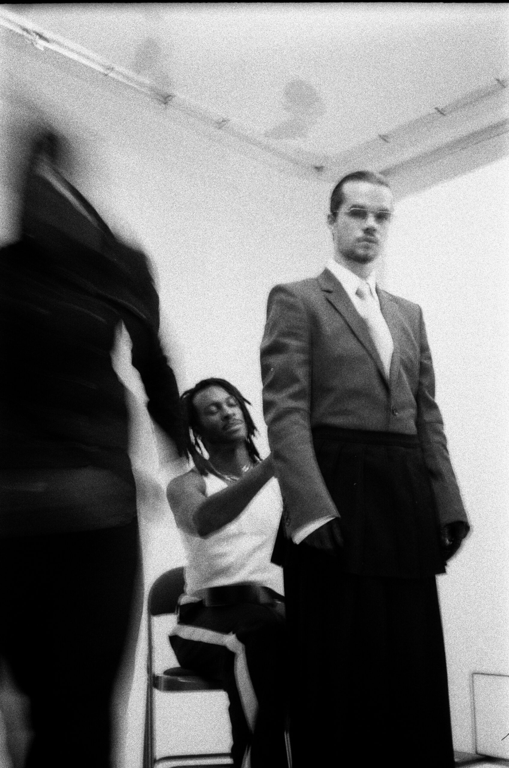
“I had the idea to make the album artwork my face reflected in a spoon when I was writing the title track. I took the idea to my good friend and creative director Malcolm Yaeng, who brought the concept to life. He organized and directed the photoshoot with the amazing Alex Waespi behind the camera; he then edited the image to create the final artwork.”
What are some of your favourite covers of all time?
“Some of my favourite album covers of all time are:
John Martyn – Solid Air
Alpha Wann – Umla
Anaiis – this is no longer a dream
Cannonball Adderley – Know What I Mean?”
How has the response to the artwork been so far?
“People seem to really love it; lots of people have told me it’s very original and striking, which I would agree with.”
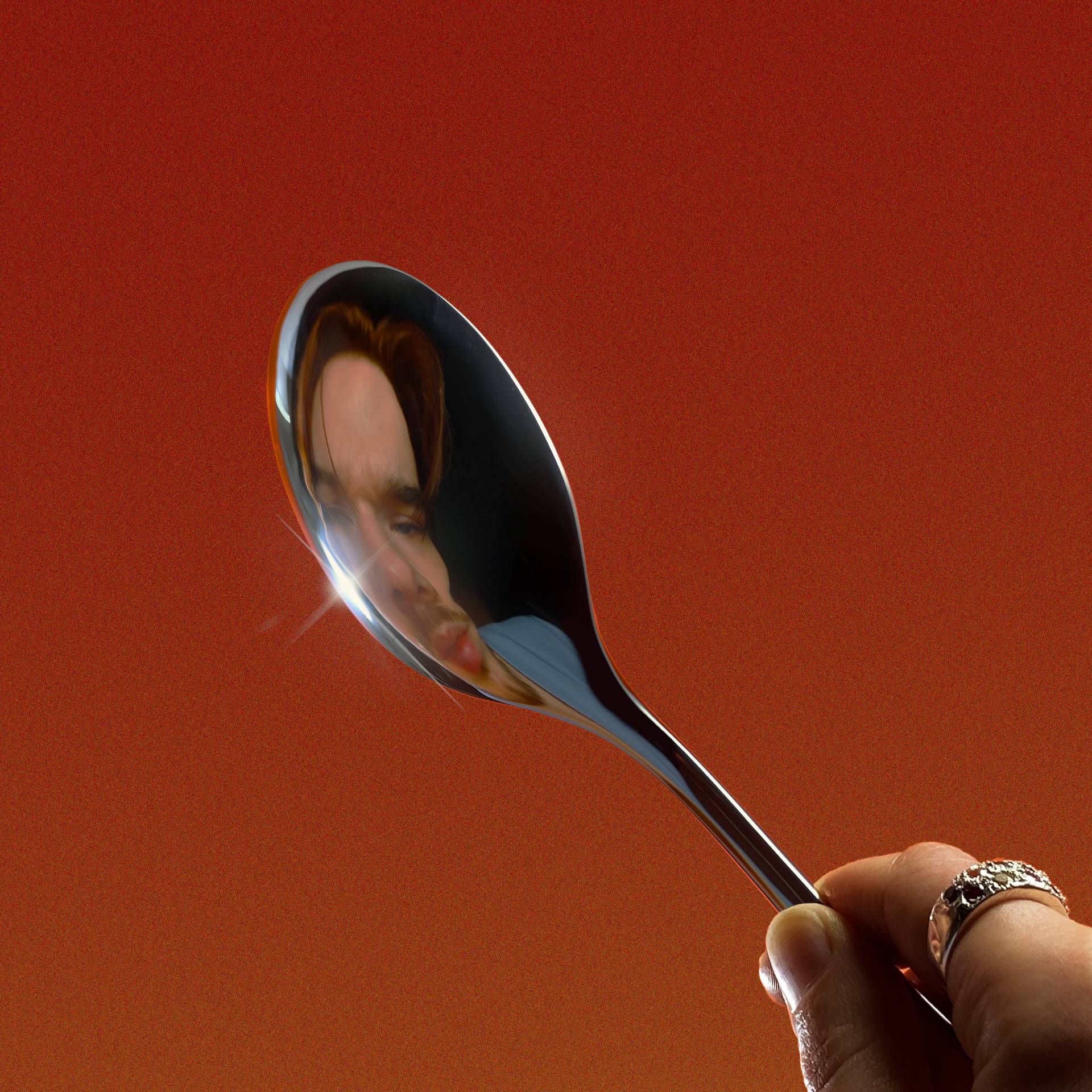
Artwork for the album ‘The Spoon’ by Oscar Jerome
Please elaborate on the medium(s) used when creating the art. We’d love to know how the artwork was created.
“I was sitting inside a makeshift room made out of boards painted an orangey-red colour. Alex Waespi, the photographer, was hiding under a black blanket with just the lens of her medium format film camera sticking out. She was shooting over my shoulder, trying to capture the perfect warped version of my reflection in the spoon. Malcolm then took it away and edited the picture on photoshop.”
Would you consider Malcolm an associate or extension of what you do as a musician or someone contracted for just this piece?
“Malcolm is definitely part of the crew; he has really helped bring this project to life and pushed me to try much more experimental and interesting things with the visuals. When you get someone to help guide you with your image, there has to be a lot of trust there, and they have to really get to know you. He definitely encouraged me to explore some parts of myself that I might not usually feel confident to show publicly. This project was quite a personal and vulnerable one, so it was amazing to have such good guidance on how to present it visually.”

With the increasing popularity of digital music, most fans view artwork as just pixels on a screen. Why did you feel the artwork was important?
“The artwork helps to set the tone for what the listener is about to experience. Yes, people are often just seeing a tiny version of it on streaming platforms, but if they’re interested, they will find it in other places and properly appreciate it. We must have done something right with the artwork because people keep turning up to my shows with spoons and waving them in the air.
“I’ll never forget the first time I saw the artwork on the vinyl sleeve; that was really what we had in mind when we were creating the artwork, even if a small percentage of listeners get to see the full-sized thing, it’s definitely worth it.”
Did Malcolm work on any art for the album besides the cover?
“Yes, Malcolm styled me for all my shoots and videos. He created the look for my character Jerry who has been a running theme throughout the project, and directed some of the videos. He even came on tour with us recently to make sure I kept the visual theme in my looks at shows.”


-

 Music6 days ago
Take That (w/ Olly Murs) Kick Off Four-Night Leeds Stint with Hit-Laden Spectacular [Photos]
-
 Alternative/Rock18 hours ago
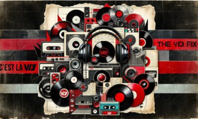
The V13 Fix #011 w/ Microwave, Full Of Hell, Cold Years and more
-
Alternative/Rock1 week ago
The V13 Fix #010 w/ High on Fire, NOFX, My Dying Bride and more
-

 Features6 days ago
Tour Diary: Gen & The Degenerates Party Their Way Across America
-
 Culture1 week ago
Dan Carter & George Miller Chat Foodinati Live, Heavy Metal Charities and Pre-Gig Meals
-
 Music1 week ago
Reclusive Producer Stumbleine Premieres Beat-Driven New Single “Cinderhaze”
-

 Indie18 hours ago
Deadset Premiere Music Video for Addiction-Inspired “Heavy Eyes” Single
-
 Alternative/Rock2 weeks ago
Three Lefts and a Right Premiere Their Guitar-Driven Single “Lovulator”