
Interviews
…And Justice For Art: Iconic Graphic Artist Ioannis Talks About His Cover Artwork for Fates Warning
These days, American Prog Metallers Fates Warning are indisputably busy. They are promoting their most recent opus, Darkness In A Different Light, the cover artwork of which features a rather-simple-yet-iconic digital illustration of a bird-like origami piece. If fans look back; however, they’ll discover that some of the most unforgettable cover artworks in this band’s discography have been designed by Ioannis. This Greek-born artist has created, for the band, hypnotic and surreal images that stimulate viewers’ imaginations to unexpected new heights. Herein the artist reveals the stories behind the making of four of these such cover artworks. Discover the secret….
These days, American Prog Metallers Fates Warning are indisputably busy. They are promoting their most recent opus, Darkness In A Different Light, the cover artwork of which features a rather-simple-yet-iconic digital illustration of a bird-like origami piece. If fans look back; however, they’ll discover that some of the most unforgettable cover artworks in this band’s discography have been designed by Ioannis. This Greek-born artist has created, for the band, hypnotic and surreal images that stimulate viewers’ imaginations to unexpected new heights. Herein the artist reveals the stories behind the making of four of these such cover artworks. Discover the secret….
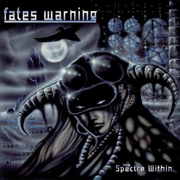
“The Spectre Within” (1985)
Ioannis: The painting that became the cover of The Spectre Within album, was based on a drawing that [guitarist] Jim Matheos saw which was based on a character created for a comic book that me and my brother were going to do, called DarkAngel. It became one of the band’s strongest images and a favorite with the metal fans. This was the first artwork that I did for the young band.
I was really into H.R. GIGER at the time so the influence is obvious. At the time I worked primarily as a illustrator and had just started to grapple with album design. The album was designed by the Art Director of ENIGMA Records and it’s not particularly well put together. I also painted a back cover that has been lost.
To complicate matters the [color] seperations were awful, never capturing the look of the original. However in 2002 the label did a repackage of the album and it was a much nicer job. I did a limited edition print and a fine art canvas hand retouched print to commemorate the anniversary re-release.
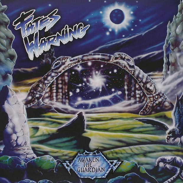
“Awaken The Guardian” (1986)
Ioannis: The cover of this album was at the time one of the hardest pieces I had ever done, failing in the first two attemptsf and inishing the final version in 2 days. This was also the first time I completely art directed the package producing a front, back and inner sleeve art, also hiring [iconic British Photographer] Mick Rock to do the photography. To this day it has become an immensely popular image especially with the Prog-metal fans. It was a continuation of the story from the last album sort of a concept thread.
It was like a dark version of a Roger Dean artwork, very fantasy-oriented, I wasn’t that fond of it at first, but years later it has grown on me. Interestingly enough at the time the band was also unsure of it. Later on they confided to me that it became their most famous image. I did a limited edition print and a fine art canvas hand retouched print to commemorate the anniversary re-release. It hung on my wall for the longest time and I still receive so much email about it. In 2007 the original was sold to a private art collector for $45,000.00 and I have regretted it ever since, its the piece a lot of people identify me with.
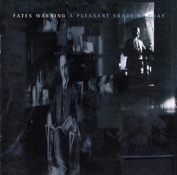
“A Pleasant Shade Of Gray” (1997)
Ioannis: Early spring of 1997, Jim Matheos called me as the band entered the studio to record their latest album produced by veteran producer extraordinaire Terry Brown of RUSH fame. I had last worked with FATES WARNING almost a decade ago creating the artwork for their classic album Awaken The Guardian. I showed Matheos a series of digital pieces I had been working on, and Jim felt they would work well for the album.
The inspiration was a series of postcards from the 1900‘s and the early music I had heard from the project. I was dabbling with digital but its really mostly a collage of photos retouched on board.
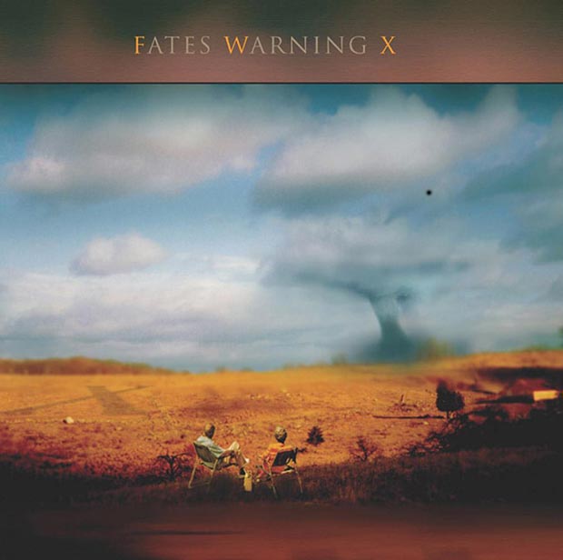
“FWX” (2004)
Ioannis: This piece was done originally as a concept piece for myself. I was then asked if it could appear as a cover for a XM RADIO collection of performances live of Porcupine Tree. In 2004, Jim Matheos once again asked me if I would be interested in doing the new Fates Warning cover and I showed him and [vocalist] Ray Alder this piece as they were in a hurry to get it done and they liked it.
The place where I shot the image is upstate Connecticut on a cold winter day, the rest of the images were from antique postcards I had purchased. The fans loved it. I really enjoyed this piece.
To find out more about Ioannis and his celebrated career and to buy fine prints of some of his most important artworks feel free to visit his official website.
Next Time on AJFA: An interview with designer Hugh Gilmour regarding his work for re-issues of classic Hard Rock/Metal albums.
Previously on AJFA: “Destroying and Rising” A Conversation with Legendary Artist Ken Kelly


The Warning Shake the Foundations of a Sold-Out Leeds Stylus [Photos]

The Cruel Knives Headline Top Night of British Rock at Manchester’s The Lodge [Photos]

Take That (w/ Olly Murs) Kick Off Four-Night Leeds Stint with Hit-Laden Spectacular [Photos]


-
 Alternative/Rock7 days ago
The Warning Shake the Foundations of a Sold-Out Leeds Stylus [Photos]
-
 Alternative/Rock7 hours ago
The Cruel Knives Headline Top Night of British Rock at Manchester’s The Lodge [Photos]
-
 Music2 weeks ago
Take That (w/ Olly Murs) Kick Off Four-Night Leeds Stint with Hit-Laden Spectacular [Photos]
-

 Alternative/Rock7 days ago
The V13 Fix #011 w/ Microwave, Full Of Hell, Cold Years and more
-

 Features2 weeks ago
Tour Diary: Gen & The Degenerates Party Their Way Across America
-

 Indie7 days ago
Deadset Premiere Music Video for Addiction-Inspired “Heavy Eyes” Single
-

 Folk1 week ago
Katherine Perkins Strikes the Right Tone with Her “Hold On” Music Video Premiere
-

 Country1 week ago
Brooke Ashton Chats About Her “Someone” Single, Creative Process, and More!