
Dance/Electronic
UnCovered: Dinah Thorpe on the Provocative Cover Artwork for Her Latest Album, ‘For The Birds’
If you’re talking about singer and songwriter Dinah Thorpe’s current output of music, it’s anything but for the birds. Thorpe released her latest album, For The Birds, on November 27th, her fifth project now, a work of art that showcases the artist in her finest moment. With influences and sounds ranging from folk, to trip-hop, to orchestral, to techno, Thorpe has created a style uniquely her own. There are thoughtful moments, beautiful ones as well, but there are points within the record where you’ll hear more danceable grooves.
Comprising twelve songs, For The Birds was written entirely by Thorpe herself, except for her captivating cover of “Slow Burn” by singer-songwriter Kacey Musgraves. The Toronto-based Thorpe has been a part of numerous festivals, including POP Montréal, Hillside, NXNE, Europride, In the Dead of Winter, Mayworks, and Ladyfest, and has shared the stage with Jeremy Dutcher, The Cliks, Sondre Lerche, Eternia, and Buck 65.
More than just a collection of songs, For The Birds features some of the beautiful photography of artist Janet Kimber which makes this album a true multimedia presentation. It was, for this reason, we recently spoke with Thorpe for our latest UnCovered interview, in which we discussed the artwork for the album, collaborating with Kimber, the inspirations behind the art, and artwork in the age of digital music.
What was the inspiration for the album’s cover artwork?
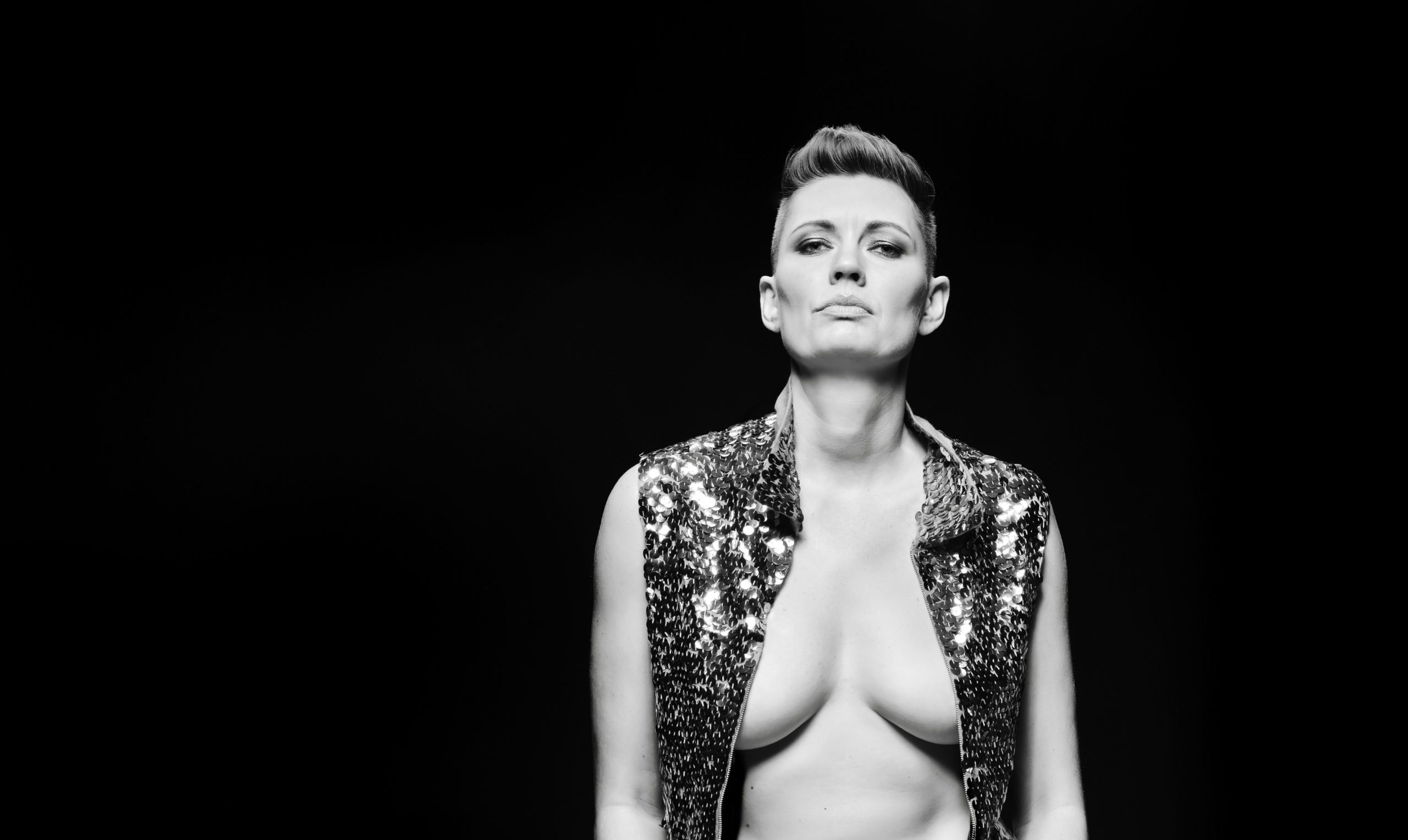
Dinah Thorpe: “I know that I had a very clear vision for this album cover, and I know that I thought about it for a very long time. I don’t remember the moment when it came to me or what prompted it. I do remember wanting to play with gender and power, and wanting to have two front covers on the same vinyl jacket.
The only conscious aesthetic reference that I used was retro gay men’s magazine covers, although even that was somewhat imaginary as I haven’t seen very many. I knew I wanted it to be black and white and I knew I wanted one photo where I was upright like a king and one shot where I was lying down like a temptress. I think Becca Howes (who did the graphic design with me) suggested the gold lettering, and I knew immediately that it was the right pop of colour. I also knew that I wanted the title to be in handwriting, although not my handwriting, which is basically illegible.”
The album cover is very, very cool. Tell us about the artist and how you found her?
“Thank you! And thank you for letting me dive into it here. For me it is a really important part of this album, and I appreciate getting to talk about it. Janet Kimber and I met at the Juno Awards back in 2012. We were at a table together waaaaaaaay at the back. We were both nominated for album artwork and neither of us won! But we won in a different way because we have been working together ever since.”
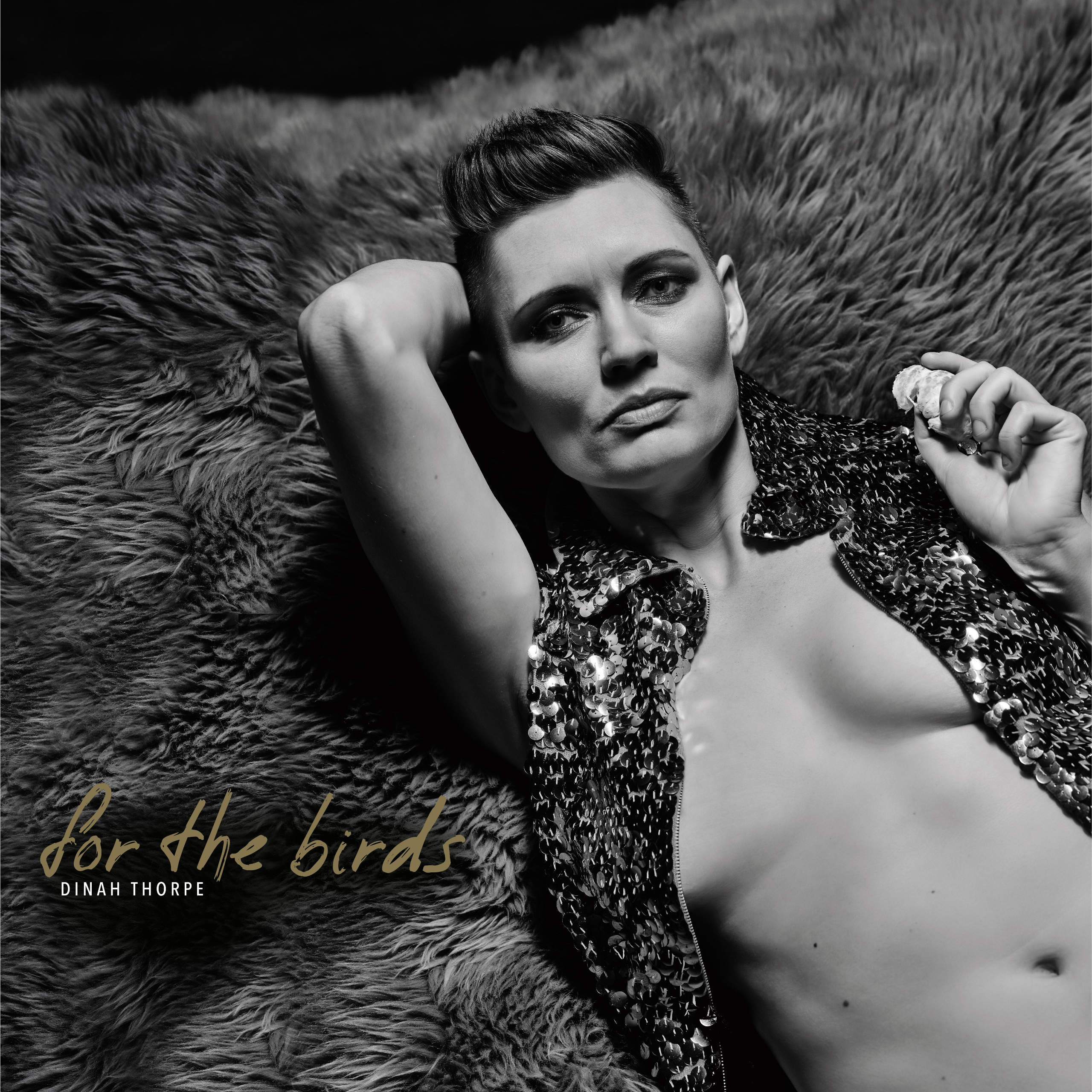
Artwork for ‘For The Birds’ by Dinah Thorpe
Could you elaborate on the medium(s) used when creating the art? We’d love to know how the artwork was created.
“It is quite a simple record cover in terms of media: just two photographs and some text. The trickiest part design-wise was orienting and integrating everything so that there really is no front or back when you hold the vinyl in your hands. (Or at least I hope so! I haven’t actually held it in my hands yet…)”
What were the partnership’s dynamics like? For example, was a specific look given, or did Janet have full free range?
“I brought my initial idea to Janet and she turned it into something way more interesting, both esthetically and in terms of posture and attitude. Janet creates a very lovely environment for making photographs, and somehow finds a perfect balance between giving me direction and flattering me. It’s a weird thing, facing lights and a camera, but it helps to be in the hands of someone who is so good at what they do. And I so appreciated working with Becca Howes on the graphic design piece. Becca was very patient with me as I made a million revisions to match my vision… And figured out some really creative solutions to design problems that I did not foresee.”
Would you consider Janet an additional band member in a sense or someone contracted for just this piece?
“After many years of working together, I would certainly consider Janet a first-string player on Team Dinah.”
Did Janet hear the album beforehand? Or, what kind of input did you give her?
“Neither Janet nor Becca heard any of the album in advance. I felt like I had a clear enough vision for the artwork and also I wasn’t ready to share any of the music yet!”
Have you ever purchased an album solely because of its album artwork? If yes, did the music live up to the artwork?
“I have a special edition of Fiona Apple’s album The Idler Wheel with things from her notebook like drawings, lyrics, and notes on song structure. I feel so lucky to have a peek into how she made what I think is an exquisite record. I also always appreciate seeing how songwriters notate their work as they are making it.”
With the increasing popularity of digital music, most fans view artwork as just pixels on a screen. Why did you feel the artwork was important?
“I love holding an album in my hands and seeing the artwork that way. I love seeing what visual choices musicians make while I listen to their work, and reading the liner notes. But I realize that I am a very old-fashioned person. I think artwork can translate to the screen and I hope this album’s artwork does, but my major preoccupation visually was the physical record cover. The smart and affordable thing to do these days is to just release digitally, but we certainly aren’t artists because it’s affordable! I love CDs and vinyl and I suspect I will continue to release physical albums. But it definitely means that I can’t afford to release albums very often.”
Have any favourite music-related visual artists?
“Jesi Jordan made an animated video for Jennifer Castle’s song ‘Justice’ that I think is so beautiful. It’s all flowers and naked people and butterflies and it suits the song perfectly.”
Was the album art influenced by any of the themes explored on the album?
“Absolutely. Both the content and the cover of For the Birds are serious and playful, both are hard and soft. Both are about embodiment, artmaking, queerness, pleasure, and hurt.”
How do you think the album art will affect the listener’s perception of your album?
“This is a really interesting question and not something I have thought about much. I did want to make a piece of artwork that people could hold in their hands while they listen to the record (it’s what I do when I get a new album that I am excited about). As the relatively naked subject of both the cover art and the music, I have no idea what it is like to take in both as someone who isn’t me. I’m too close to it to have any kind of outside perspective. Maybe in ten years! I suspect some people will choose not to listen to my work because of how I look on the covers. And that is probably for the best. If the ambiguity and indeterminacy of the cover images are offensive to you then my music is very likely to offend you as well!”
https://youtu.be/NEZ6jXkxbRU
Is the art for this album related to any of your previous album cover artwork?
“This artwork is definitely a continuation of the queer pin-up theme that started with the artwork for my album 12. For that album, Jayme Spinks designed a CD cover that is an actual pin-up calendar. Both covers are intended to be a bit serious and a bit camp. The idea of the queer pin-up is also central to my side project, Superbutch. Though that project seeks to create lots of different kinds of positive representations of genderqueerness, not just photos of me in lots of makeup and sequins!”
What’s your favourite thing about this album cover?
“I love the lying down photo, the one where I am holding a piece of clementine. I think Janet captured such an interesting mood and posture. I appreciate that I am lying down but also engaging with the camera in a way that makes it very clear that I am neither passive nor dead (as women so often are on album covers). Aside from Janet’s substantial skill, I think it worked because I was actually sassing her about making me work through snack break. It was supposed to be a test shot, the clementine was not a planned prop!”
Do you have a favourite album cover of all time?
“It’s a cliché answer for sure, but one of my favourites is Patti Smith’s Horses cover. I love how simple and perfect it is, and the attitude and light that (photographer) Robert Mapplethorpe captured. Tracy Chapman’s self-titled album art is also simple and perfect. Seems like I like portrait covers! But I also love when musicians draw their own artwork, which is not something I would be able to do.”


-
 Music1 week ago
Take That (w/ Olly Murs) Kick Off Four-Night Leeds Stint with Hit-Laden Spectacular [Photos]
-

 Alternative/Rock5 days ago
The V13 Fix #011 w/ Microwave, Full Of Hell, Cold Years and more
-
Alternative/Rock2 weeks ago
The V13 Fix #010 w/ High on Fire, NOFX, My Dying Bride and more
-
 Features1 week ago
Tour Diary: Gen & The Degenerates Party Their Way Across America
-

 Indie5 days ago
Deadset Premiere Music Video for Addiction-Inspired “Heavy Eyes” Single
-
 Music2 weeks ago
Reclusive Producer Stumbleine Premieres Beat-Driven New Single “Cinderhaze”
-

 Folk5 days ago
Katherine Perkins Strikes the Right Tone with Her “Hold On” Music Video Premiere
-

 Country1 week ago
Brooke Ashton Chats About Her “Someone” Single, Creative Process, and More!