
(dis)Cover Artwork
(dis)Cover Artwork – Vol 2: zebrahead, The Wring, Ade, Aysanabee, HEDRA, Åskväder
In volume 2 of our series (dis)CoverArtwork, we dive into incredible cover art for releases from Zebrahead, The Wring, Ade, Aysanabee, Hedra, and Åskväder.
Ever see a totally rad cover artwork on an album, EP or single and wonder how it got to be so fetching? You’re not alone; we have as well. In fact, this crosses our minds daily, thanks to the deluge of new music bombarding our inboxes. Enter (dis)Cover Artwork, a simple series focused on diving a little deeper into some of the most eye-catching imagery to grace musical output.
We regularly break down six different covers from a multitude of artists across all genres that we found to be particularly un-look-away-able. We touch on the new music and the story behind each cover and artwork. Moreover, we also get some input from the bands and artists themselves to gain a little more insight into what these rad covers are all about.
After checking this out, we’re sure you’ll look at all the artwork in your album collection a little more curiously!
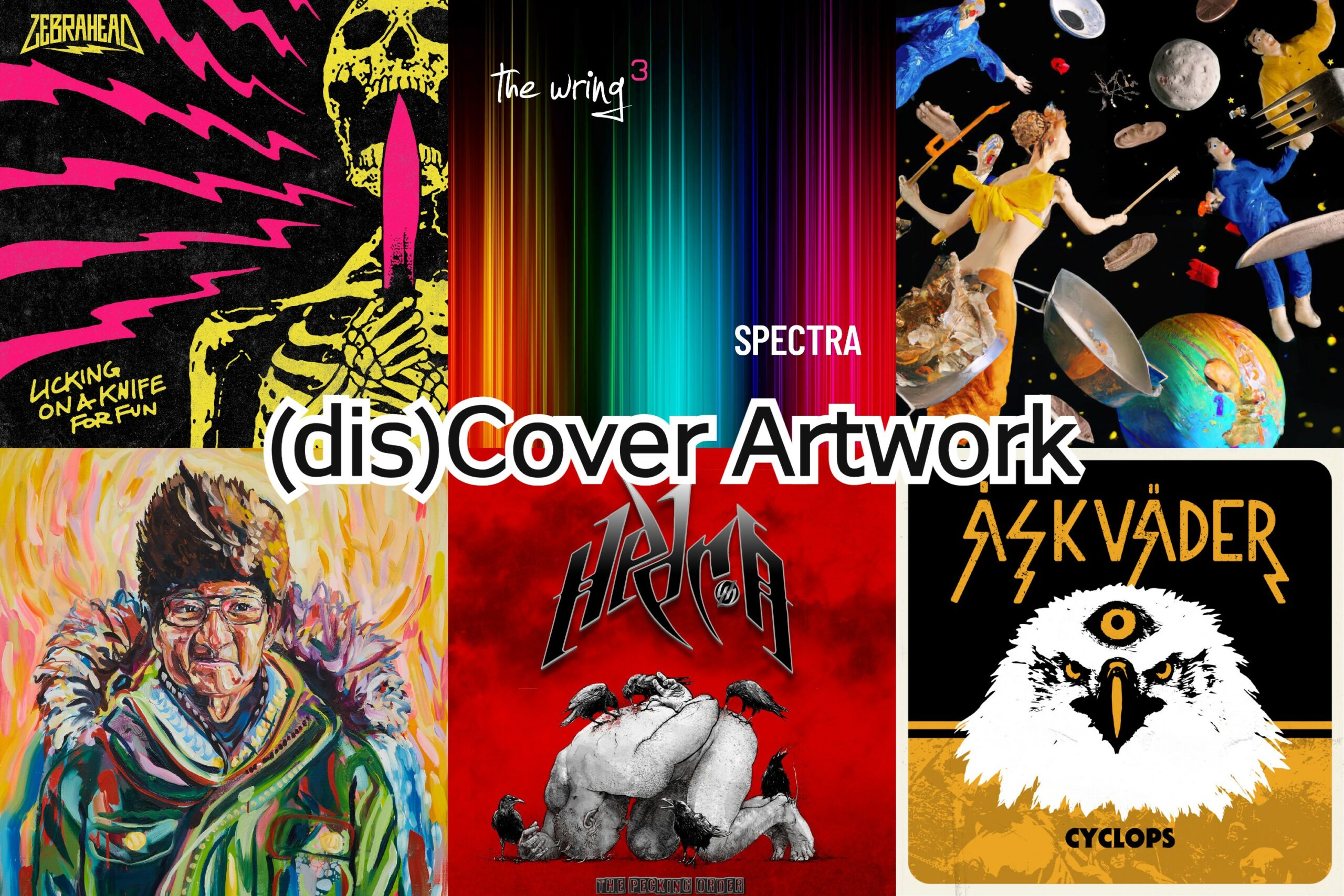
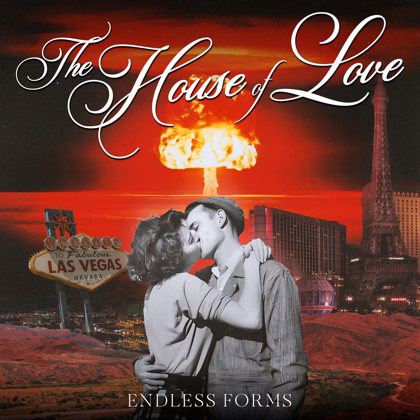
Artwork for the single “Licking on a Knife for Fun” by Zebrahead
1. zebrahead – “Licking on a Knife for Fun”
release: November 11, 2022
label: MFZB Records
genre: punk, punk rock, rap punk
As soon as we saw that La Habra, California’s rap-punkers zebrahead dropped their new single “Licking on a Knife for Fun,” we were clicking like mad to hear the new single. To our delight, not only is the song dope, but the cover art is too. Well, with an official music video coming soon, and their II EP due on February 3, 2023 (the follow-up to the III EP – released in 2021), plus I EP out in late Fall next year, we had to give this art some love.
Commenting on the track, bassist Ben Osmundson says, “Excited for the world to hear ‘Licking on a Knife for Fun’! A spastic and aggressive take on self-doubt and poisonous friends……cause we all have had it happen…more than we would ever like.”
Lead singer Ali Tabatabaee adds, “‘Licking a Knife for Fun’ is about not realizing that you are in a toxic relationship with someone that is pushing you to the edge of doubting your own self-worth.”
Speaking in more detail to the totally punked-out artwork that we want as a tattoo, Ben Osmundson tells us:
“The overall look of ‘Licking a Knife for Fun’ sticks with a theme we started on our last EP III. We decided to release 3 EPs instead of one album to see if a little change was good. We really felt connected to the Hot Pink, Neon Yellow, and black look and wanted to keep the theme going with each song and EP getting its own artwork.
“We really felt connected to the Hot Pink, Neon Yellow, and black look and wanted to keep the theme going with each song and EP getting its own artwork.”
“Our art guy Chris (killerartworx) in Germany has been pretty amazing with new fresh twists on the look….cause 15 songs and 3 EPs are a lot for one theme. But so far, we are loving the idea. This one is pretty self-explanatory, though, with the song name. At the last minute, he brought in the squiggly lines, and it kinda tied it all together.
“Feel lucky working with Chris. Very talented guy who is willing to try all our silly ideas and push them to be better.”
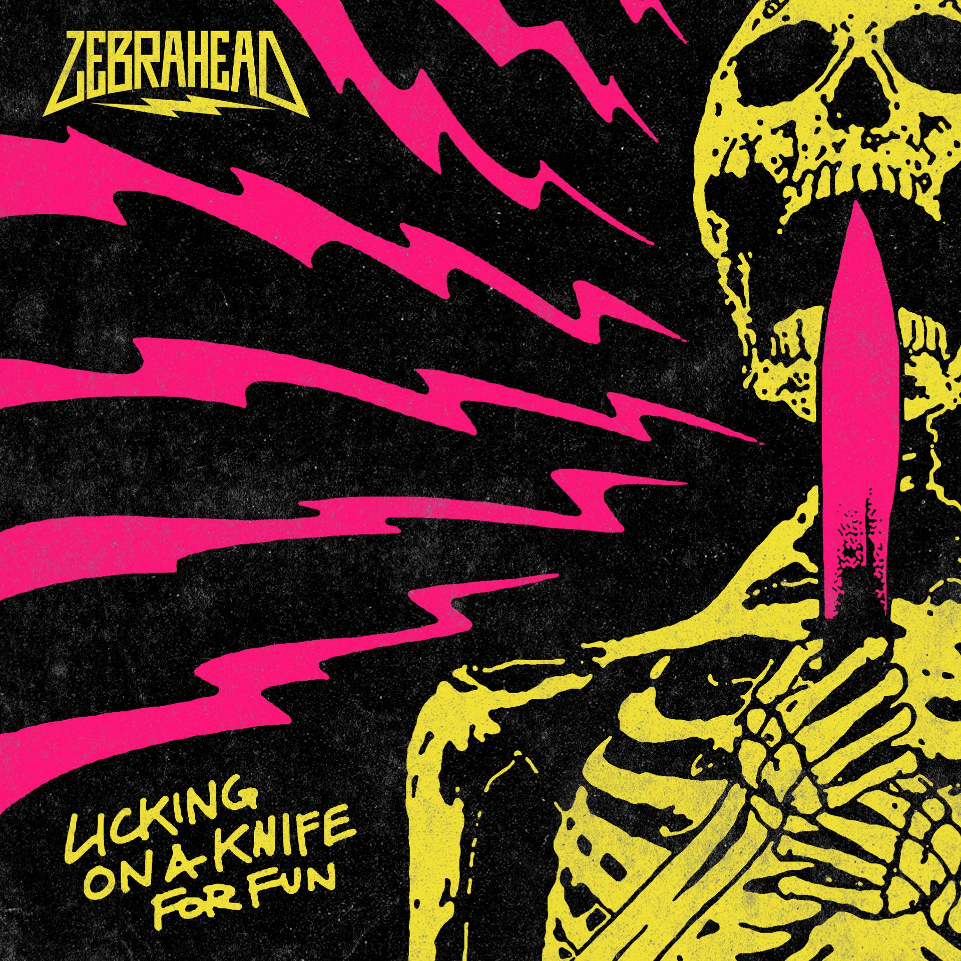
Artwork for the album ‘Spectra’ by The Wring
2. The Wring – Spectra
release: December 16, 2022
label: WormHoleDeath Records
genres: progressive metal
As Canadian progressive metal outfit, The Wring—the recording lineup consists of Don Dewulf (guitar), Marco Minnemann (drums), Chandler Mogel (vox), Reggie Hache (bass, keys), and Isamu McGregor (keys)—gear up to drop their new album Spectra on December 16th via WormHoleDeath Records, we wanted to delve further into the clean, spectral cover art, which got its name in large to the myriad of sounds the band spans, including hard rock, jazz, metal, classical, ’80s rock, and ’70s rock, to name the main ones.
This is all evidenced by the new single “Stiletto” ft. Marco Minnemann. According to Don Dewulf: “This song is about the debilitating need for social media attention and validation. The blade goes in, and you never even feel it, then you slowly bleed out. The verses are in 5/8 and ⅞ creating a somewhat jarring effect, and also speaking to the theme. Chandler does a killer job on the chorus vocal, and there is a very peculiar odd-time breakdown before the solo. Very fun song to play.”
Speaking to the artwork in more detail, Don Dewulf shares:
“I went to Gord [Woolley] with a hyper-conceptual and totally pretentious idea for the cover. He provided a bunch of takes on my theme and then sneaked his own idea in at the very end of that. I realized that my ideas were pure hubris and that he had nailed it. What you see as the final version is his sneaky concept. I think it’s fantastic!. Trust people that know what they are doing…”
“The music is complex and nuanced, and the title ‘Spectra,’ by definition, is colourful, so I started exploring where that could go.”
Adding colour (pun intended) to his creation, the artist Gord Woolley comments for us:
“The music is complex and nuanced, and the title ‘Spectra,’ by definition, is colourful, so I started exploring where that could go. I think I did eight or ten covers before showing Don. Some were versions based on his direction, and then a few things to push the conversation to what I thought was right. He liked where I was heading, and from there, I did a bunch of new variations that really emphasized the simple visual beauty and impact of the colour spectrum paired with clean sophisticated type.”
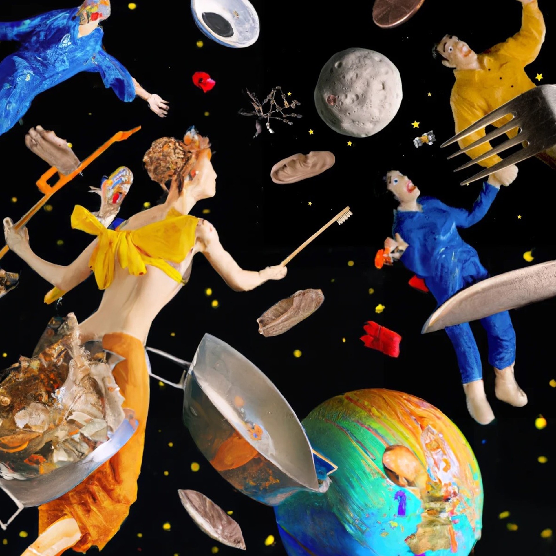
Artwork for the album ‘Junk in Orbit EP’ by Ade
3. Ade – Junk in Orbit EP
release: November 4, 2022
label: Trickwork
genres: indie pop, bedroom pop, power pop
New York-based producer and songwriter Ade is fresh off the release of his three-song power pop recording, Junk In Orbit EP. The album follows 2021’s full-length Midnight Pizza and the dancey “Opposites” single released via Kitsuné last Spring.
Commenting on the new album, Ade shares: “The Junk in Orbit EP is a collection of pandemic songs; reflections on that first anxiety-riddled wave of quarantine in which our primary experience of the outside world was through our social media feeds – often unhinged and sloppily tailored algorithms bombarding us with misinformation, celebrity, political and systemic failure, Animal Crossing, cooking videos, and any number of unsolicited photos of our exes, pre-pandemic ephemera, and other digital memories.”
Accompanying the new work is a hallucinatory music video for the “Ambivert” single, directed and animated by Oliver Levine with prop fabrications by Phoebe Jane Hart (including a prop TV that bizarrely went viral on TikTok after a random clip set off a debate about its origins).
Speaking of the controlled chaos that is the Junk in Orbit EP cover art and how it ties into the above-mentioned video’s themes, Oliver Levine notes:
“The Junk in Orbit album art is an offshoot of the video I directed for Ade’s song ‘Ambivert.’ In the video, the pre-chorus sections take place in a very busy outer space, where domestic objects float around aimlessly. I felt like this image not only literally represents the title of the EP, but runs parallel to the sentiments voiced in ‘Ambivert’: ambivalence, agoraphobia, anxiety – but cheeky. The album art was created using a still from the video, and DALL·E 2 to expand the picture using AI. I love the tooth fairy-type character the AI synthesized!!”
“I felt like this image not only literally represents the title of the EP, but runs parallel to the sentiments voiced in ‘Ambivert’: ambivalence, agoraphobia, anxiety – but cheeky.”
Adding context to the cover art and his work with Oliver Levine, Ade states:
“I’ve known Oliver (Levine) for over a decade now – we actually went to high school together. He’s always been a visionary, eccentric person, and it’s been inspiring to have a friend like him to evolve with as parallel artists. Naturally, it was excellent to get the opportunity to properly collaborate after all this time, and the result is nothing less than what I expected from an imagination as unique as his.”
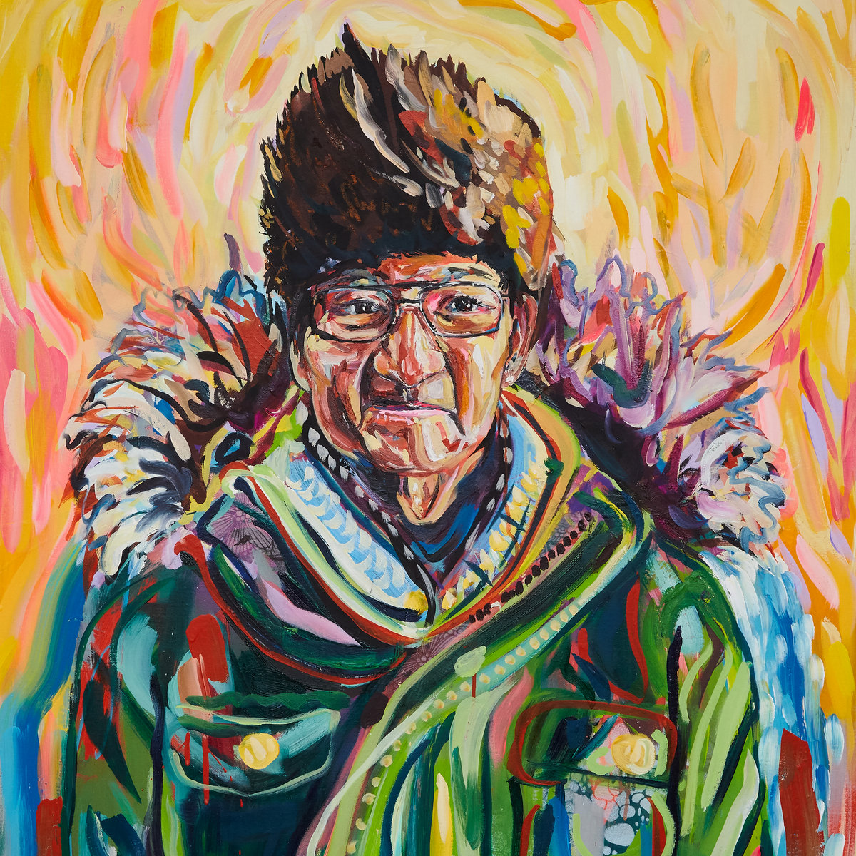
Artwork for the album ‘Watin’ by Aysanabee
4. Aysanabee – Watin
release: November 4, 2022
label: Ishkōdé Records
genre: alternative
Aysanabee is a Toronto-based artist from Sandy Lake First Nation who, on November 4th, dropped his debut album Watin via Ishkōdé Records. The record’s title and artwork were taken from a single source of inspiration, Aysanabee’s grandfather, audio of whom is also peppered throughout the music.
According to a recent press release, Aysanabee’s debut offering “justifies the anticipation with its assured execution and scope. In Watin, Aysanabee’s search for the opposite states of loss and pain brings a sense of reassembly in real-time. Throughout Watin, Aysanabee grapples with open-ended questions and missing pieces. The album is a work of renewal, gathering the fragments of language, family and memory as an immense and intimate work of rebuilding.”
Commenting on the final album cover and how it came to be Aysanabee shares:
“The artwork was painted by Metis artist Montina Hussey whose work I’d admired for a while. I commissioned the portrait maybe a week or two after I quit my career to become a full-time musician. Spending several thousand dollars on art probably wasn’t the soundest plan after abandoning a safety net, but it ended up being such an integral part of the album and story: The cover.
“Spending several thousand dollars on art probably wasn’t the soundest plan after abandoning a safety net, but it ended up being such an integral part of the album and story.”
“The image itself, of my grandfather, was the photo I had taken of him the day I left him in long-term care in northern Ontario. The day the pandemic was declared in Canada, the day, I didn’t know at the time, would spark the fire that led to the creation of this album.”

Grandfather, photo by Aysanabee
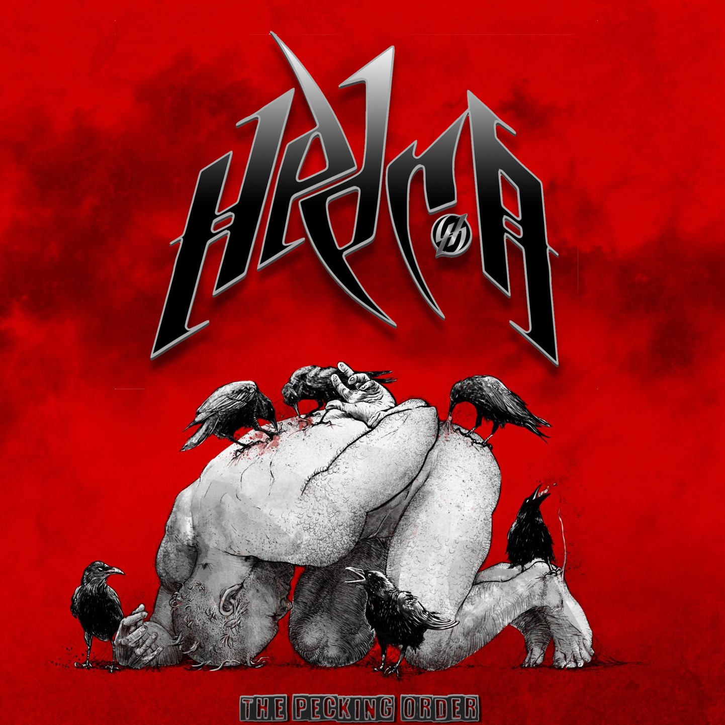
Artwork for the EP ‘The Pecking Order’ by Hedra
5. HEDRA – The Pecking Order
release: November 11, 2022
label: Devils Clause Records
genre: progressive metal
UK progressive metal quintet HEDRA dropped their ripping new six-track EP, The Pecking Order, on November 11th via Devils Clause Records and, as heard on the single “Jackdaw,” the music can be likened to a mixture of Iron Maiden, Tool, and Mastodon. Obvious tie-ins aside (like the crows pecking at the buckled-over human), we were intrigued by the album’s imagery.
According to the band, “The EP started its completion from demo stages to finalisation during the pandemic year of 2021. On the 17th of October 2021, Bassist Kozi contacted his friend and natural pen artist Kamil Karpinski from “Kamil K Karpinski ART.” The brief started as a requirement to draw something that represented the similarity between humans and animals as this was the inspiration for the music. A quick sketch – based on his previous art, which we liked – from the brief, which stated it must include a ‘Jackdaw’ came back and was immediately discarded as not well balanced and a bit too ‘zoo’ attraction in its appearance.”
The musicians continue the covert art’s story:
“By the 18th November 2021, various ideas had been passed backwards and forwards, including an image by Jim; this is where the idea of animals attacking humans changed the concept; this was then reverted back to Artist Kamil to gain further inspiration.
“The concept was immediately understood, and a basic image for the cover was returned. The band was amazed at how simply striking it was and represented the contents of the music straight away. Although the image would have been great as it was, perhaps the scene was a little too empty with regards to making the focus point stand out; we also needed to consider what would be seen first when walking to it in a record store.
“We decided to link it in with the pandemic and desperate times the E.P. represents by adding the red background symbolising ‘Danger’ or ‘Angst’ as a Bull often dictates.”
“By 30th December, the first cd mockup was made; it was at this point Jim decided that the original logo was perhaps not as bold and as powerful as it needed to be to make it appear as a hard-hitting metal album. We had already decided to keep the packaging as digipak format to suit previous release, Mind Dimension, in 2017.
“A new logo was designed by Jim, not symmetrical as per previous logo designed in 2015 by Baz Ter; Jim added a mix of light & dark in the logo to match the figure & the title ‘The Pecking Order’ suddenly came about at the point of dropping the logo into the image.
“The Pecking Order Font Black on White by Daniel Hochard was created by Jim to look like scraps of metal or plate left on the plain, perhaps its own concept of leaving a bit of metal for everyone!
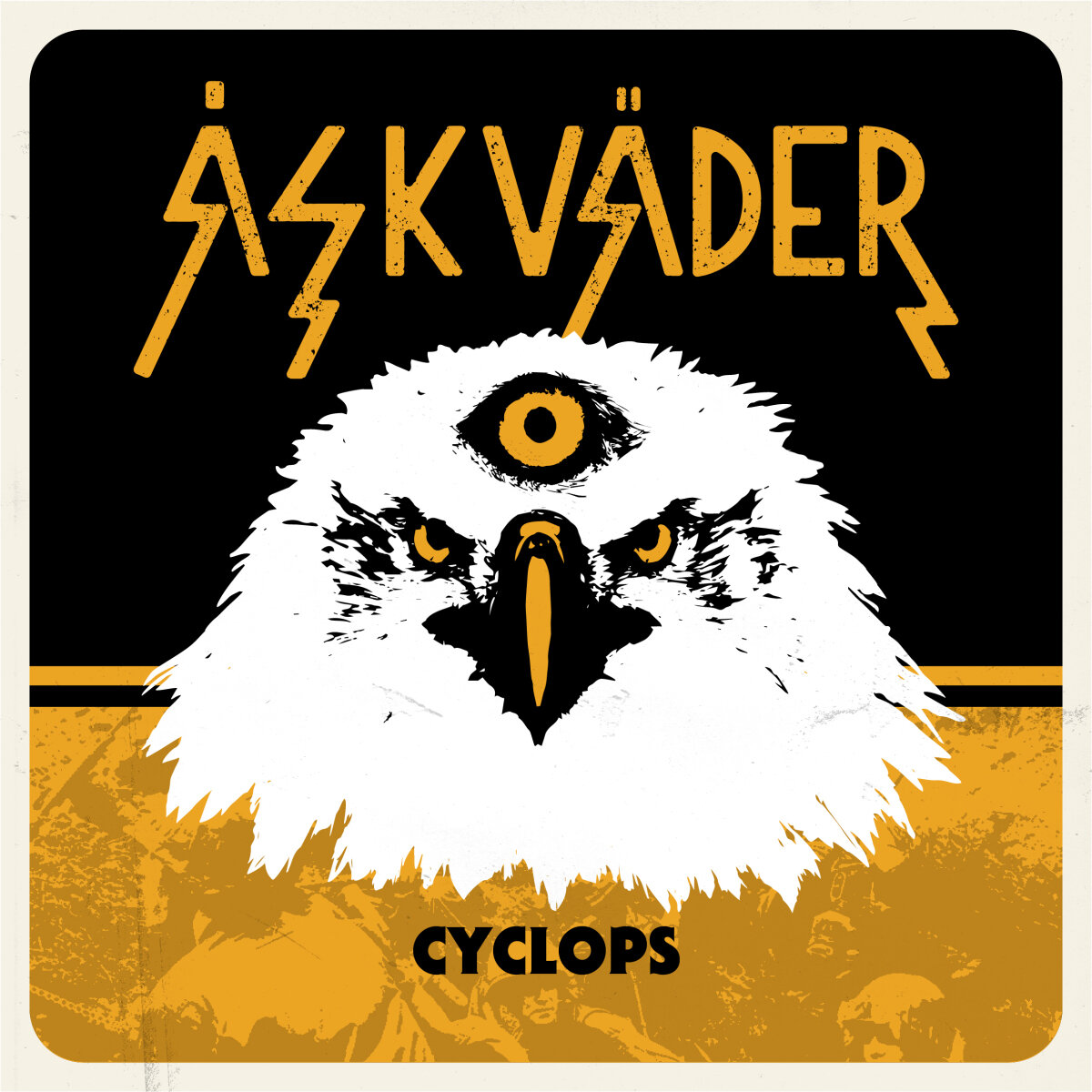
Cover art for the single ”Cyclops” by Åskväder
6. Åskväder – “Cyclops”
release: November 4, 2022
label: The Sign Records
genre: garage rock
Following the March 2022 release of their twelve-track album, Fenix, Gothenburg, Sweden garage rockers Åskväder return with their newest single, “Cyclops,” via The Sign Records on November 4th. Accompanied by a Carl Stenlöv-made music video, this marks the first of two new tracks Åskväder recorded during the second half of the year.
Why this song, and why now? The band shares, “Our idea was to create a fast paced track with some great dynamics to it and of course also add our signum – hooks, groove and hooks. Our goal for the build up of the song is that the listeners should be compelled, through the duration of this gem, to raise their fists in the air and start head banging. We are deeply troubled by the recent events in the world such as the ongoing war and injustices taking place and ‘Cyclops’ is our effort to express our thoughts. The lyrical content is of great importance to us and it kind of wrote itself as it is a storm of feelings channeled through our music.”
So, what does the single’s majestic, three-eyed-eagle image signify and how does it tie into the tune? Well, Martin Gut tells us:
“The cover art for the brand new track ‘Cyclops’ released by Åskväder displays a mighty eagle adorned with the all-seeing eye of a cyclops. The cover vivifies the intention of the track displaying a mighty entity limited with a narrow perspective which leads to war, injustice and suffering. The color palette of black, yellow and white intensifies the experience along with the embedded image of soldiers marching in the background. The scene is set to create a powerful ally visually for a powerful track. It intensifies the experience for the listener connecting the dots of the lyrical content of the song. The symbolism of the imagery gives the track its own purpose and life.”
“The cover vivifies the intention of the track displaying a mighty entity limited with a narrow perspective which leads to war, injustice and suffering.”
And the cover artist Marta Ennes adds:
“Martin called me one day and told me that they needed a powerful image to describe an important tune they had written. Given the lyrical content and the name of the song, the choice for me of which visual elements to use for the cover was self-evident. Once I sent the first draft, the guys were thrilled at first sight.”


-
 Alternative/Rock5 days ago
The Warning Shake the Foundations of a Sold-Out Leeds Stylus [Photos]
-
 Music2 weeks ago
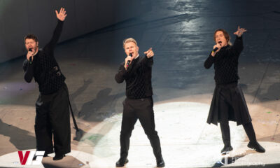
Take That (w/ Olly Murs) Kick Off Four-Night Leeds Stint with Hit-Laden Spectacular [Photos]
-
 Alternative/Rock5 days ago
The V13 Fix #011 w/ Microwave, Full Of Hell, Cold Years and more
-
Alternative/Rock2 weeks ago
The V13 Fix #010 w/ High on Fire, NOFX, My Dying Bride and more
-

 Features2 weeks ago
Tour Diary: Gen & The Degenerates Party Their Way Across America
-

 Indie5 days ago
Deadset Premiere Music Video for Addiction-Inspired “Heavy Eyes” Single
-

 Folk6 days ago
Katherine Perkins Strikes the Right Tone with Her “Hold On” Music Video Premiere
-

 Country1 week ago
Brooke Ashton Chats About Her “Someone” Single, Creative Process, and More!