
Alternative/Rock
UnCovered: Will Wood Discusses His Humorous New Cover for ‘The Normal Album’

Diverse, eclectic, and maybe just a little odd, Will Wood has been enjoying some recent success thanks to the release of The Normal Album via Say-10 Records. Wood owes a lot to his faithful followers for the creation of this record since they were the ones who helped make it possible by helping to fund its recording through an Indiegogo campaign. The campaign met its goal in just one day and Wood has certainly delivered on his promise with an all-around solid effort that features the artist at his most creative and his most vibrant. It also arguably features him at his most musically eccentric, which is exactly the way he would like you to view him. There’s nothing boring about Will Wood; with his energy and his knack for the unusual, how could you possibly be bored?
After getting you more familiar with Wood earlier this summer with the premiere of his “2econd 2ight 2eer” music video, we’ve caught up with him for a chat about the artwork. To really get into the unconventional headspace of Wood, we recently spoke to him for our latest UnCovered interview to discuss the amusing cover for The Normal Album and how it was influenced by the album, as well as Wood’s one-of-a-kind sense of humour.
What was the inspiration for the album’s cover artwork?
Will Wood: “Growing up, I always felt like my perfect suburban town was hiding something, that writhing under the manicured lawns and behind picket fences was a flesh and blood underworld that ate children and excreted gender roles, religion, and the possibly/partially arbitrary cultural rules that keep us tethered to conventional reality. I sort of wanted to expose that underbelly, flip it over and show off its naughty bits and tell you, ‘see? It’s all a flabby little pervert animal that just like everything else in the cosmos exists to breed and die.’
It’s the ignorance to that ugly creature that’s crawling around in the mulch and schoolyards like one of those neurotoxic Vietnamese centipedes that allows the monster to keep feeding. Allows kids like me to get all twisted up by experiences they shouldn’t have had.
So I went with those black vampire ‘hiss at the sun’ shutters, my muted outfit and sickly makeup, the crumbling text, all juxtaposed with my hello-to-the-milkman wave and Photoshop anime eyes. Slapping that on top of a dimly-lit retro background I think kind of gets that point across. It’s about a bygone era that never really was, it’s about me and my peers’ childhoods and the loss of innocence to that animal.
This isn’t untrue of places other than suburbia. I sort of use suburbia as a metaphor in the artwork, and in the opening track. It’s not about a place, it’s about the facade. The superego and how we all have our own lawns and picket fences around our heads and our lives, and that underneath our smiling faces and fashion we’re all meat machines propelled by electrical impulses born of nothing but the instinct to survive long enough to put out the latest model.
It’s underneath all that, though, that’s where I want go. Some day I want to get to the thing beneath the thing that we hide beneath the thing, that thing that we all are. So that’s why that image belongs on the cover. Also, my friends and I found a cool house.”

Tell us about the artist you worked with and how you found him/her?
“The photographer was a delightful woman named Angelica Pasquali; I highly recommend her work. She’s a very socially conscious and active person with a lot of important things to say about mental health, environmentalism, and other things people need to be talking about. I took her photos and went from there with the graphic design work. We met… well God knows where, my memory is shot from the years of research chemicals and subsequent years of medication. The inner sleeve collage was me and artist/filmmaker Mike Diebold, whose work you can see in a number of my music videos (Danger Baby Films) and my movie The Real Will Wood, which is an obnoxious reality-bending concert film/documentary that’s on Amazon Prime now.”
Please elaborate on the medium(s) used when creating the art. We’d love to know how the artwork was created.
“I like to at least have a hand in everything visual associated with my work. Some of my merch I just don’t have the time or skill for, but album art has always been extremely important to me, and I’ve always been really dedicated to making sure I was either the artist of or at least the lead creative force. So I came to Angelica with a concept, then Mike Diebold and I scoped out houses and collaged together. After the photo shoot, I used my minimal graphic design skills to try and tie it all together by manipulating the colors and textures, editing the proportions to a somewhat uncanny place, and building the background.”
With the increasing popularity of digital music, most fans view artwork as just pixels on a screen. Why did you feel the artwork was important?
“The album art is like a title brought into another dimension. It allows you to take the label you use to sum up the subject and bring it into an abstract and visual language. I think that art exists to communicate things that can’t be communicated otherwise, abstract ideas and cultural energy. It’s connective tissue between human spirits in a way. Neurons firing in the Godhead brain. The album cover is the disclaimer before you share your dark secret, it’s a keep-out sign to those you’re not trying to speak to and a welcome mat to those you are. Hopefully I reach the right ears, the people I’m really trying to reach, by using the cover to say something like ‘hey, so don’t freak out but…”
When people look at the album cover artwork, what do you want them to see/think?
“I want them to see my sense of humor. I know I’ve been lofty and grandiose and grim throughout this interview so far, but I don’t create anything without at least some amount of levity in my process or how I think about it. The Normal Album cover is a piece of black comedy to me. The record is dark at times, but if you take it too seriously, you’re going to get all the wrong ideas. People often struggle to tell when I’m kidding, and I get a kick out of that sometimes, but I think people often assume jokes can’t be serious or vice versa.”
Have any favourite music-related visual artists?
“I can’t resist Alex Grey. That man gets it.”
Was the album art influenced by any of the themes explored on the album?
“For sure. I use a lot of self-contradiction and dichotomy on the album, the same way I use the juxtaposition of the howdy-neighbour expression and the dark tone of the cover. Duality is a big part of its theme. Weird versus normal, self versus the world, past versus present, progressive versus conservative (I don’t mean politically, I don’t talk politics on the album), and how the relationship between the two halves of a dichotomy is complimentary. Everything defines its opposite. And of course on a more direct level, the subject itself of the cover reflects the main theme of the album. The darkness in the facade, the unreality of culture, the void within the form, etc.”
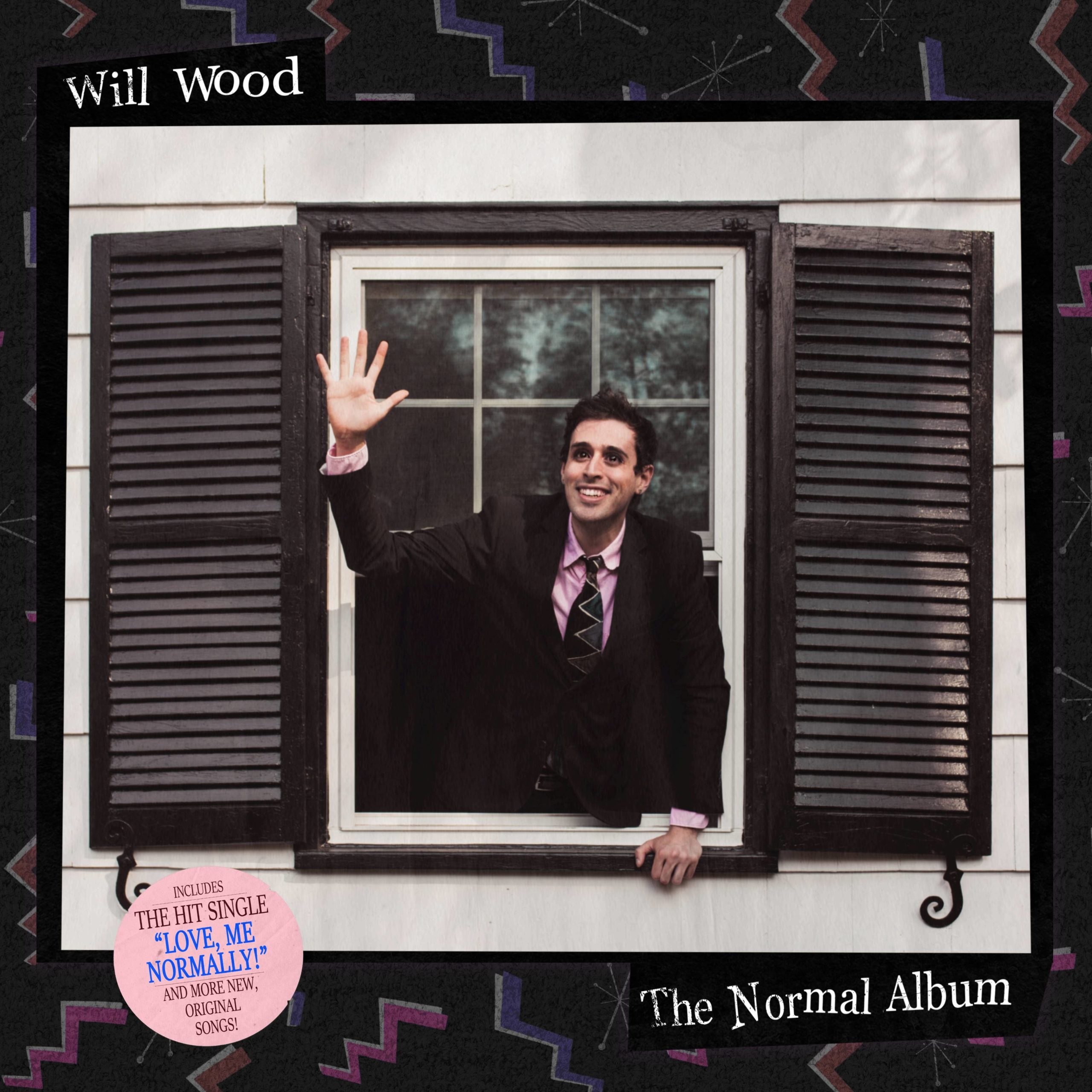
Artwork for ‘The Normal Album’ by Will Wood
How do you think the art will affect the listener’s perception of the album?
“I think album art defines an album in a lot of ways. The same way you can tell how a person feels from looking at their face, I think people can tell how an album feels by looking at its cover if it’s done effectively. So, I think, or at least hope, that people will be introduced to the abstract language I use in the lyrics and genre-bending when they see it. A sort of Rosetta stone and tone-setter that gives the listener a visual companion to the musical experience. Hopefully they’ll pick up on, like I said earlier my sense of humour, a bit of my worldview, and a first look at my intentions with the album’s overall conceptual statement.”
What’s your favourite thing about this album cover?
“I think it does a pretty good job summing up the essence of the record, or at least my intentions with it, with a single icon. There’s only one subject on the cover, only one concept, and it’s simple. I think that’s a sign of a strong album cover, when it’s a single icon. I hope I’m right about that. But if I’m not, oh well. We can’t all come up with Dark Side of the Moon.”
Do you have a favourite album cover of all time?
“I have to bring up Alex Grey again. I wish I had the resources and creativity to make album art like Tool has made. Fear Inoculum had a damn video screen in the CD tray playing Alex Grey video art. 10,000 Days had a stereoscope built into it so the art could be seen in 3D. My favourite Tool cover, and therefore favourite cover, because all Tool covers are mind-bogglingly powerful, is for their classic Lateralus. Alex Grey created a sort of spiritual map of the human body, and then built it into a booklet with transparent pages, so you could remove a layer of cross section of this body and reveal its organ systems and energy fields or what-have-you with each page like an anatomy textbook on DMT. It’s such a compelling piece of art, I can’t think of anything that tops it.”


-
 Alternative/Rock6 days ago
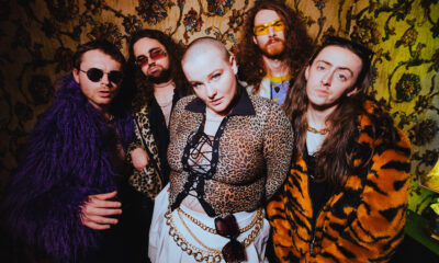
The Warning Shake the Foundations of a Sold-Out Leeds Stylus [Photos]
-
 Music2 weeks ago
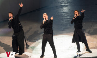
Take That (w/ Olly Murs) Kick Off Four-Night Leeds Stint with Hit-Laden Spectacular [Photos]
-
 Alternative/Rock6 days ago
The V13 Fix #011 w/ Microwave, Full Of Hell, Cold Years and more
-
Alternative/Rock2 weeks ago
The V13 Fix #010 w/ High on Fire, NOFX, My Dying Bride and more
-
 Features2 weeks ago
Tour Diary: Gen & The Degenerates Party Their Way Across America
-

 Indie6 days ago
Deadset Premiere Music Video for Addiction-Inspired “Heavy Eyes” Single
-

 Folk6 days ago
Katherine Perkins Strikes the Right Tone with Her “Hold On” Music Video Premiere
-

 Country1 week ago
Brooke Ashton Chats About Her “Someone” Single, Creative Process, and More!