
Interviews
UnCovered: Atarka Discuss the Concept and Inspiration Behind ‘The Mountain’ Artwork
For our latest UnCovered interview, Brit metallers Atarka talk about the inspiration and concept for the artwork on their EP, ‘The Mountain.’
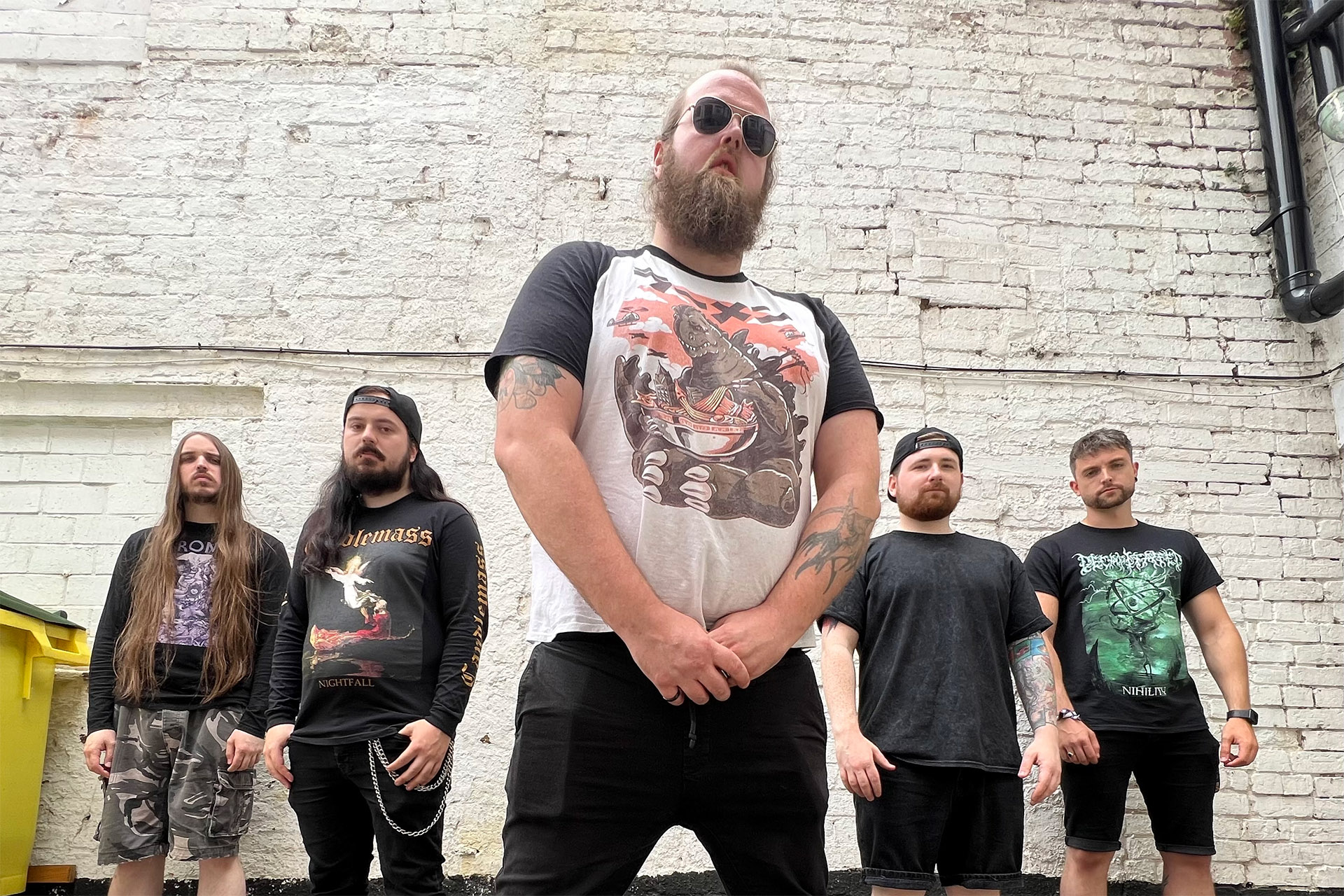
Hailing from the home of heavy metal, Birmingham, England, melodic death metallers Atarka return with their sophomore release, The Mountain, out on April 14th, 2023.
The EP is the follow-up to their 2020 album, Sleeping Giant, and includes the recent single “Barbarian,” which saw the band joined by Soilwork vocalist Björn Strid. In the latest in our UnCovered series, we spoke to vocalist Jamie Smith about the EP artwork, which sees nature meet fiction and fantasy.
Before we dive into the conversation, check out the video for the brilliant “Barbarian” below.
Which album is the artwork for?
Jamie Smith: “This artwork is for The Mountain, our sophomore release out April 14th on all digital platforms. It is the follow-up to our 2020 debut Sleeping Giant and features a huge amount of musical maturity and an evolution of our sound, which we cemented on our first album.”
Please help us understand, what are you trying to convey with the cover’s imagery. Give us details on the concept.
“The Mountain, by nature, is somewhat conceptual. It definitely has one foot in the realms of fiction and fantasy, and it was important that the artwork reflected that. A solitary protagonist so small in the frame in the frozen wilds staring down a seemingly insurmountable obstacle. This is reflected in how the band felt making this record; the pandemic really split us up as a collective, and trying to write music during this time was our own mountain to climb, but much like our protagonist, we stared down the challenge and overcame it and our little four-track behemoth is what we have to show for it – it was worth every second of hardship.”
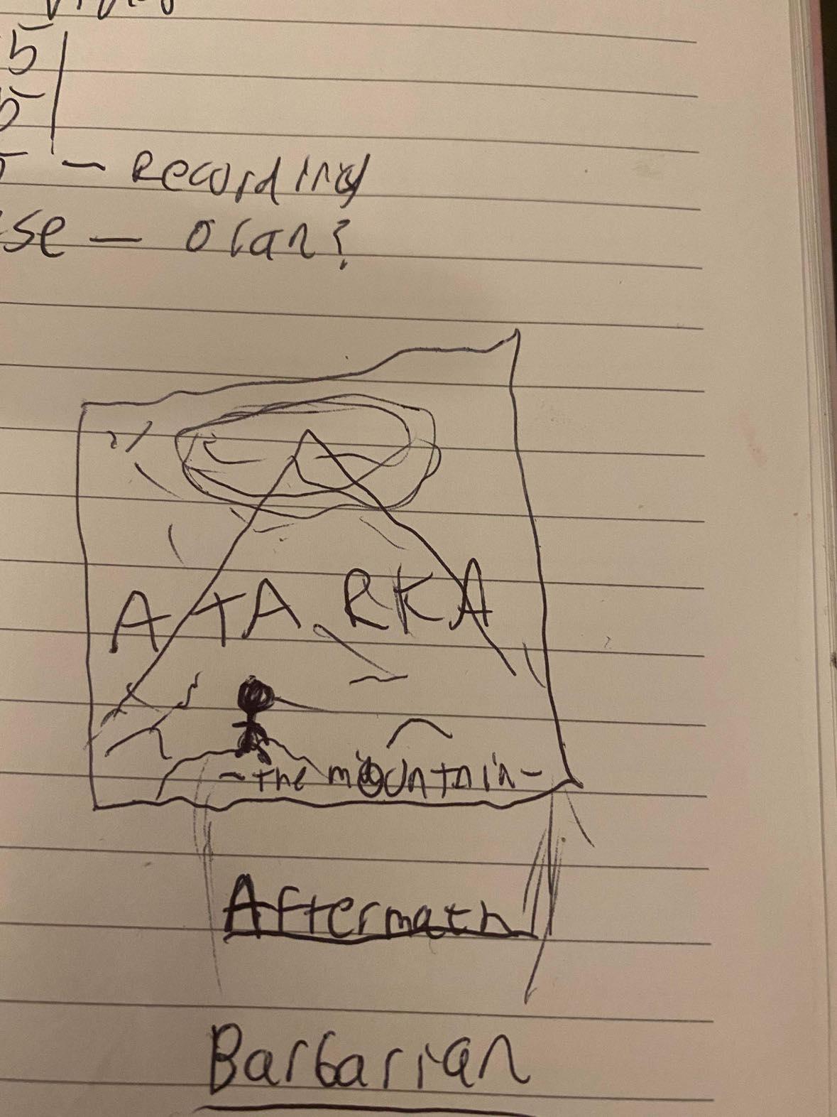
The Mountain Initial Draft
Who created the artwork? How did the musician/band decide on that artist?
“The artwork was put together by Oran O’ Beirne of Overdrive Music and Mainstage Design. We developed a great working relationship with Oran after the release of Sleeping Giant, and he had done great work for our social pages using his graphic design skills as well as redesigning and improving Sleeping Giant’s album cover. So when it came time for release number two, there was no one else in the discussion; it was an absolutely unanimous decision in the band that Oran was the guy. You can commission anyone to draw up your artwork, record with, make videos, etc., but when you work with someone who is genuinely invested in you as a band, then there’s a whole different energy.”
What’s the story behind the album and the artwork? Is there a particular theme or narrative being displayed on which you can elaborate?
“Throughout the album, there is a throughline story, there’s a bit of a disjointed narrative going on where the story doesn’t play out track by track, but it’s in there for anyone who wants to put it together. The Mountain is envisioned as a coming-of-age ritual for a tribe of warriors in the wilds of an ancient land, the people see the mountain as something of a deity, and the young who survive the climb are those who were chosen by the mountain and go on to be the warriors and protectors of their tribe for generations to come. The protagonist of the record reaches the summit and finds themselves warped and changed by an encounter with a Lovecraft-inspired outer god and returns to their people not as a warrior but as a Tyrant. The artwork is what I would describe as the ‘film poster’ for this concept.”
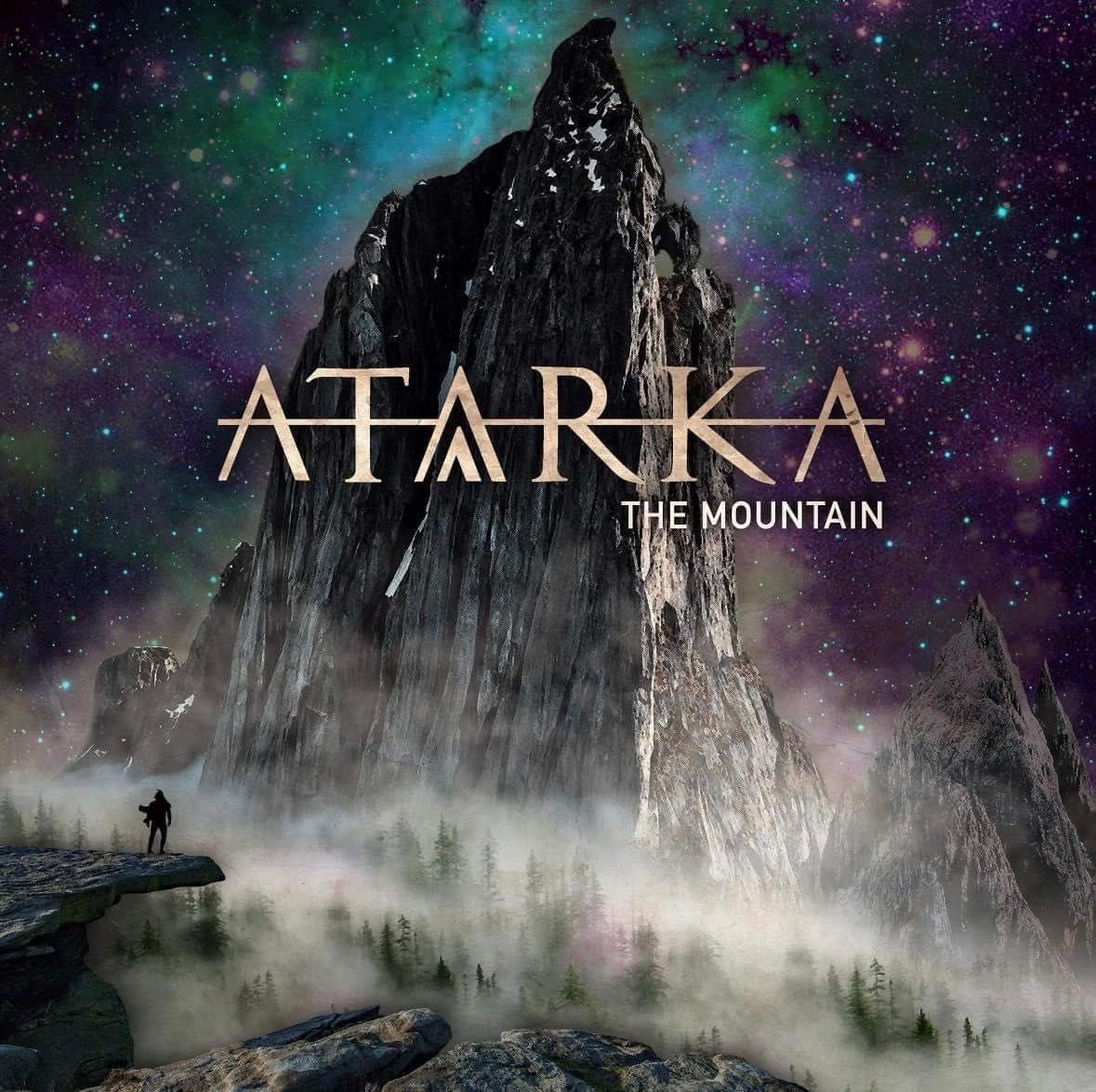
Atarka “The Mountain” EP Artwork
Where would you be most excited to see your album artwork postered, or displayed?
“I’ve been very excited since the release of our first single from ‘The Mountain’ at just how many times I’ve seen the EP art splashed across people’s social media; seeing people sharing and genuinely enjoying your music is one of the best feelings in the world. It was also surreal that we were hand-picked by Nuclear Blast Records for one of their new release playlists where our track sat between In Flames and Slipknot, a real out-of-body experience to see our artwork and song next to two of the most influential bands in our genre.”
Who are some of your favourite visual artists?
“I grew up reading comic books, and there are so many artists I admire, Andy Kubert, Bryan Hitch, Jim Lee, Frank Miller and Mark Bagley, just to name a few. Yoji Shinkawa, who is best known for being the lead character designer on the Metal Gear series, is also a favourite of the band; there’s a scratchy, distorted, almost uncomfortable flair to his artwork that just makes it all the more appealing. Junji Ito is also one to mention, my personal favourite manga artist who is capable of creating some of the most disgusting images ever conceived by a human mind and still somehow manages to make these images beautiful as well as horrifying.”
What art style would you be interested in seeing if a variant version of your album artwork was created?
“I’d personally enjoy an anime art style take on the cover, reimagining the whole concept as a shonen anime and having our protagonist wielding the kind of weapon you’d see Guts from Berserk with. If there are any anime/manga artists reading this, do feel free to reach out.”
How has the response to the artwork been so far?
“It’s all love; our fanbase is the greatest! Mainstage Design hooked Phil (Sheldon, Drums) up with his own custom kick drum skin of the album artwork, and that got a great response from us following when we shared it for the first time. We can’t wait to show it off more in upcoming music videos and our live shows.”
The first draft of Atarka’s “The Mountain” EP Artwork
What were the partnership’s dynamics like? For example, was a specific look given, or did the artist have full free range?
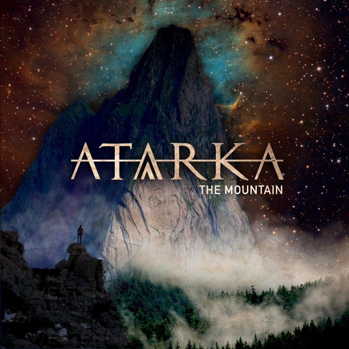
“It was an incredibly collaborative process; Oran at Mainstage Design is an absolute pleasure to work with. We briefed him on the design – including an incredibly basic sketch that I drew for him on the back of a lyric notepad, and he just went to town. There were 3 versions of The cover before we landed on the final design, and each one that came back was better than the last. There was a great and open relationship where no ideas were off limits, and no one’s egos were involved if something didn’t work or didn’t suit the record. I think the final design speaks for itself and says everything you need to know about what this record might sound like Daunting, Merciless but in its own way quite beautiful.”
With the increasing popularity of digital music, most fans view artwork as just pixels on a screen. Why did you feel the artwork was important?
“That’s a great question; unfortunately, with the popularity and ease of streaming music, the traditional album on CD with the artwork on the case is slowly dying out or at least becoming less of a priority. I have more of a collectors mindset personally, and there’s nothing quite like being able to look at your collection and take in the whole legacy of an artist (or director, for that matter) and soak in their whole legacy just by looking at the cover art. A Lot of bands seem to be pivoting to single releases now, but I’m still a huge fan of album releases with badass art to back them, so hopefully, there’s still a bit of life in the old way of doing things for now.”

Atarka “Favourite Album Covers” Artwork
What do you think are some of the cover artworks that have translated best/worst onto t-shirts and other merchandise?
“There are certain iconic album designs that really lend themselves to merchandise like t-shirts. These designs lead people to buy a piece of clothing without even knowing the band because a great piece of art is a great piece of art. Examples I can think of off the top of my head are things like Green Day’s hand grenade heart from American Idiot and the iconic skulls on a crucifix from GNR’s Appetite for Destruction, huge bands who managed to break away from the subculture and infect the mainstream with nothing but an album cover. Another one is Slipknot’s self-titled album, I personally own at least four shirts with that artwork on them, and they’re all incorporated into merch in very creative ways, 9 figures staring out at you through a distorted lens, emotions unreadable through the masks, absolutely timeless, it completely draws you in.”
Was the album art influenced by any of the themes explored on the band’s album?
“Absolutely; outside of the fictional concept, our lyrics are written in empathetic allegories that anyone who has ever struggled can relate to. We all deal with our own mountains every single day, the world is harsh, and it’s getting harsher, and sometimes even getting out of bed at all to face the day can be your mountain. The EP and, by extension, the art attempts to frame the torrent of seemingly unconquerable challenges that we as people are faced with in life, as well as the struggles of those that came before us.”
Do you have a favourite album cover of all time?
“I do love Ascendancy by Trivium – I don’t know how much nostalgia is talking here, but it’s so simplistic with no clutter going on, just their logo which they nailed on their first attempt, and a character ripped straight from the most recognizable song on that album ‘Pull Harder on the Strings of your Martyr’ as a tyrannical King spreads his genocidal wings across the cover, so simple but so classic, love it.”
Atarka releases The Mountain on April 14th, 2023, and you can pre-order your copy here.


Hastings Beat Punks Kid Kapichi Vent Their Frustrations at Leeds Beckett University [Photos]

A Rejuvenated Dream State are ‘Still Dreaming’ as They Bounce Into Manchester YES [Photos]

Cirque Du Soleil OVO Takes Leeds Fans on a Unique, Unforgettable Journey [Photos]


-
 Hardcore/Punk7 days ago
Hastings Beat Punks Kid Kapichi Vent Their Frustrations at Leeds Beckett University [Photos]
-
 Alternative/Rock6 days ago
A Rejuvenated Dream State are ‘Still Dreaming’ as They Bounce Into Manchester YES [Photos]
-
 Culture1 week ago
Cirque Du Soleil OVO Takes Leeds Fans on a Unique, Unforgettable Journey [Photos]
-
 Music23 hours ago
Reclusive Producer Stumbleine Premieres Beat-Driven New Single “Cinderhaze”
-

 Indie1 week ago
Michele Ducci Premieres Bouncy New Single “You Lay the Path by Walking on it”
-
 Culture2 days ago
Dan Carter & George Miller Chat Foodinati Live, Heavy Metal Charities and Pre-Gig Meals
-

 Alternative/Rock1 week ago
William Edward Thompson Premieres His Stripped-Down “Sleep Test” Music Video
-

 Country1 week ago
Jayce Turley Reflects on “Misery” with the Premiere of His New Single