Alternative/Rock
UnCovered: Toronto’s CONVERSATION Detail the Awesome Album Artwork for ‘The Honesty EPs’

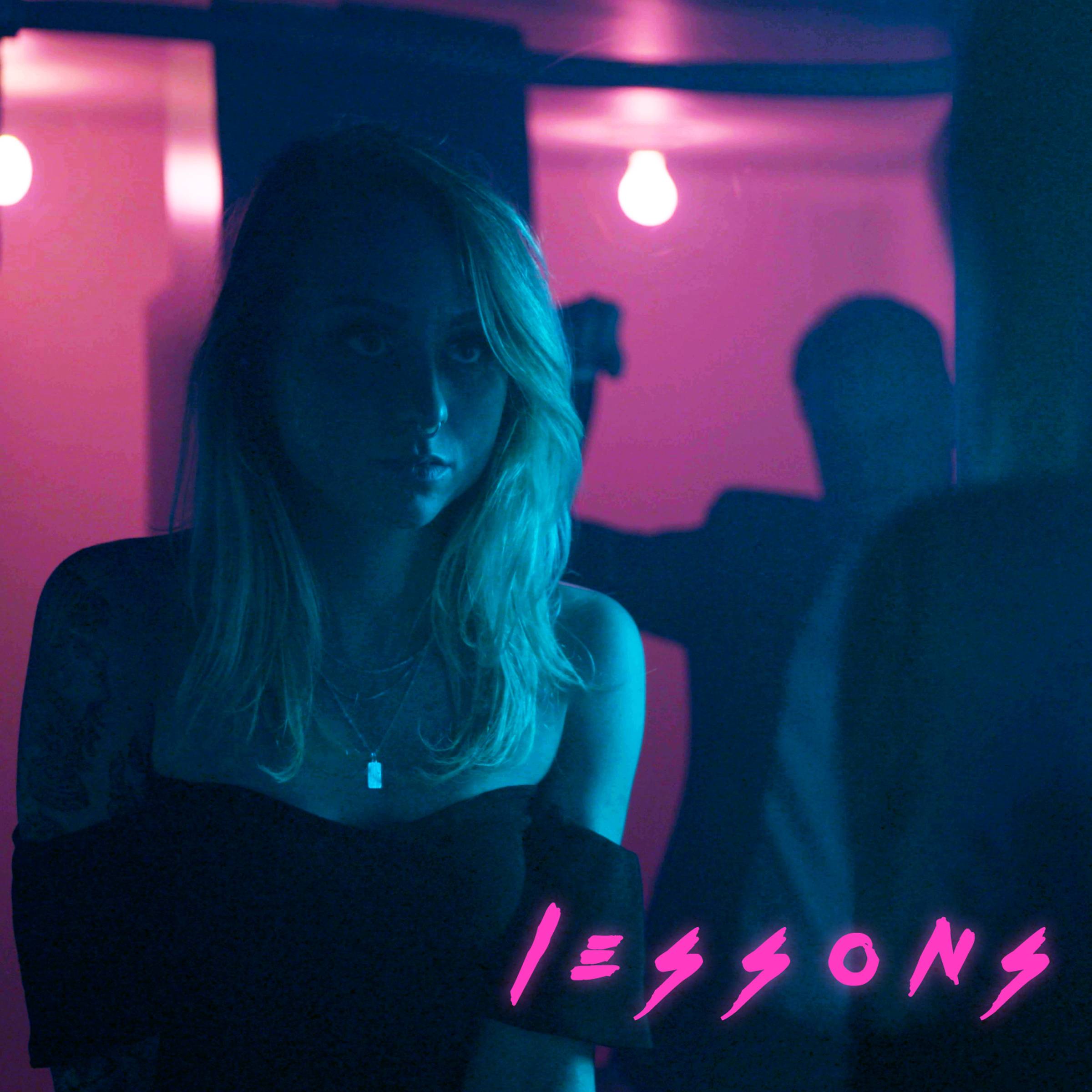
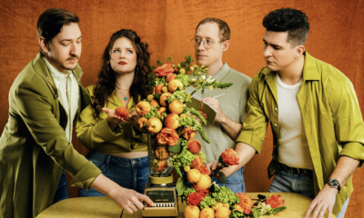
Are you ready for some enlightening discussion? We sure hope so, because today we are covering Toronto post-hardcore band CONVERSATION and their brand new EP Realization | Release. As the second part of their Honesty EPs, Realization | Release was released on May 1st, the follow up to last year’s Romance | Reflection. The EP is highlighted by the new single “Lessons,” a song burgeoning with urgency and fitting comfortably among the many different sounds you hear on each track. The sound of Realization | Release is most notable for its cross-section of influences, including current alternative rock, the post-hardcore of early Underoath, and hooks pulled from pop music.
Since CONVERSATION began to hit their stride in 2017, they have been rightfully recognized for their talent and musical progressiveness, playing shows with groups like Silent Planet, Our Last Night, and Enter Shikari. Hell, the band’s music has been getting around so capably that they even caught the attention of Jack Daniels who selected them to be a part of an international ad campaign.
We recently caught up with a couple of members of CONVERSATION to talk artwork, that is, the artwork for all four covers of The Honesty EPs. The band runs down in detail all of the elements that helped bring about these artworks, how their artwork translates to merchandise, and they also explained the thematic nature of the EPs and how they play into the artwork.
What was the inspiration for the album’s cover artwork?
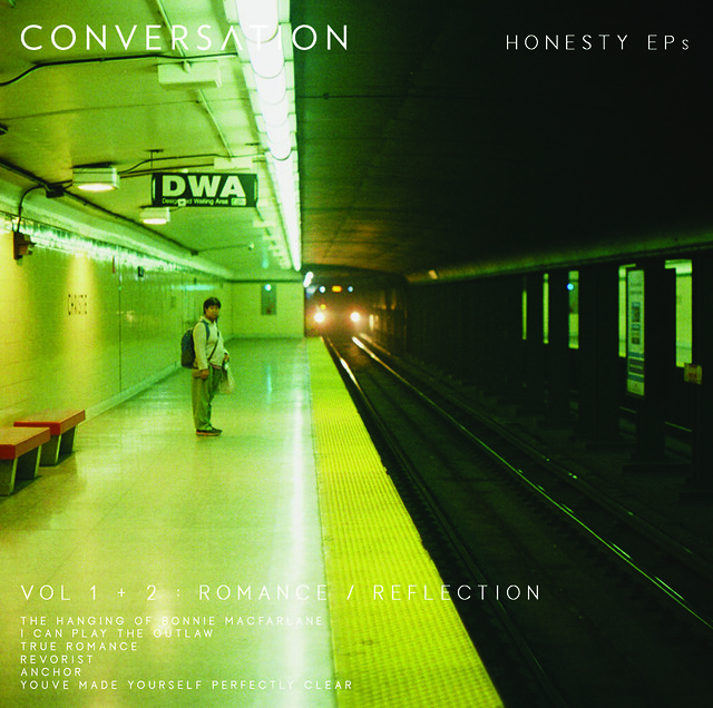
Timothy John Bolton (vocals): “The artwork for this record and our previous record are all tied together. Technically, there are four covers in total for what we call The Honesty EPs. Romance, Reflection, Realization and Release. All of our covers have the same layout with a different piece of photography representing the record. And all of the photography belongs to our bassist, Erik John Potvin. When I came up with the idea and the overall concept I really wanted everything to feel simple and honest, and I feel like Erik’s work really captures that.”
Erik John Potvin (bass): “I was actually quite surprised and flattered when Tim suggested using my photography for the album art. Never would have suggested that myself, but the rest of the band liked the idea too, so I was happy to oblige.”
Please elaborate on the medium(s) used when creating the art. We’d love to know how the artwork was created.
Erik: “I’ve shot 35 mm film since 2000 as a hobby, thanks to a course I took in high school. I’ve had a few cameras come and go from my life but the main one I still use today is a Pentax Spotmatic F 35 mm SLR. I’m not sure exactly what year mine is from but I know the model was first released in 1973. I often go out and about with my camera loaded, whenever I’m in the mood. Sometimes I come back without even clicking the shutter, sometimes I have three rolls of film to develop. Depends what I see, what mood I’m in.
The image we used for Romance is my friend Alexa Babiuk, who’s an amazing photographer, in a subway station. I took three or four shots of her reflection while the train was stopped with people getting on and off. I was a big fan of this image because it looks like a collage but it’s just one image with different reflections.
The image we used for Realization was a random day that I came across an old warehouse with a bunch of old things for sale. It was a really weird vibe. I remember coming around a corner and seeing this bed and a mannequin leg and just thinking ‘what the fuck is this place?’ I took a lot of shots in there, and this one was my favourite. I tried to go back once but the building is totally desolate and torn apart now. Somebody is either tearing it down or doing massive renovations.”
What were the partnership’s dynamics like? For example, was a specific look given, or did the artist have full free range?
Timothy: “Erik and I tried many different layout and photos before finalizing on what we chose. I had a very specific vision in mind and Erik was really able to bring it into reality. The REALLY fun part was trying to get all five members of the band to come to an agreement on each cover. That definitely wasn’t a quick conversation.”
Erik: “Tim came to me with a concept and I was happy to try and lay it out. I think out of modesty I wondered if we should be trying to find an art direction that was cooler than my photography, but I had to admit I did like the look he was going for. I didn’t have any better ideas so, why the heck not? Once we had a few possibilities mocked up, I definitely felt my artistic criticism kicking in, similar to my process with my photography. Certain images you love, certain ones you despise.”
Have you ever purchased an album solely because of its album artwork? If yes, did the music live up to the artwork?
Timothy: “Yeah it was a few years ago now; I was looking for something brand new and came across The Mars Volta’s first record, Deloused In The Comatorium. The cover is really quite bizarre! It’s a fat, bald man’s head, completely painted gold, and shooting a beam of light out of his mouth. I just said, ‘fuck it, let’s see what this insanity sounds like.’ I loved it from the first listen and then learnt that it was a couple of the fellas from At The Drive-In so I was completely sold.”
Erik: “Back when record and CD shops were a thing, I ran into a buddy at one and I told him I wanted to try and find some cool jazz music. He told me one of his favourites was a group called Mediski, Martin & Wood. I checked out what the shop had and there were several albums, and I went with Uninvisable because the cover was cool. Still one of my favourite records to this day.”
With the increasing popularity of digital music, most fans view artwork as just pixels on a screen. Why did you feel the artwork was important?
Timothy: “I agree that this generation doesn’t view album artwork with the same importance but I have always considered an album’s artwork to be a huge part of the overall album’s experience. I remember sitting in my room and just studying every single part of a CD’s booklet and reading the lyrics while I listened to the music. So, with that in mind, I think I can speak for every member of CONVERSATION when I say that the artwork for all of our music is definitely an important part of the overall experience.”
Erik: “I completely agree. I don’t know if it’s because I’m a visual person, but my opinion can be heavily swayed based on the imagery of something. They say don’t judge a book by its cover, but let’s be honest. We do. Well, I do!” (laughs)
When people look at the album cover artwork, what do you want them to see/think?
Timothy: “If anything, I just really want people to feel something from the artwork. Like with any form of art, you really just want people to take it in and let it resonate inside them. Where it eventually lands will really depend of the individual.”
Erik: “Since I enjoy photography as a hobby I enjoy thinking about what went into the photo I’m looking at. Who took it? Where were they? What were they doing, how were they feeling? What resulted in this image being captured? What happened before and after this moment? Sometimes it’s impossible to know, so it can be fun to make something up. So I suppose I want the viewer to take anything they want from it. As long as it’s something.”
What are your thoughts and/or the pros and cons of digital art versus non-digital?
Timothy: “I think something that is both a pro and a con about digital art is the accessibility. We’re so incredibly lucky to have all of this art at our fingertips. But with so much now instantly available, people aren’t treating the work with as much respect as they used to. We’re happy to listen to 25 seconds of a song and then move onto the next thing, and I think that’s really sad. When I was growing up and music was becoming a huge part of my life, I absolutely loved knowing every single part of an album and the band. I feel like that love isn’t there to the same degree any more.”
Erik: “I agree with Tim, I think a majority of people won’t appreciate some really incredible stuff as much as they could. However at the same time, at least for me, when something stands out, it’s that much more impressive.”
What do you think are some of the cover artworks that have translated best/worst onto t-shirts and other merch?
Timothy: “Hmm…. best would probably have to be Jane Doe by Converge. That cover art has just become so iconic. I think it’s a pretty safe bet to say you would see at least one Jane Doe tee at any hardcore show anywhere in the world.”
Erik: “The only thing that comes to mind is one time I saw a larger person wearing a shirt with what I believe is the first Britney Spears cover. It didn’t look good.”
Do you prefer having the most creative control when you get a project, or do you prefer when the band gives you a lot of input?
Erik: (laughs) “Good question. I think it definitely helps to have some ideas or suggestions as guidelines, because that really helps inspire some ideas. But I know once I have a certain direction I’m going in, I’m very easily offended if people start giving me certain feedback. The egotistical side is like ‘what the hell do you know? You’re AMATEURS!’ But I definitely know I wouldn’t want it to be COMPLETELY up to just me so I think both sides are equally important.”
Was the album art influenced by any of the themes explored on the band’s album?
Timothy: “The theme that has existed across both records is definitely the idea of honesty. That honesty can be to the people around you but more importantly, it would be the idea of being honest with yourself. I do feel that the artwork represents that honesty; the photography that we used has an honesty to it.”
Erik: “I suppose I’ve never really considered that myself, but I feel it’s certainly accurate. For every photo I’ve taken that I’m happy with, there’s probably at least five or six I was not happy with, and even more times I’ve looked through the view finder and just not clicked the shutter. I’d say that’s definitely me being honest with myself, if I’m happy with it or not.”
How do you think the album art will affect the listener’s perception of your album?
Erik: “That’s very difficult to speculate on, I think it will be different for everyone. But that is something I’ve often considered. Does this art represent our sound? Who’s to say? I could make arguments saying it does and does not. I’d be interested to hear what some people’s perception is.”
What’s your favourite thing about this album cover?
Timothy: “I think my favourite thing would be the fact that it was completely made ‘in house.’ I have always loved Erik’s photography so, for me, there was never any question of using someone else’s work. We are an independent band in almost every aspect so the fact that we created the music and the artwork without anyone else’s work feels fitting.”
Erik: “I’m just happy my friends like my photography (laughs)! But seriously I am quite honoured the band wanted to use it. And I’ll admit I’m proud to see it on there. So I’d say my favourite part is having the opportunity to combine by photography with our music.”
Did Erik work on any art for the album besides the cover?
Timothy: “Erik completed all of the graphic design on our record and is responsible for the photography on the covers. However, the photography on the insert belongs to a couple of dear friends of ours. All of the band photography was done by an amazing artist named Jake Chirico. We have also worked with Jake on all of our music videos. And the live shot of the band playing is actually a candid shot taken during one of our music video shoots by a long-time friend named Chantelle; she was an extra on the set and was snapping shots throughout the shoot and we felt it really captured a cool moment.”
Erik: “Chantelle got some great shots at that video shoot. And we used a LOAD of Jake’s photos for a collage on the other side of the insert. We can’t thank that guy enough; I’d say he’s practically a member of the band at this point.”
Do you have a favourite album cover of all time?
Timothy: “Wow! Tough question. I don’t know if I have an absolute favourite but the album that comes to mind would be The Devil and God Are Raging Inside Me by Brand New. That record was a huge departure for them and the artwork represented the music in such a great way. It is an incredibly emotive image and allows everyone to feel their own way about it.”
Erik: “Yeah holy smokes, that’s hard to narrow down… but one that comes to mind that has always stuck with me is Thursday’s Five Stories Falling. It’s just a picture of mannequins dressed as the band with their gear with a white background but I’ve always thought it was cool. And creepy. Which is awesome.”
-

 Hardcore/Punk6 days ago
Hastings Beat Punks Kid Kapichi Vent Their Frustrations at Leeds Beckett University [Photos]
-
 Culture1 week ago
Cirque Du Soleil OVO Takes Leeds Fans on a Unique, Unforgettable Journey [Photos]
-

 Alternative/Rock5 days ago
A Rejuvenated Dream State are ‘Still Dreaming’ as They Bounce Into Manchester YES [Photos]
-
 Music17 hours ago
Reclusive Producer Stumbleine Premieres Beat-Driven New Single “Cinderhaze”
-
 Indie1 week ago
Michele Ducci Premieres Bouncy New Single “You Lay the Path by Walking on it”
-

 Culture1 day ago
Dan Carter & George Miller Chat Foodinati Live, Heavy Metal Charities and Pre-Gig Meals
-

 Alternative/Rock1 week ago
William Edward Thompson Premieres His Stripped-Down “Sleep Test” Music Video
-

 Country1 week ago
Jayce Turley Reflects on “Misery” with the Premiere of His New Single

