
Alternative/Rock
UnCovered: Picture One Outline the Creative Process Behind the ‘Across The Depths of Seven Lakes’ Artwork

We’re inviting you to peer Across The Depths of Seven Lakes today with Picture One, and the recent release of their cinematic new album. Out now via Deanwell Global Music, the label also operated by the band’s mastermind, Thomas Barnwell IV, the eight-song recording is a fusion of power pop, new wave and synth-punk, a combination of all of the genres and forms of music Barnwell IV loves the most. The album is, in a sense, a celebration of his favourite ‘80s synth-pop and post-punk bands such as Depeche Mode, The Cure, and the French innovators Asylum Party. Lyrically, Across The Depths of Seven Lakes can get dark at times, but it’s evened out from being a depression fest with the inclusion of dancy, upbeat synth-pop sounds.
The tracks are inviting and will get listeners thinking about life, themselves, the world around them, and the pain of everyday tragedies. What’s not forgotten, though, is what Picture One view as the miracle of the human ability to overcome nearly anything; something which makes this a cathartic listen, particularly at a time when many people are looking to more fully immerse themselves in something meaningful.
Accompanying the incredible music on Across The Depths of Seven Lakes is the thought-provoking, gloomy glance across the lake that you see on the album cover. It serves as a fitting initial message to new listeners of what they’re about to experience. We spoke with Barnwell about the cover artwork, the collaborative creation process, his favourite music-related artists, and how he hopes the album artwork will affect the listener’s perception of the album.
What was the inspiration for the album’s cover artwork?
Thomas Barnwell IV: “The cover was inspired by surrealist photography and art, and is an interpretation of the lyrics for the song ‘Love Spell’ on the record. The two biggest inspirations for the piece were René Magritte and modern surrealist photographer Le Fawn Hawk. The silhouette and the imagery used are an intentional homage to the surrealist style. The cover is intended to symbolically represent the overall theme of the record, which is resolve and transcendence.”
The new album cover is pretty likable to say the least. Tell us about the artist and how you found him/her?
“The image was a collaboration between myself and my good friends Todd Briner, Max McDonough, and my sister Tracy Jo Barnwell. Todd and Tracy helped me workshop the idea. Todd took the actual photo itself, and Max helped with the production.”
Could you elaborate a little bit on the medium(s) used when creating the art? Tell us more about how the artwork was created.
“Initially I had the idea of a silhouetted image of myself looking out over a lake. Over the lake would be two or three floating umbrellas. I initially tried to create the image myself using images brought into photoshop and composited, but I wasn’t able to ever get it to look real. It always had a certain photoshopped look to it. I wanted it surreal while appearing real. I decided to try and shoot the entire thing using practical effects. Believe it or not there was no compositing done in the final artwork. It is a centered image of myself taken at dusk at Constitution Lake in Atlanta. The umbrella floating on the back was hung from a drone and flown out over the lake.”

What were the partnership’s dynamics like between all four of you? For example, was a specific look given, or did the artist have full free range?
“It was very much a collaboration. I had the initial idea that I then workshopped with Todd and my sister. Initially I wanted the umbrellas to be on fire. My sister created numerous composites of the idea in photoshop of myself looking out over various landscapes, different configurations of the umbrellas, sometimes on fire, sometimes not. At one point we had a plan to light a bunch of umbrellas on fire and have me hold them over my head but then I decided I’d rather not die for my art.”
Would you consider your collaborators additional band members in a sense?
“In a sense they are another member, yes! They don’t help me create the music directly, but I think the visual side of music can be just as important as the music itself. Their participation and collaboration feeds into the presentation of the music, so in that sense they are like an additional member of the band.”
Did everyone who contributed to the cover art hear the album before hand? Or, what kind of input did you give them?
“They did. I played them the entire record prior to creating the art. I also had some ideas about what I wanted the artwork to look like before bringing people in to help with it. It morphed into something new once we all starting riffing on it.”
Have you ever purchased an album solely because of its album artwork? If yes, did the music live up to the artwork?
“Yes! I was flipping through some vinyl once and found Metamatic by John Foxx, which has this amazing cover of John Foxx staring and reaching into a giant square of light. The cover drew me in immediately, and the music is great! I still love that record. I’ve bought others based on the cover alone, but none that have lived up to that one.”
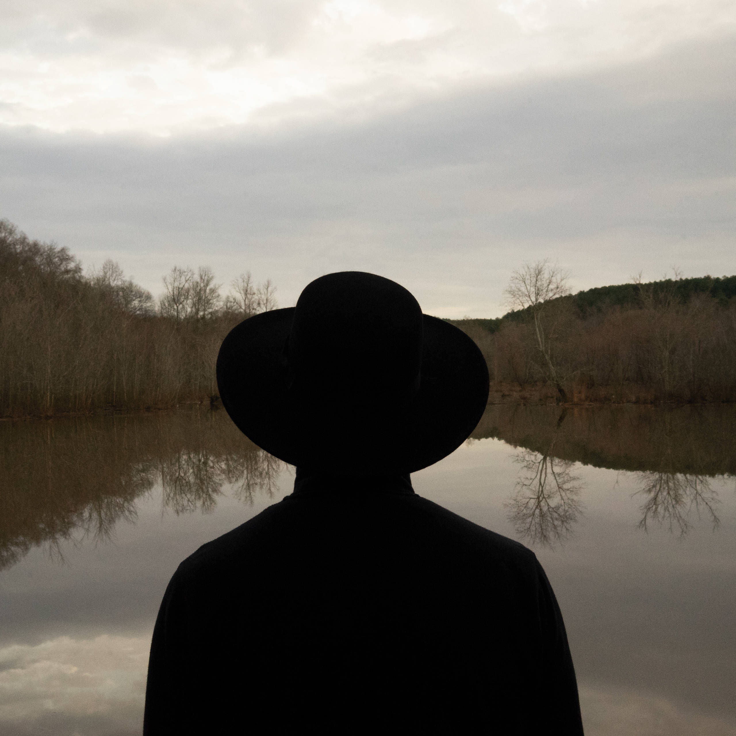
Artwork for ‘Across The Depths of Seven Lakes’ by Picture One
With the increasing popularity of digital music, most fans view artwork as just pixels on a screen. Why did you feel the artwork was important?
“I feel it still has a place when trying to convey a concept around a record or a song whether viewed digitally or physically. It is sadly true that digital platforms put way less emphasis on the art itself, so I feel you’ve basically got one image that’s going to represent your record as a whole, so you’ve got to make it count. It basically will become the one thing that someone can see at thumbnail size that should be instantly recognizable as representing your record.”
When people look at the album cover artwork, what do you want them to see/think?
“I hope the image on the front draws them in, and the subtle symbolism makes them curious to hear the music, and to figure out what’s behind the cover.”
Have any favourite music-related visual artists?
“Yves Cheynet who is featured on a majority of the Martin Dupont covers. Thomas McMahan who directed many of the Drab Majesty videos. Pearl Thompson from The Cure who did a number of the band’s covers. Tim Pope who directed a number of The Cure’s earlier videos. I’ve also always appreciated a lot of the earlier work by Michel Gondry.”
What are your thoughts and/or the pros and cons about digital art versus non-digital?
“It’s true that you lose a lot of real estate when you present something digitally. Generally, most streaming platforms don’t account for back covers or inner artwork, and only one platform that I know of includes the lyrics. My first two records only had a front cover, so nothing was lost with the visual presentation between the tape and the digital release. My newest record is a vinyl release that includes a gatefold with lyrics on the inside. The back artwork is a continuation of the artwork on the front of the record. It was designed with the digital release in mind, so the front is intended to be the artwork most people see for the record. The back cover and inner gatefold are like a bonus for people that buy the vinyl or seek it out.”
What do you think are some of the cover artworks that have translated best/worst onto t-shirts and other merch?
“In general I think album covers on t-shirts are usually too busy. I prefer more simple designs on t-shirts such as logos or stripped-down versions of existing artwork. Violator by Depeche Mode, which already had a super simple cover, translates well onto a shirt in a nice way. The cover of Three Imaginary Boys by The Cure also looks nice on a shirt.”
Do you prefer having the most creative control when you get a project, or do you prefer when the band gives you a lot of input?
“I’ve really enjoyed the collaborative process when it comes to visual art. It’s cool to see where my original art ideas morph into something all their own when I bring other people in. I always try to keep the core of the idea present, but I love letting others run with it.”
Was the artwork for the album influenced by any of the themes explored on the actual record?
“Transcendence, love, magic, and resolve are the primary themes on the album and what I wanted to convey in the artwork.”
How do you think the album art will affect the listener’s perception of your album?
“I hope it helps to augment the lyrics and the mood of the record if they are able to see the art while listening. If they see it prior to hearing the record, I hope it draws them in to hear what the music is about.”
Is the art for the album related to any of your previous album cover artwork?
“Certain concepts are the same and constant through all my album covers. All three of my records try to convey a specific emotional state with the cover art. All three have a person or persons placed in an intentional setting with their faces obscured. My first record was exploring the idea of togetherness, be it friendship or relationships. The second record was the idea of being and feeling offset from something. The third record is the idea of resolve and transcendence. I tried to place people in settings on each of the covers that expressed these ideas.”
When it came time to come up with artwork, did you give guidance on how you wanted the artwork done or was this just a natural brainstorm?
“I had some initial ideas, but then there was tons of brainstorming that happened between Todd Briner, my sister, and me. Ultimately, I think through collaboration we came up with something way better than my initial idea.”
What’s your favourite thing about this album cover?
“I like that it leaves plenty of breathing room for the audience to come to their own conclusions about it. I also love that we were able to pull it off with just practical effects. The process of creating it was super fun, and I have some amazing friends who don’t seem to bat an eye when I have crazy ideas. ‘You want to attach an umbrella to my drone and fly it over a lake? Let’s do it!’”
Did your collaborators for the album art work on any art for you besides the cover?
“Todd Briner did the back cover photograph as well and all the graphic layout for the record. A German photographer named Matthias Ripp took the picture of the lake on the inner gatefold.”
Do you have a favourite album cover of all time?
“The Pleasure Principle by Gary Numan is one of my favourite all-time record covers. It’s super simple, intentional, draws you in, and leaves lots of room for interpretation.”


Take That (w/ Olly Murs) Kick Off Four-Night Leeds Stint with Hit-Laden Spectacular [Photos]

The V13 Fix #010 w/ High on Fire, NOFX, My Dying Bride and more

Hastings Beat Punks Kid Kapichi Vent Their Frustrations at Leeds Beckett University [Photos]


-
 Music4 days ago
Take That (w/ Olly Murs) Kick Off Four-Night Leeds Stint with Hit-Laden Spectacular [Photos]
-
 Alternative/Rock5 days ago
The V13 Fix #010 w/ High on Fire, NOFX, My Dying Bride and more
-
 Hardcore/Punk2 weeks ago
Hastings Beat Punks Kid Kapichi Vent Their Frustrations at Leeds Beckett University [Photos]
-
 Culture2 weeks ago
Cirque Du Soleil OVO Takes Leeds Fans on a Unique, Unforgettable Journey [Photos]
-

 Alternative/Rock1 week ago
A Rejuvenated Dream State are ‘Still Dreaming’ as They Bounce Into Manchester YES [Photos]
-

 Features3 days ago
Tour Diary: Gen & The Degenerates Party Their Way Across America
-
 Culture6 days ago
Dan Carter & George Miller Chat Foodinati Live, Heavy Metal Charities and Pre-Gig Meals
-
 Music6 days ago
Reclusive Producer Stumbleine Premieres Beat-Driven New Single “Cinderhaze”