
Interviews
UnCovered: Suffer No Fools Discuss Their Captivating ‘We Die As We Live’ Cover Artwork

“We die as we live!” When you think about it, yeah, that actually has really got some truth to it! British melodic metal band Suffer No Fools is back with a brand new record titled We Die As We Live which drops on April 17th via LifeBlood Records. 2020 is unquestionably shaping up to be the most exciting year yet for this group as they prepare to release their best effort to date. They’ve put some heavy lifting into making a name for themselves on the live circuit, getting out on treks with Forever Never, Krysthla, and Hollowstar resulting in exposure to a whole new legion of fans.
Originally from the small town of Hertfordshire, England, the quartet has been playing together now for over four years. They first started to get notoriety in their hometown which extended to London when they began to gigging there more often. Despite their love of metal’s history, Suffer No Fools have set their sights squarely on establishing their own musical identity apart from what people typically imagine when they think of a modern heavy metal band.
As part of our UnCovered series, we caught up with Suffer No Fool’s bassist Alex Bain to ask him more about the band’s epic new cover artwork for We Die As We Live. Bain describes working with artist Mesozord, the group’s own large interest in overseeing the design process, and the outline provided to the artist of what they wanted to accomplish with the cover image.
What was the inspiration for the album’s cover artwork?
Alex Bain: “We really wanted to capture as many of the core themes, lyrically speaking, that are found within the album, and represent them visually. Lyrically our first EP Songs for the Restless Youth was far more involved with big picture ideas such as society, politics, war, corruption, and other such themes. We Die As We Live is a much more introspective album by comparison, whereby the majority of lyrics on the first EP were written by myself, the lyrics of the new album are much more personal to our singer Ali (Khan). The themes speak of life, death, trying to better oneself, hope, and other existential topics. The artwork was a great representation of two of the core themes; life and death, but it also represents degradation, re-birth, and the cyclical nature of the universe.”
The album cover is crazy-cool. Tell us about the artist and how you found him/her?
“Mesozord is a good friend of ours and we have worked with him on multiple occasions. Initially, when I was looking for an artist for the first EP I knew exactly the sort of style that I wanted on the album cover. I first started looking online at various album art which I liked and looked at the artists who had worked on those pieces, from there I managed to stumble upon similar artists. This web of connections eventually brought me to DeviantArt where there are thousands of amazing artists, and this is where I first saw Mesozord’s work. His unique style was perfect for what we wanted to achieve, so I reached out to him in the hope he might be free to work with us, he said yes and we haven’t looked back since.”
Please elaborate on the medium(s) used when creating the art. We’d love to know how the artwork was created.
“Mesozord works digitally, and as such he is very accommodating when it comes to alterations or notes regarding the artwork in question. I believe it is a combination of Illustrator and Photoshop.”

What were the partnership’s dynamics like? For example, was a specific look given, or did the artist have full free range?
“I had a rough brief in mind for Mesozord to work with. The exact brief was as follows:
Album title: We Die As We Live.
Concept: Playing card-esque, one figure up, one down. Represents life and death, could be a reflection in water below. Must have Suffer No Fools logo at the top like previous artwork and album title somewhere (at the bottom?).
Colours: black, white, red (just a rough guide)
Other than this, Mesozord had free range to interpret the brief as he saw fit, we had great confidence in his ability to apply himself and his imagination to create something amazing. Similar to our previous work together, he sent updates and in progress versions to us which we would then critique and request very slight changes. As you can see from the start to the finish there were very few changes made.”
Would you consider the artist an additional band member, or someone contracted for just this piece?
“I think at this point I can’t imagine a Suffer No Fools album cover, or t-shirt without Mesozord’s art adorning it. We keep in touch regardless of band-related matters so I would definitely describe it as a friendship. Where our music has become synonymous with his art, I can’t imagine the partnership ending any time soon. Mesozord has proved himself to be an amazing artist, a good friend, and fantastic at really working with us to achieve something beautiful.”
Did the artist who did the cover art hear the album beforehand? Or, what kind of input did you give him/her?
“Mesozord did not hear the album beforehand, this wasn’t a conscious decision, it was more to do with schedules as the album hadn’t reached the end of production by that point. The only input we gave was the initial brief and the few critiques throughout the process.”
Have you ever purchased an album solely because of its album artwork? If yes, did the music live up to the artwork?
“When I was first getting into music, I can’t say that I had enough money to really be that free with my purchases, I had to really decide and commit to anything I was buying, as I didn’t know the next time I would have the chance to buy something new. As I got a bit older, having grown up in the ’90s when the internet really hit its stride, it became much easier to be intrigued by album art, and with the advent of music online it made it so much easier to just click on a bands album cover and discover their music. Of course with YouTube and Spotify this is really the pinnacle of being able to do just that, which I think is great.”
With the increasing popularity of digital music, most fans view artwork as just pixels on a screen. Why did you feel the artwork was important?
“As I previously mentioned, with services like Spotify you can just look at an album cover, and if you like it you can click it and take a listen. It’s become so much easier now, and I think for that reason due to the sheer amount of music that is out there, you really do need an epic and interesting album cover to spark someone’s interest in your music, especially if you aren’t an established artist. I don’t think enough artists put thought or care in to their artwork, you see the same sort of artwork across multiple artists, it’s always the same sort of cookie cutter photoshop job with a grungy background and some vaguely ‘metal looking’ assets chucked on top. I get why people do it, because it’s cheap and easy, but I think if you take your time and maybe spend a little money (and you don’t have to break the bank) you can easily come up with something unique and maybe a bit more interesting.”
When people look at the album cover artwork, what do you want them to see/think?
“I think intrigue is always good, that’s the first feeling I want people to have, where we don’t necessarily have colours on our artwork (pink, yellow) that people might associate with a metal band, but we do have imagery that is familiar to metal fans, this unique vision could ignite people’s interest. That’s similar to our music as a whole in a way, where we aren’t your run of the mill metal band, we do something that is familiar but at the same time different. Beyond that, if people see the art and piece together a theme or a story from it, then the art has succeeded in conveying what we want it to convey.”
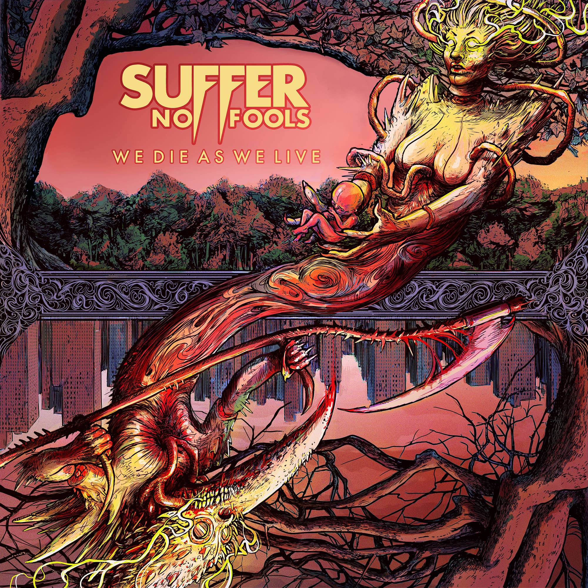
Artwork for ‘We Die As We Live’ by Suffer No Fools
Have any favourite music-related visual artists?
“Eliran Kantor is an amazing artist, I’m always impressed by his work, and I love the stuff he has done with Testament. Don Brautigam was a brilliant artist, from his work with Metallica and Anthrax, all the way back to the stuff he did with James Brown, you can see a true visionary with his own style. I don’t tend to keep up with the art world so much, however if I see an album cover that really blows my mind I’ll go and check out who made it and what else they’ve worked on. I really like Mike D’Antonio’s art for Killswitch Engage, he’s done the artwork for the majority of their albums, if not all of them, and I love his consistency in style and the way he has a unique vision for each release.”
What are your thoughts and/or the pros and cons about digital art versus non-digital?
“To me it makes zero difference, I get that certain people have a preference, however in this day and age it’s all going to end up on a small LED screen on someone’s phone, so why be so precious about it? We have the same argument going on in music too, especially regarding recording technology, it’s always analogue vs digital, and for the most part if your ears can’t tell the difference then it doesn’t matter. I guess that’s the same for art, if your eyes can’t tell the difference, why does it matter?”
What do you think are some of the cover artworks that have translated best/worst onto t-shirts and other merch?
“Simple designs are always great, think of Unkown Pleasures, Never Mind the Bollocks, Dark Side of the Moon, you can’t really beat them for the visual impact they’ve had. Although having said that, there’s something to be said for art that is a bit more involved like Master of Puppets, or Reign In Blood, or Powerslave. Those are iconic album artworks that are just as synonymous with t-shirts as they are with the actual CD or record cover. As for worst artwork, I can’t really think of any that spring to mind, I guess if your art is good it will translate pretty well no matter the medium, although Fistful of Metal is awful either way!”
Do you prefer having the most creative control when you get a project, or do you prefer when the band gives you a lot of input?
“I’m usually the instigator, so I’m the one who will get the ball rolling or start the conversations. I love to work collaboratively however and I’m always stoked when the rest of the band feel passionate about an idea or a riff, or whatever it might be. The more input the better as far as I’m concerned, as it all gets a bit much if it’s just yourself versus the world.”
How do you think the album art will affect the listener’s perception of your album?
“It’s just an extra element to tell the story, when I think of songs or albums by bands that I love, I immediately think of the artwork first, that association is extremely important in my opinion. I don’t know if the artwork will necessarily alter the perception of the music from a listener’s perspective but I believe it’s possible. I know that certain albums that I listen to have different shades to them, and this can correspond directly to the art. Going back to Master of Puppets, the red and orange shades of the art give the album a sombre tone, and I think this reflects many of the themes on the album, as such you could probably describe the album as heavy a very red feel to it, if that makes sense?”
Is the art for this album related to any of your previous album cover artwork?
“Mesozord has a very unique style, and his style was something that we felt gave continuity to our releases. By looking at Songs for the Restless Youth you can see that it was produced by the same band, and you have similar visual themes carrying over: the apocalyptic landscape, the figures representing different facets of the themes, and the overall visual feel of both pieces.”
What’s your favourite thing about this album cover?
“The dichotomy of the two figures and the way they are presented, totally separate, yet somehow connected, life and death once again. It’s Yin and Yang, it’s Karma, it’s representative also of the album title We Die As We Live, what goes around comes around.”
Do you have a favourite album cover of all time?
“Yes, although it changes all the time. Right now it’s Powerslave, that is just a perfect piece of art, it’s intriguing, it’s mysterious, it’s mythical, historical, and theatrical. These are all great descriptions of the music found within and of Iron Maiden’s music as a whole. I can imagine when it first came out that a lot of people probably bought it just because of the artwork.”


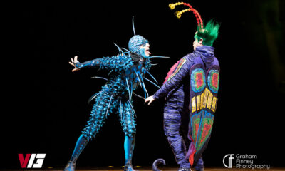
Cirque Du Soleil OVO Takes Leeds Fans on a Unique, Unforgettable Journey [Photos]

Hastings Beat Punks Kid Kapichi Vent Their Frustrations at Leeds Beckett University [Photos]

A Rejuvenated Dream State are ‘Still Dreaming’ as They Bounce Into Manchester YES [Photos]


-
 Culture6 days ago
Cirque Du Soleil OVO Takes Leeds Fans on a Unique, Unforgettable Journey [Photos]
-
 Hardcore/Punk5 days ago
Hastings Beat Punks Kid Kapichi Vent Their Frustrations at Leeds Beckett University [Photos]
-
 Alternative/Rock4 days ago
A Rejuvenated Dream State are ‘Still Dreaming’ as They Bounce Into Manchester YES [Photos]
-

 Indie7 days ago
Michele Ducci Premieres Bouncy New Single “You Lay the Path by Walking on it”
-
 Culture9 hours ago
Dan Carter & George Miller Chat Foodinati Live, Heavy Metal Charities and Pre-Gig Meals
-

 Alternative/Rock1 week ago
William Edward Thompson Premieres His Stripped-Down “Sleep Test” Music Video
-

 Country1 week ago
Jayce Turley Reflects on “Misery” with the Premiere of His New Single
-

 Hardcore/Punk6 days ago
Spiders from Uranus Premieres Their Debut Album ‘Blow It Out!’