
Folk
UnCovered: Jean-Paul De Roover and Mike Pianka Discuss the Creation of the ‘LOVE’ and ‘LOSS’ Album Covers

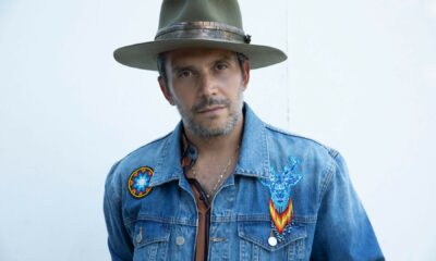
Young and up-and-coming singer-songwriter Jean-Paul De Roover has been a busy man lately, with the release of his new album, LOSS, on February 21st, which was preceded by the sister album LOVE last May. As you may have gathered from the album titles, LOVE and LOSS stand in contrast to each other, with LOVE focused on the artist’s excitement over several new developments in his life, including a new marriage, a new home, and the birth of his child. LOSS, meanwhile, is a darker album centred around the difficulties experienced by different friends and family of De Roover; events like losing a close friend, his parents getting divorced, and the deaths of loved ones. Both albums are noteworthy for the moods and emotions they are able to stir, and they draw attention to what a skilled and versatile songwriter this Thunder Bay, Ontario native is.
Even before you start listening to LOSS, you get an ominous feeling from the album’s cover artwork with its rather lonely overtop view of an empty bed. Rather than pass the process off completely to an artist, De Roover was very much involved in the creative process behind the LOSS and LOVE cover images. Along with his input, De Roover worked with photographer Mike Pianka who helped to fully develop the vision and was responsible for actually creating the final product.
We spoke with both De Roover and Pianka to get the inside story on the creative process behind the making of the LOSS and LOVE covers, including how the two met and agreed to work together, the guidance De Roover offered Pianka, and what it is exactly that De Roover would like people to take away from seeing and engaging with the artwork.
What was the inspiration for the album’s cover artwork?
Jean-Paul De Roover: “LOSS is the sibling album to LOVE, and both of them have matching artwork. LOVE is a singer/songwriter acoustic folk record, while LOSS is an alt-rock/progressive record, each centred around their titled themes. The inspiration for each came from the collection of music, rather than one particular song. We wanted to show each emotional state without showing any people, and I think focusing on an intimate scene like a bedroom really helped get that message across.”
Tell us about Mike and how you found him?
De Roover: “Mike Pianka is a photographer based here in Thunder Bay. We had only worked together briefly during some family shoots, but he came highly recommended by my photographer wife Shannon Lepere. Shannon was originally slated to shoot the cover but suggested I work with Mike because of how dark the content was going to get for the second cover, LOSS. Rather than having two different photographers work on the project, I wanted to make sure that there was a consistency across both albums by having one person oversee the whole process.”
Please elaborate on the medium(s) used when creating the art for the albums. We’d love to know how the artwork was created.
Mike Pianka: “Both albums were digital photos with very little editing done to bring them to the final product. We built the set in a small section of a local market that was gracious enough to let us use the space until 3 am. We basically brought a whole bedroom with us; bed, nightstands, sheets, pillows, everything. We mounted a camera about 20 feet in the air over the set to get the kind of birds-eye view of the bed we were looking for and remotely triggered it from a laptop on the ground. From there we just tweaked the set until we were happy with the look.”

What were the partnership’s dynamics like? For example, was a specific look given, or did Mike have full free range?
De Roover: “This was definitely a collaborative project. The original concept was mine, but we spent several weeks adding images to a Google document as we discussed inspirations, ideas, looks etc. Everything we did from there on out was a team decision, which I think is so important to this type of collaborative work.”
Did Mike hear the album beforehand? Or, what kind of input did you give him?
De Roover: “Yes, I made sure that Mike had full access to the music. At that point, LOVE was almost completed but LOSS was still in demo phase, but he was still able to understand the shift between the two.”
Have you ever purchased an album solely because of its album artwork? If yes, did the music live up to the artwork?
De Roover: “Years ago I was infatuated with different types of packaging so I would walk into used record stores and ask for them to show me the coolest packaging they had. I would then buy it based solely on how it looked and would add it to my collection. Sometimes it would be the design of the artwork within a traditional CD digipak format, or it would be something unconventional – tins, multi-panel fold-outs, pop-ups, books, etc. I’d say that it’s about 50/50 whether or not the music measured up to the creativity of the artwork/packaging.”
With the increasing popularity of digital music, most fans view artwork as just pixels on a screen. Why did you feel the artwork was important?
De Roover: “For me, I find that artwork is an essential companion piece to the music. It helps to explain and elaborate on the artistic vision of the collection of songs. While I feel that leaving things open to interpretation for the listener is important, as an artist myself I want to make sure that my vision is complete and that there’s unity to the theme of the project as a whole.”
When people look at the album cover artwork, what do you want them to see/think?
De Roover: “This project is different because it’s not just about the cover artwork of one album, but rather the two of them and how they differ. Both are identically framed overhead shots of a bed, but beautifully distinct in their content. I want them to feel the emotional warmth of LOVE, with its colouring, homie blankets and a lush plant in the corner, while you can instantly feel the shift in LOSS with it’s cooler, darker tones, cover-less duvet and a dried-up dead plant in the corner. There are lots of other details to be picked up on, but the biggest feature for me was the shift in tone and content. I wanted people to feel that something was missing in LOSS, and that there was a sense of devastation.”
Do you prefer having the most creative control when you get a project, or do you prefer when the band gives you a lot of input?
Pianka: “No, I definitely don’t need to have the most creative control when it comes to most projects I work on. I think sometimes the best work comes out when you have collaboration. When you start bouncing ideas off each other, amazing things start to happen, you know. Jean-Paul would kick off a thought about the overall vision for the sister albums and we would go from there, fleshing out the details, the look, the story. With something like an album cover, or two album covers, in this case, it makes sense to have an open dialogue with the artist to make sure their vision becomes a reality.”

Artwork for ‘Loss’ by Jean-Paul De Roover
When it came time to come up with artwork, did you give the artwork guidance or was this just a natural brainstorm?
De Roover: “I had a very specific vision for the cover when we first started discussing it. The original concept was similar in the sense that they would each be a glimpse of a bedroom through a doorway, with LOVE showing a lived-in scene similar to the final cover. LOSS, however, was going to be much much darker than its final version, which is part of the reason why Mike Pianka was brought on board.
Through a long process of brainstorming and location scouting, we finally settled on an overhead shot at the Thunder Bay Country Market, one of the only places with a ceiling high enough for us to mount the camera with an unrestricted view of their unique hardwood floor. Some of the elements in the photo had planned props, live/dead plants, dozen of smoked cigarettes, etc, but there was a lot of exploration within the space as well as we brought dozens of blankets, sheets, mats, etc… in order to see what would work best on camera.
What’s your favourite thing about this album cover?
Pianka: “It was a unique opportunity to work on two album covers that were related. I love the fact that they share characteristics that make them familiar to each other like the bed, the room, the camera angle but are so contrasting in emotional impact. LOVE is light and inviting and you can almost feel the warmth coming off the sheets while LOSS is cold, dark and gives you a feeling that something is wrong, something is missing. I also love that there are these little details in each cover that we had fun with putting in. You really have to spend some time with the covers to see them.”
De Roover: “Some of Mike’s closeup shots from the shoot became the back and inside covers. Some additional behind the scenes photos have also been used in some of the marketing materials and branding for the two albums as well.”


Take That (w/ Olly Murs) Kick Off Four-Night Leeds Stint with Hit-Laden Spectacular [Photos]

The V13 Fix #010 w/ High on Fire, NOFX, My Dying Bride and more

Hastings Beat Punks Kid Kapichi Vent Their Frustrations at Leeds Beckett University [Photos]


-
 Music5 days ago
Take That (w/ Olly Murs) Kick Off Four-Night Leeds Stint with Hit-Laden Spectacular [Photos]
-
 Alternative/Rock6 days ago
The V13 Fix #010 w/ High on Fire, NOFX, My Dying Bride and more
-
 Hardcore/Punk2 weeks ago
Hastings Beat Punks Kid Kapichi Vent Their Frustrations at Leeds Beckett University [Photos]
-

 Alternative/Rock2 weeks ago
A Rejuvenated Dream State are ‘Still Dreaming’ as They Bounce Into Manchester YES [Photos]
-

 Features5 days ago
Tour Diary: Gen & The Degenerates Party Their Way Across America
-

 Culture1 week ago
Dan Carter & George Miller Chat Foodinati Live, Heavy Metal Charities and Pre-Gig Meals
-
 Music1 week ago
Reclusive Producer Stumbleine Premieres Beat-Driven New Single “Cinderhaze”
-

 Alternative/Rock1 week ago
Three Lefts and a Right Premiere Their Guitar-Driven Single “Lovulator”