
Interviews
UnCovered: EYES ON SATELLITES Deconstruct the Cover Artwork of Their EP ‘The Illuminator’
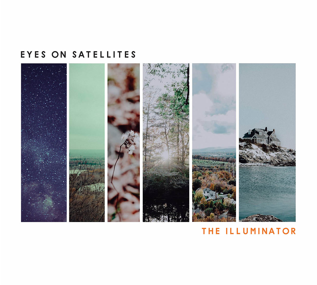
Lowell, MA post-hardcore group Eyes On Satellites unravel the six Rickelle Tavares photos used in creating the cover art for their EP The Illuminator. Turns out, each picture represents one of the album’s six tracks!

Steaming out of Lowell, MA like and artistic locomotive is the post-hardcore/rock group Eyes On Satellites! The dudes in this group create some serious bangers yet never lose sight of weaving in deeper meaning when crafting their ambient and melodically-laced heaviness. Their new EP, The Illuminator, mixed and mastered at Glow in the Dark Studios by Matt McLellan (Underoath, Being As An Ocean), dropped on April 6th and can be found on all major service providers, like Spotify and Big Cartel. Speaking of art, we noticed the new album’s cover seemed more intricate than meets the eye, so we caught up with bassist Daniel Matthew and vocalist David Longval to unravel the six full pictures used in creating the record’s artwork. Turns out, each picture represents one of the EP’s six songs!
What was the inspiration for the album’s cover artwork?
Daniel Matthew: The songs on the EP were written as a story. We went back and forth on a few different designs to use for the album cover, but we decided to go with the six pictures. We wanted everything to tie together as a whole and each of the six pictures represent the songs on the album. There’s a lot of hidden meanings and messages throughout the songs, and we felt that the album cover fit the tone of the record.
Your new album cover is crazy-cool. Tell us about the artist and how you found him/her?
David Longval: The artist is Rickelle Tavares, we met her a few years ago when we were on a small tour, she reached out to take photos of us and she has been like family to us. We asked her for some nature photos and those were what she came up with and they were perfect.
With the increasing popularity of digital music, most fans view artwork as just pixels on a screen. Why did you feel the artwork was important?
David Longval: The EP had a very in-depth concept and we felt we wanted to make it as visually appealing as it is audibly appealing. We felt like each picture told its own story that lined up perfectly with the story told in the songs.
What are your thoughts and/or the pros and cons about digital art versus non-digital?
David Longval: We are all geeks when it comes to music and all of us have our own collection of old albums and CDs. There’s just something about holding music in your hand and being able to have a visual interpretation of the music that’s on the album.
What do you think are some of the cover artworks that have translated best/worst onto t-shirts and other merch?
Daniel Matthew: I personally (Daniel) like a lot of the old school bands’ cover art designs. Back in the late ‘90s early 2000s, cover art to albums was simple and to the point. I personally feel the simplistic look translates well onto t-shirts/band merchandise over the more common flashy style that’s become more prominent. Less is certainly more, to me, in that case.
Have any favourite music-related visual artists?
Daniel Matthew: One of my personal favorites, while not entirely music related would have to be David Lynch. Twin Peaks was a huge influence on writing the lyrical content to this EP. His style of film and choice of soundtrack to what he does fits the tone of everything perfectly and we wanted to try and capture that same essence with everything from the songs to the actual complete package of the album.
Watch the official “She Bends Her Arms To Look Like Wings” music video.
And, just because we wanted to be thorough, here’s a track-by-track rundown of each of the six songs on the EP, The Illuminator.
01. “Further Now”
– The night sky represents self reflection. When looking at the sky at night and seeing the endless amount of stars, moon and anything else, we often wonder what else lies beyond and question things. Self reflection is one of the main focuses of The Illuminator.
02. “Clarity”
– Hopelessness. The dark gloomy tone of the photo represents the dark feelings inside all of us. We’ve all been in a place at one point or another where we’ve felt stuck or lost.
03. “Illuminator”
– The flower/plant in the third photo seems like it’s on its last legs. If you look closer you can still see signs of life with the few buds it has left. This represents that even in the dark times we all have the power to push on.
Check out the full, original images shot by Rickelle Tavares.
04. “Ghostwood”
– The sun shining through the trees at the edge of the horizon, a symbol for “there’s always a light at the end of the tunnel”. We’re the only ones that can follow the path we choose, even in the darkest of times, stick it out and you’ll get to the end where everything is alright.
05. “Greenvale”
– A peaceful town in reference to the fictional town of Greenvale. Looks are deceiving and beauty is in the eye of the beholder.
06. “She Bends Her Arms To Look Like Wings”
– We all want to find a place that we can call home, a place that we can call our own. This photo represents comfort. Comfort in finding who you are and having the courage to be yourself even when feeling out of place.


Take That (w/ Olly Murs) Kick Off Four-Night Leeds Stint with Hit-Laden Spectacular [Photos]

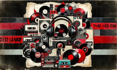
The V13 Fix #010 w/ High on Fire, NOFX, My Dying Bride and more

Hastings Beat Punks Kid Kapichi Vent Their Frustrations at Leeds Beckett University [Photos]


-
 Music4 days ago
Take That (w/ Olly Murs) Kick Off Four-Night Leeds Stint with Hit-Laden Spectacular [Photos]
-
 Alternative/Rock6 days ago
The V13 Fix #010 w/ High on Fire, NOFX, My Dying Bride and more
-
 Hardcore/Punk2 weeks ago
Hastings Beat Punks Kid Kapichi Vent Their Frustrations at Leeds Beckett University [Photos]
-

 Alternative/Rock2 weeks ago
A Rejuvenated Dream State are ‘Still Dreaming’ as They Bounce Into Manchester YES [Photos]
-

 Features4 days ago
Tour Diary: Gen & The Degenerates Party Their Way Across America
-
 Culture1 week ago
Dan Carter & George Miller Chat Foodinati Live, Heavy Metal Charities and Pre-Gig Meals
-

 Music7 days ago
Reclusive Producer Stumbleine Premieres Beat-Driven New Single “Cinderhaze”
-

 Alternative/Rock1 week ago
Three Lefts and a Right Premiere Their Guitar-Driven Single “Lovulator”