Interviews
UnCovered: Motograter Divulges Details About the Gnarly Sam Shearon-Created ‘Desolation’ Album Cover
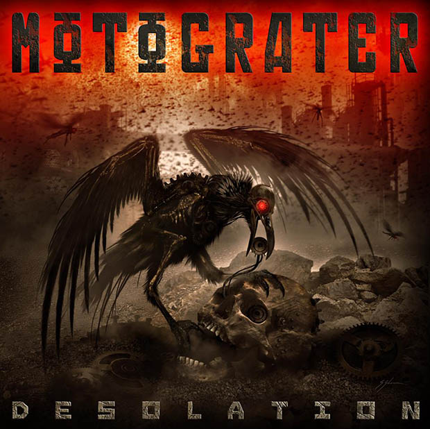
Our popular And Justice For Art series “UnCovered” continues with Motograter discussing the Sam Shearon-created cover art for Desolation, their sophomore album released via EMP Label Group.
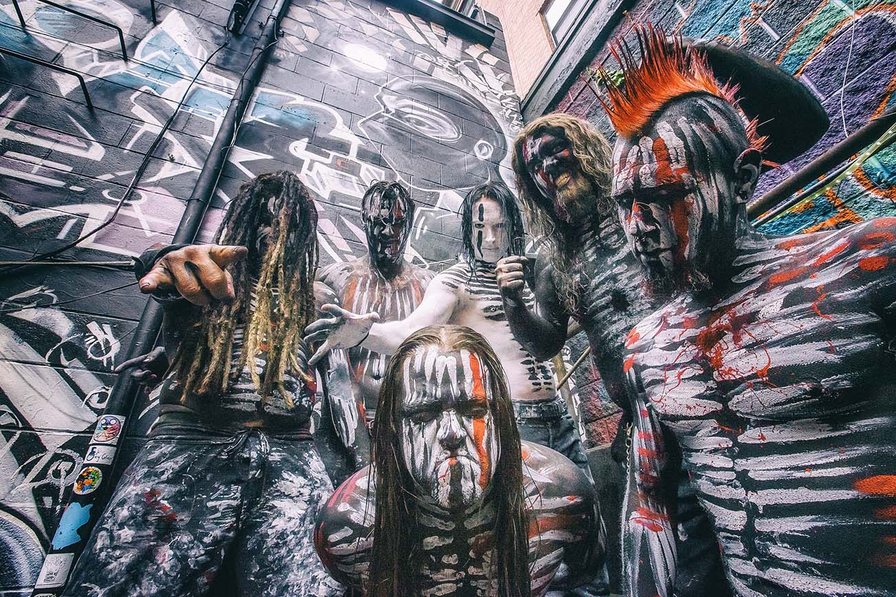
Our popular And Justice For Art series “UnCovered” continues with Santa Barbara, CA-based metal/rock mainstay Motograter divulging details about the cover artwork of their recently-released sophomore album Desolation. Drummer Noah “Shark” Robertson afforded us his time and shed light on the slick imagery on the recording, which dropped on August 11th, 2017 via EMP Label Group.
What was the inspiration for the Desolation album’s cover artwork?
Noah “Shark” Robertson: Desolation contains themes of death and decay and a lot of “end of the world” type of imagery. Fear of death, fear of dying, fear of aging and decaying. Hopelessness and self-loathing… Prophecies of the end times. The raven or crow sort of became the “harbinger of death” in the ‘Desolation’ story line… a sign of things to come. The Raven is the “death coach” in some of the folklore found in parts of Europe. In Irish folklore it is known as the “silent coach”. It is said that the sight or sound of the coach is the “harbinger of death”. It is a warning of imminent death to yourself or someone close to you. Christians believed crows to be companions of Satan and carriers of damned souls. The bird was thought to have “a special taste for criminals and enjoyed plucking the eyes out of sinners.”
Some cultures believe that a group of crows or a “murder of crows” seen perching on a tree, signifies the presence of souls from Purgatory. Crows are also known for being very clever and highly intelligent and are considered to be wise souls. Northern American cultures see crows as a sort of spirit guide and at times even a prophetic being. They are seers of the future. North American tradition sometimes views the crow or raven as “the mediator between the land of the living and the land of the dead, accompanying the dead souls on their final journey.” In Edgar Allen Poe‘s “The Raven”, depending on how you perceive the story, Poe appears to believe that the bird has come to predict his own death, and that he has perhaps even come to speak to Poe as death himself… So that is the origin story for the artwork.
Your new album cover is crazy-cool. Tell us about the artist and how you found him?
Robertson: Art for Desolation was created by Mister-Sam Shearon, who has created covers for comic books and graphic novels including Clive Barker’s “Hellraiser”, Judge Dredd, The X-Files, Mars Attacks, KISS, and Clive Barker’s “Books of Blood”; as well as artwork for some of the biggest names in rock music, such as Godhead, Ministry, Rob Zombie, Iron Maiden, Powerman 5000, Biohazard, American Head Charge, Rammstein, Fear Factory and Kill Devil Hill. We first became aware of Sam Shearon because of American Head Charge. He did the cover of their Tango Umbrella album. It was really eye catching. Once we did some research, we knew we had to work with him. He is a gifted artist and his creations are really dark and imaginative. (See charcoal sketch.)
What were the partnership between the band and the artist dynamics like? For example, was a specific look given, or did the artist have full free range to create?
Robertson: We communicated the lyrics and themes contained in the songs on Desolation and a narrative started to form. Shearon was very easy to work with and immediately understood our vision and how to make it a reality. He specializes in the dark and mysterious. So Desolation was right up his alley.
Would you consider the artist an additional “band member”, or someone contracted for just this piece?
Robertson: I don’t think Desolation would be the same without this amazing artwork behind it. It really brings the album to life. Early on in the process Sam stated, “Let’s make history together!” He was excited to be a part of the project from the beginning. We are blessed to have worked with an artist that truly believed in the project and was enthusiastic about doing so.
Did the artist who did the cover art hear the album before hand? Or, what kind of input did you give him?
Robertson: We sent Sam the pre-production stuff we were working on, before the songs really had a chance to take shape. But we kept him updated and sent newer versions of songs, once they were completed. He seemed to really be on board with everything we were creating. He gave us really positive feedback, every step of the way.
Have you ever purchased an album solely because of its album artwork? If yes, did the music live up to the artwork?
Robertson: I have done that many times, especially when I was younger. I bought the first Slipknot album because of the cover. I bought the first Mudvayne album and Disturbed albums because of the cover art. I’ve discovered some of my favorite bands, simply because I liked the art and the music happened to be equally amazing. I remember walking through record stores, just waiting for something to catch my eye. I bought my first Mushroomhead album because the entire band was on the cover and I thought it looked really cool.
What do you think are some of the album cover artworks that have translated best/worst onto t-shirts and other merch?
Robertson: So many answers I could give. The first thing that comes to mind, is the grotesque imagery of bands like Cannibal Corpse, Dying Fetus, and Decapitated. Death metal art translates well to merch, because it’s so vivid and grotesque. It’s hard to ignore! I can’t really think of any album art that I don’t like. I think everything is different and unique and has it’s place.
Motograter is known for its unique tribal paint the members wear onstage. Are all the members painted the same, or is each member wearing a unique color/symbol? How did the whole paint thing come about?
Robertson: In the early days Motograter was experimenting with shoe polish and baby powder! (laughs) Joey, one of the original members, was the main proprietor behind the “paint” and the look the band has, I believe. It has evolved over time. It is always changing. For the most part we are all the same, with slight variations. The singer typically has something else going on. The band members are usually black with white stripes/streaks over the top. We add red here and there and have been bringing it back more prominently recently. James Legion, our singer, is typically white with black stripes/streaks. It has sort of grown to the point where each member has a certain pattern that you can recognize. If you pay attention, you’ll notice the small details we put in. (See photo of Skunk and Nuke before the show.)
What do you want fans to see/think when they look at the tribal paint? Is it open to interpretation, or do you want them to see something specific? If so – what do you want them to see?
Robertson: It identifies us as a unit. We are a tribe, so to speak. It is our WAR PAINT! We are ready for battle when we are all geared up in the paint. The red is a warning and sends a message that we mean business. When the new album was about to drop, we began bringing red back again on our most recent tours. We are ready for WAR! The paint is a tradition and isn’t likely to go away anytime soon. Otherwise, it just wouldn’t be Motograter.
Anything else you want to share that you haven’t in other interviews?
Robertson: Thank you for all the continued love and support. As long as there is a demand out there for Motograter, the gears will keep turning!
Check out the band’s music video for their song “Dorian”
“Desolation Tour” Dates:
09/19 – Titanfest (Headliner) – Fife, WA
09/27 – Brick By Brick – San Diego, CA
09/28 – Club Red – Mesa, AZ
09/29 – Top Deck – Farmington, NM
10/03 – Rail Club – Fort Worth, TX
10/04 – Come And Take It Live – Austin, TX
10/06 – Come And Take It Live – Austin, TX
10/08 – Southport Music Hall – New Orleans, LA
10/10 – The Dungeon Tavern – Panama City, FL
10/12 – O’Malley’s – Margate, FL
10/13 – The Haven – Winter Park, FL
10/15 – The Drunk Horse Pub – Fayetteville, NC
10/19 – Canal Club – Richmond, VA
10/20 – Fish Head Cantina – Halethorpe, MD
10/21 – Dingbatz – Clifton, NJ
10/22 – The Lost Horizon – Syracuse, NY
10/23 – Amityville Music Hall – Amityville, NY
10/25 – Reverb – Reading, PA
10/28 – Stage On Herr – Harrisburg, PA
10/30 – Trixie’s Entertainment Complex – Louisville, KY
11/01 – The Token Lounge – Westland, MI
11/03 – Route 20 – Strurtevant, WI
11/04 – Top Fuel Saloon – Braidwood, IL
11/05 – The Firebird – St. Louis, MO
11/10 – Dr. Jack’s Drinkery – Omaha, NEB
11/12 – Herman’s Hideaway – Denver, CO
11/18 – Malone’s Bar – Santa Ana, CA
-
 Music5 days ago
Take That (w/ Olly Murs) Kick Off Four-Night Leeds Stint with Hit-Laden Spectacular [Photos]
-
 Alternative/Rock6 days ago
The V13 Fix #010 w/ High on Fire, NOFX, My Dying Bride and more
-

 Hardcore/Punk2 weeks ago
Hastings Beat Punks Kid Kapichi Vent Their Frustrations at Leeds Beckett University [Photos]
-

 Alternative/Rock2 weeks ago
A Rejuvenated Dream State are ‘Still Dreaming’ as They Bounce Into Manchester YES [Photos]
-
 Features5 days ago
Tour Diary: Gen & The Degenerates Party Their Way Across America
-
 Culture1 week ago
Dan Carter & George Miller Chat Foodinati Live, Heavy Metal Charities and Pre-Gig Meals
-

 Music1 week ago
Reclusive Producer Stumbleine Premieres Beat-Driven New Single “Cinderhaze”
-
 Alternative/Rock1 week ago
Three Lefts and a Right Premiere Their Guitar-Driven Single “Lovulator”

