
Interviews
…And Justice For Art: A Guide to (some of) the Best Metal Album Covers of 2015 (Part 2) – Feat. Amorphis, Grave, Soulfly, Tempel, Iron Maiden, My Dying Bride
Metal albums continue to be a commanding force of nature in 2015 and their accompanying visuals – the cover artwork – have immensely helped in creating additional interest for the music, enhancing its allure.

Metal albums continue to be a commanding force of nature in 2015 and their accompanying visuals – the cover artwork – have immensely helped in creating additional interest for the music, enhancing its allure. In this new episode of “And Justice For Art” we continue to explore all the “behind-the scenes” details of some of the year’s greatest album covers. We’ve gathered first-hand information provided by some of the artwork’s designers and musicians involved with the creation of these amazing pieces of art. What we learned was, as with the music itself, extremely compelling!
01. Amorphis – Under The Red Cloud:
Cover Artwork by: Valnoir of Metastazis
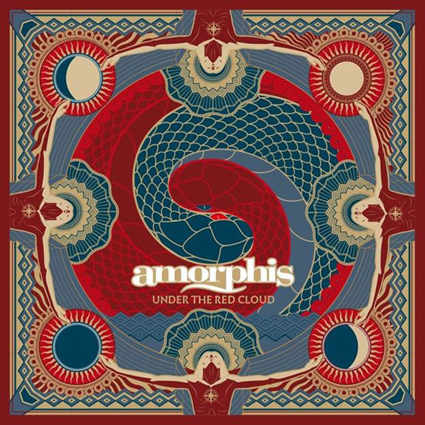
Finland’s Metal masters, Amorphis, decided to hire French visual provocateur, Valnoir of Metastazis for the creation of the cover artwork of their critically-acclaimed album, Under The Red Cloud. This marks the first collaboration between the two. Valnoir admits that “this artwork has been strongly inspired by Art-Deco, Finnish themes, the paintings of Finnish painter Akseli Gallen-Kallela and the symbolic Germanic/Nordic Art-Deco represented by artists such as Fidus.”
Regarding the meaning of the artwork, longtime guitarist, Tomi Koivusaari, comments: “The cover represents time we are all living in right now. ‘Under the red cloud’ means that something bad might happened, threat or having that kind of feeling.” Valnoir adds, “The red cloud, briefly symbolized above the snakes, represents the fate of mankind. In the middle of the scene, two snakes, two brothers, in an ambiguous position. Impossible to know if they are protecting each other, or eating other. Maybe both.”
Koivusaari assures that the band is “extremely happy how the cover came up.”
02. Grave – Out Of Respect For The Dead:
Cover Artwork by: Costin Chioreanu
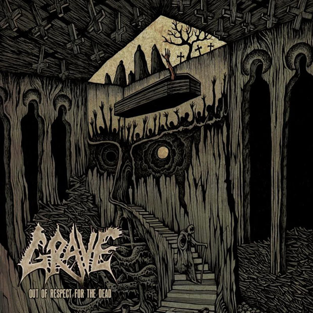
Romanian visual maestro, Costin Chioreanu and Death Metal provocateurs, Grave have been collaborating for a while. Their latest stint is the cover artwork for the band’s upcoming album Out Of Respect For The Dead.
The handmade/mixed media image depicts a distinctive look of the underworld. It also seems to deal with a subject that Chioreanu has explored in some of his previous work: the soul’s transcendence beyond death. At the same time, there are many obvious elements that allude to the name the band—Grave. “This is the 5th front cover I am doing for these Swedish death metal masters,” the artist comments. “At the same time, this illustration is marking 7 years of continuous collaboration!”
03. Soulfly – Archangel:
Cover Artwork by: Eliran Kantor
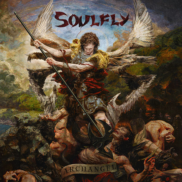
“I’ve been a fan of Max Cavalera’s music ever since discovering Sepultura’s Beneath The Remains album in high school,” says Berlin-based artist, Eliran Kantor, who designed the cover artwork for Soulfly’s Archangel.
Kantor’s depiction of the Archangel Michael is closely related to Soulfly’s iconography. “Max asked me to do a traditional piece depicting Archangel Michael – and I tried to go beyond the straight-up neoclassical style as that has been perfected centuries ago,’ the artist says. “So I mixed in Soulfly’s own visual world: hence the wings and spear being shaped like the Soulfly tribal icon, the cliff with the ocean view just like on the first record, and the Brazilian flag being the core of it’s color scheme.”
04. Tempel – The Moon Lit Our Path:
Cover Artwork by: Lucas Ruggieri
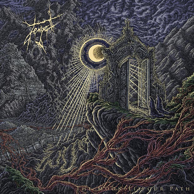
The Moon Lit Our Path is Tempel’s latest album. Obviously, these instrumental metallers took that title very seriously and asked American illustrator, Lucas Ruggieri, to recreate it in the cover artwork.
“Ruggieri came up with the cover concept,” Ryan, the band’s guitarist, comments.”We gave him the album title, song titles and the music. From there, he used that as inspiration. As he made progress in the design, each time we saw what he had completed it was fantastic His detailed line work is mind blowing and really represented a style that we were looking for.”
The complete panoramic image was completely hand-made and can be seen here. According to the band, it’s “a clear representation of the music within the album. Lucas illustrated emotion and captured imagery that reflects that unsettling and appealing feel. Each portion of the piece represents a song title on the album, as well as the album title’s concept. Since we are an instrumental band, having a visual element represented in the artwork was very important for us. We couldn’t be happier with how the artwork turned out!”
05. Iron Maiden – The Book Of Souls:
Cover Artwork by: Mark Wilkinson
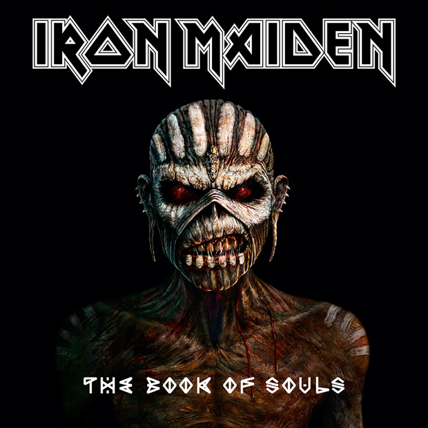
The cover for Iron Maiden’s sixteenth studio album doesn’t feature the conceptual intricacies and post-modern overtones of the classic artworks illustrator, Derek Riggs, created for the band—especially during the ’80s. However, veteran British designer, Mark Wilkinson (who already had collaborated with the band in several projects) made sure to deliver one of the most detailed and meanest Eddie incarnations in the visual history of the band.
“I was invited to submit rough visuals for Iron Maiden’s album art at the beginning of this year,” Wilkinson (who has created iconic artworks for Judas Priest and Marillion) comments. “I started with the figure of Eddie tearing his heart out. This seemed to go down well, so they then instructed me to add a Voodoo or Mayan look to him…something very dark, malevolent, scary…coming out of the shadows. I created a different visual, something simpler which I concentrated more on the white voodoo markings and his textured skin—a head and shoulders figure, to establish how Eddie might look.”
Eventually, the band and management gave thumps up to Wilkinson. “[Bassist] Steve Harris and [manager] Rod [Smallwood] really liked this and it was decided to make it the cover…go for something simple but striking, a departure from previous detailed Maiden covers.”
06. My Dying Bride – Feel The Misery:
Cover Artwork by: Matthew Vickerstaff

My Dying Bride’s guitarist, Andrew Craighan, and British designer, Matthew Vickerstaff closely collaborated in the creation of the stunning cover for the veteran band’s new album Feel The Misery. The graphic proposes a new twist of traditional churches’ stained glass imagery. Craighan suggests that there’s ominousness behind the beautiful graphic. He comments, “Religion is a façade. Used to divide, conquer and control us. Behind this veil of benevolence lies a putrid hatred for mankind endlessly working to destroy us… Feel The Misery?”
07. Riverside – Love, Fear and the Time Machine:
Cover Artwork by: Travis Smith
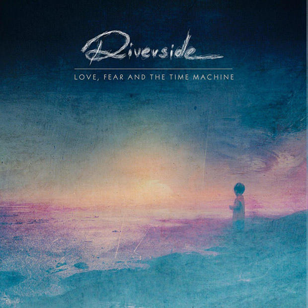
Riverside’s music is closer to Prog Rock than to Metal. However, for the cover of their latest album Love, Fear and the Time Machine, the Polish band hired the talents of one of the most renowned Metal designers of all time. We’re talking about American artist, Travis Smith, who has created many iconic artworks for Opeth, Death, Overkill, Katatonia and more. In fact, he and the band have been collaborating for more than a decade.
Instead of taking a dark approach, Smith decided to give the artwork a meditative, impressionistic look. Regarding the cover concept, he comments: “The lyrics of the album as a whole are about a transformation, and being faced with having to make an important life-altering decision, and the fear of what might happen to us because of it – but seeing freedom in the future…. The front cover itself – with the child looking towards a bright uncertain horizon, and the tiny roads below reaching out before him in different directions towards it, or looking back at the way he’s come – explores at a part of that, but in the context of reliving an earlier time in your life, remembering your youth, and having the chance to go back in time, escaping the old life to rewind and try again, and change what it has become.”
About the use of a pastel-like color palette, the designer adds: “We wanted to approach this one with a more colorful, hopeful, atmosphere compared to the darker, moodier vibes of the past releases. The music itself walks down that kind of path this time, even venturing into places from the ’70s and ’80s. And the artwork represents that as well.”
Next Time on AJFA: A Guide to (some of) the Best Metal Album Covers of 2015 (Part 3)
Previously on AJFA: A Guide to (some of) the Best Metal Album Covers of 2015… so far – Featuring Byzantine, Hate Eternal, Sirenia, Oceano, Cattle Decapitation


Take That (w/ Olly Murs) Kick Off Four-Night Leeds Stint with Hit-Laden Spectacular [Photos]

The V13 Fix #010 w/ High on Fire, NOFX, My Dying Bride and more

Hastings Beat Punks Kid Kapichi Vent Their Frustrations at Leeds Beckett University [Photos]


-
 Music2 days ago
Take That (w/ Olly Murs) Kick Off Four-Night Leeds Stint with Hit-Laden Spectacular [Photos]
-
 Alternative/Rock3 days ago
The V13 Fix #010 w/ High on Fire, NOFX, My Dying Bride and more
-
 Hardcore/Punk1 week ago
Hastings Beat Punks Kid Kapichi Vent Their Frustrations at Leeds Beckett University [Photos]
-

 Alternative/Rock1 week ago
A Rejuvenated Dream State are ‘Still Dreaming’ as They Bounce Into Manchester YES [Photos]
-

 Culture2 weeks ago
Cirque Du Soleil OVO Takes Leeds Fans on a Unique, Unforgettable Journey [Photos]
-

 Features2 days ago
Tour Diary: Gen & The Degenerates Party Their Way Across America
-
 Culture5 days ago
Dan Carter & George Miller Chat Foodinati Live, Heavy Metal Charities and Pre-Gig Meals
-
 Music4 days ago
Reclusive Producer Stumbleine Premieres Beat-Driven New Single “Cinderhaze”