Features
…And Justice For Art: Pantera’s “Vulgar Display Of Power” – The Truth Behind One of Metal’s Most Mythical Images
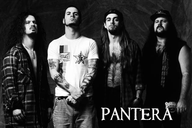
Vulgar Display Of Power was definitely the album that catapulted Pantera into the role of quintessential American Metal band of 90’s.

Vulgar Display Of Power was definitely the album that catapulted Pantera into the role of quintessential American Metal band of 90’s. Between Dimebag Darrell’s towering riffing and superlative solos, Phil Anselmo’s vicious vocal delivery and Vinnie Paul and Rex Brown’s groove-oriented rhythmic session, the face of extreme music changed forever. Among others, songs like “Mouth for War”, “New Level”, “This Love”, “Walk” and “Hollow”, cemented the end of the musical metamorphosis this Texan quartet had begun to undergo on their previous full-length, 1990’s Cowboys From Hell. All this, combined with top-of-the line production values courtesy of Paul and recording guru Terry Date, helped to finally conjure the definitive Pantera sound… the sound that still today is so often imitated, but never replicated. The sound that is responsible for finally installing this fierce entity in the sacred and exclusive pantheon of Metal music, once and for all.

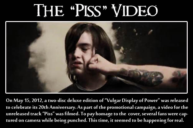
This release also marked the first time that Pantera – after some failed previous attempts – was able to showcase a truly striking image on one of their cover sleeves. And what a powerful image it was; a real photograph of a fist unashamedly belting a man’s face in the most outrageous, yet expressive way possible. It couldn’t represent in a more perfect fashion, the dominating power of the record’s music.
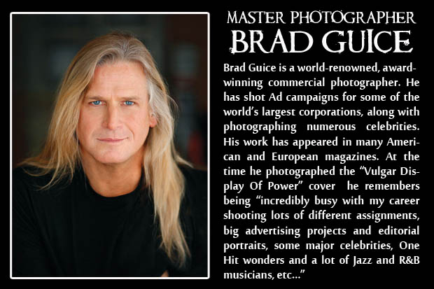
Popular legend says that the man on the cover – an alleged fan of the band – was hit in the face around 30 times while getting ten dollars a punch until just the right picture was finally taken. Of course, a story like that was ideal to enhance the well-documented and larger-than-life Pantera exploits, even years after their separation, but is it true? Despite how juicy and legendary this tale may be, the truth behind the myth reveals a very different reality, intrinsically related to the talent, artistry and technical proficiency of a single individual: master photographer Brad Guice. “He was never punched. The legend is totally false”, affirms the New York-based artist. “Someone made that up and had a good laugh about it, I am sure. The real image was professionally produced in a photo studio with it being well thought out and executed.”

The demystification goes even further. “It was the record company’s idea”, Guice says. “The (project’s) art director – then popular designer Bob Defrin – called me. He was someone I had met several times through parties, mutual friends, industry connections etc, but this was our first project together. He knew I had a certain style that I gave in some of my images”. In fact, the then 33 year old photographer was already a popular name among the music and advertising industry. Having produced campaign images for Coca Cola, editorials for Harper’s Bazaar, Interview Magazine and for artists like Sting, BB King and Prince, Guice was well-known for giving his images what he calls “a particular kind of movement” which made him the ideal candidate for the project.
Creating an image capable of conveying such a rapturous moment of stripped down brutality without providing a real punch, demanded vast photographic knowledge. Also it required plenty of technical preparation and planning. “It was a very rehearsed set up… with the fist moving and pushing the model’s face hard to achieve the look, but not at all punched. I shot the image in color. First, I used strobe (lights) in the foreground to stop the motion, and tungsten spots in the background and hair for the dramatic movement through a drag/time exposure. I had a strong fan to help blow the hair to help with movement. I needed to play with the camera’s shutter speed, and my own moving the camera with the so-called punch to get the desired effect of movement and a feeling of reality. I also used a lower camera angle to make for a more powerful dramatic view.” Using the classic Hasselblad 2¼ x 2¼ camera square format also helped him “to visualize the final crop of an album cover. I created a deep/bright red background that was beautiful coming through the male model’s hair; it added a dramatic look, movement and power to the photo,” says Guice.

Choosing a face model also proved to be crucial to the success of the whole project and even became a challenging task in and of itself. “I called every model agency looking for a long-haired model. They were very popular back at that time. They were so popular that they were all booked on shoots, traveling on editorial jobs to the Caribbean etc… None available! At the last second, I believe it was the Ford model agency that called and said they had a model flying in from Los Angeles and could come by my studio for a casting. He showed up and was perfect. The model’s name was Sean Cross.” Guice reveals that he “also booked a hand model for the punching fist” and that his relationship with Cross would later transcend professional boundaries: “He became a good friend. Actually was one of my best men at my wedding.”
Believe it or not, the most surprising aspect of the whole saga has nothing to do with achieving the complex image. Even today, Brad is still amused that during the sessions “no one was present from the Record Company! I was left on my own to shoot and design the photo on set! No one was there to direct or give guidance except for the initial phone call to me at the onset of the project. I communicated with the record company on the phone along the way, but no one came to supervise the shoot or be a creative influence on set.” Could this be interpreted as a sign of total blind faith in the photographer’s abilities or was this just a sign of carelessness from a major label in charge of a project that involved thousands of dollars? One thing is clear, we’ll probably never know.

Something that we do know however, is how Brad Guice reacted to the finished product: “I was actually surprised when I saw the final cover in black and white. I did not think it looked anywhere as good as the red background. In fact I was very disappointed in how it came out. The color version was superior by far. I was surprised at the record company changing it.” Today he acknowledges that the photograph has become an iconic piece of Metal history and that probably helped him to “shoot quite a few albums after that.” However, despite feeling extremely grateful for being part of that project, he truly hopes not to be just remembered or identified with that single image, but for another kind of photographic work. “I also shoot a lot of humanitarian aid documentary, hopefully stirring emotional stuff that I hope impacts people to do great things, and help people and great causes around the world,” says Guice.

What is most amazing is that the power of the Vulgar Display Of Power cover hasn’t diminished through the years, not even a little. As a fan-favorite, it’s an image that still helps to sell large amounts of merchandise and apparel while helping to keep alive the legend of Pantera. This said, after uncovering the real truth behind the artwork, there remains an unknown. Something between the lines that still resounds very deeply. Could it be that the aforementioned legend about the artwork’s origins was something created with a very specific agenda? Perhaps by someone working for the record label? Maybe the marketing department? All with the intent of creating a more fascinating story or air of violence and power to be associated with the album and band?
If this were the case, then it was a very logical idea from a business standpoint. Taking advantage of some of the excesses of extreme music in an effort to broaden Pantera’s image could be perceived as acceptable, even if it meant that the truth was hidden… at least for a while. Regardless, this probably wasn’t the first (or last) time that something like this would happen in the tumultuous world of rock and roll.
Band and Album Title: Pantera, “Vulgar Display Of Power”
Release Date: February 10, 1992 via ATCO Records
Cover Artwork Commissioned by: ATCO Records and Pantera
Authors: Brad Guice (Photography) Larry Freemantle (Artwork Design)
Original Dimensions: 2¼ x 2¼ Inches (Film size)
Technique: Studio photo taken using a 220 Ektachrome 64 ASA film and a Hasselblad 2¼ x 2¼ camera
Coming Next Week: Metal Artists’ All-Time Favorite Album Covers (Part 1)
Previously on AJFA: Archaios’ “The Distant” – A Third World’s Cry of Emptiness
-

 Alternative/Rock2 weeks ago
The Hives Bring Their Swedish Swagger to Leeds O2 Academy [Photos]
-

 Culture4 days ago
Cirque Du Soleil OVO Takes Leeds Fans on a Unique, Unforgettable Journey [Photos]
-

 Hardcore/Punk3 days ago
Hastings Beat Punks Kid Kapichi Vent Their Frustrations at Leeds Beckett University [Photos]
-

 Alternative/Rock2 days ago
A Rejuvenated Dream State are ‘Still Dreaming’ as They Bounce Into Manchester YES [Photos]
-

 Indie5 days ago
Michele Ducci Premieres Bouncy New Single “You Lay the Path by Walking on it”
-

 Alternative/Rock5 days ago
William Edward Thompson Premieres His Stripped-Down “Sleep Test” Music Video
-

 Country6 days ago
Jayce Turley Reflects on “Misery” with the Premiere of His New Single
-

 Dance/Electronic2 weeks ago
Perfect Female Type Premieres Synthwave Single “Science of Love”


